- Century Media Records
Year
- 2026
What
- Album packaging design
- Photography
- Digital single & merch artwork
Role
- Art Direction
- Graphic Design
Album Packaging Design for “The Ghost of a Future Dead” by At The Gates
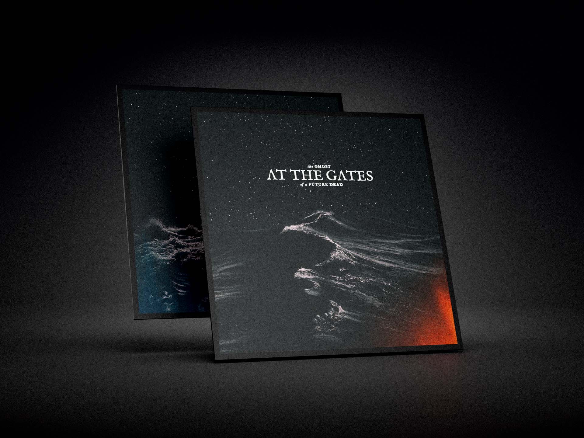
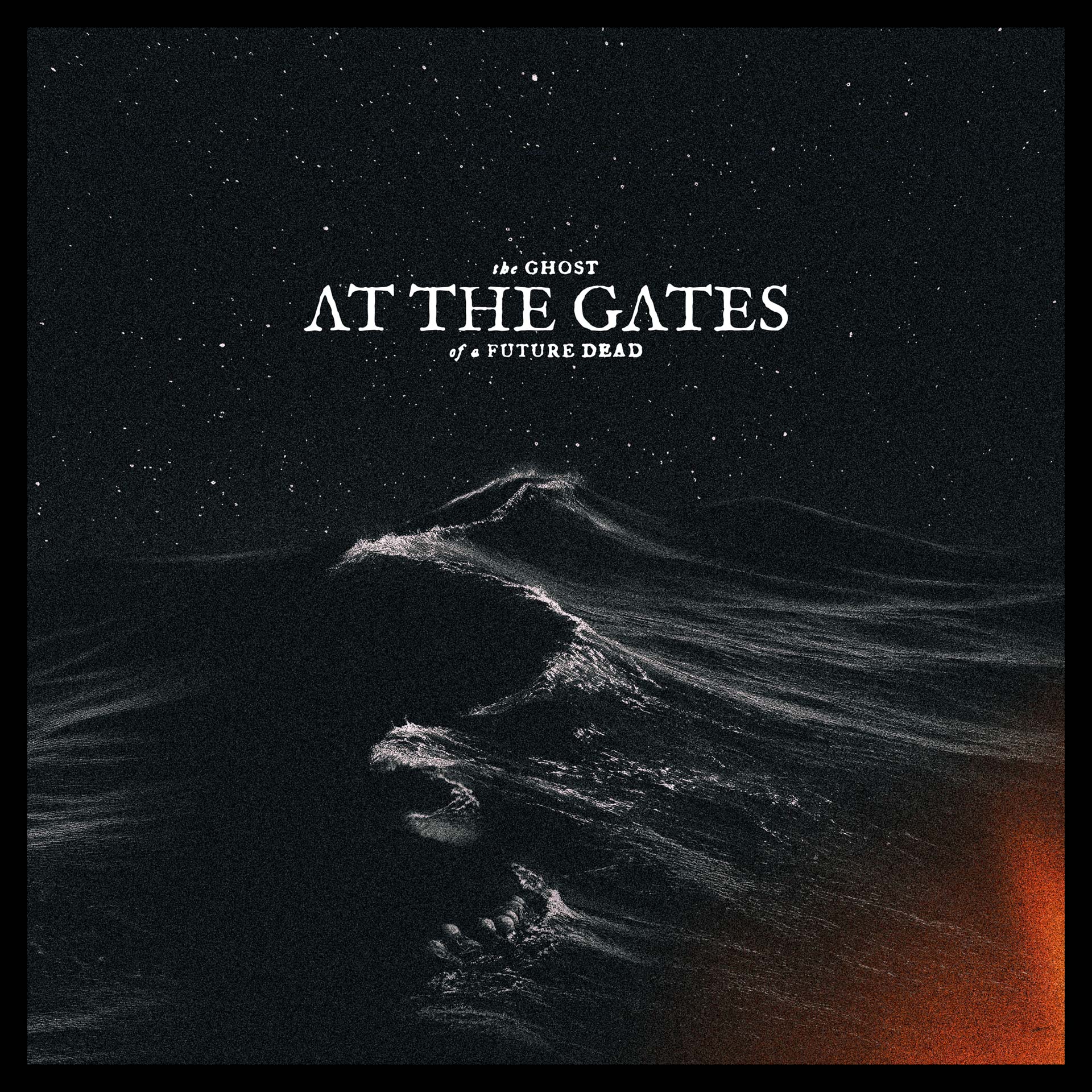
For this project, I was responsible for the art direction, graphic design, and conceptual development of At The Gates’ album The Ghost of a Future Dead, released on April 24, 2026 via Century Media Records.
Widely regarded as one of the defining bands behind the emergence of melodic death metal and the internationally influential “Gothenburg Sound”, At The Gates have played a central role in shaping Scandinavian extreme metal since the early 1990s.
The project encompassed the complete visual identity for the release, from the initial conceptual framework to the final production of all design elements, ensuring a cohesive visual language across every format and edition.
The visual concept, in short:
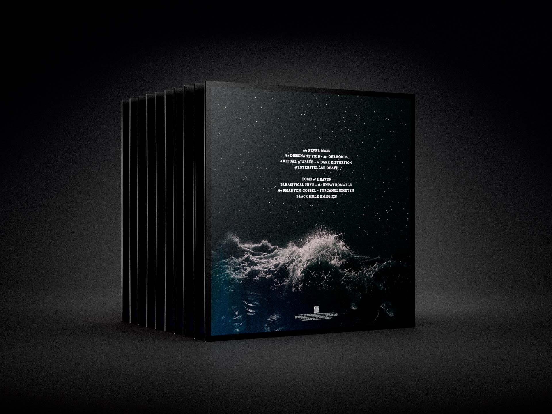
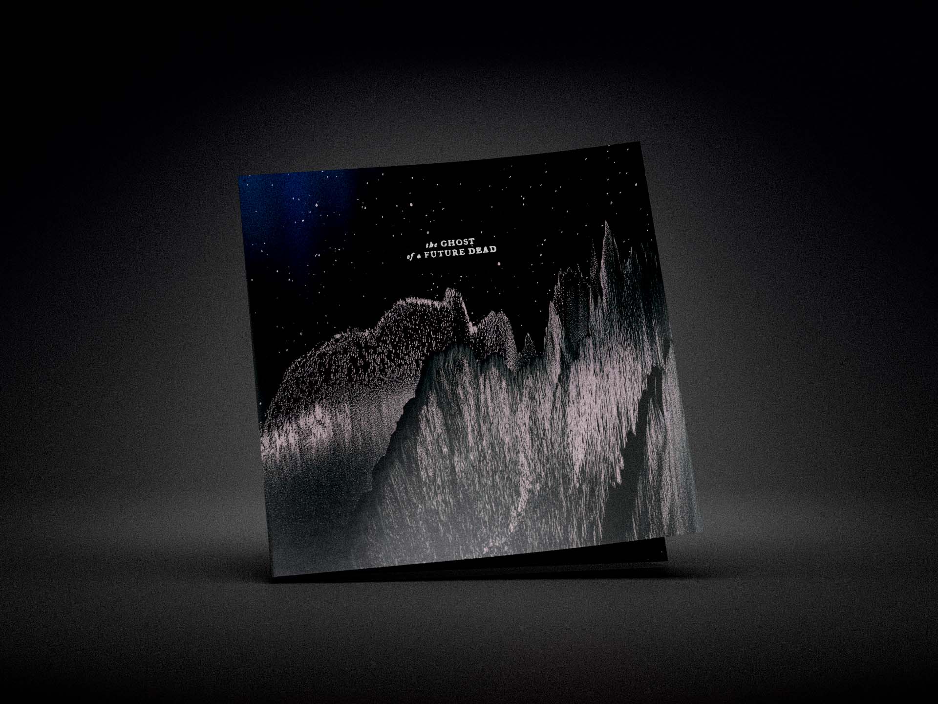
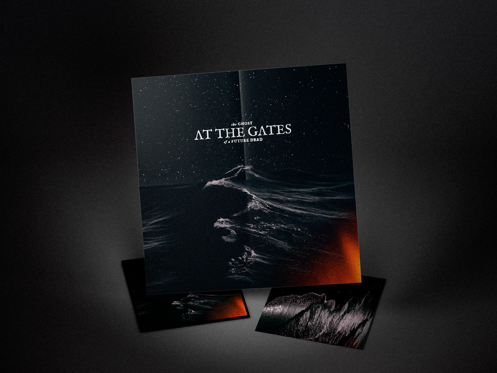
The wild and violently unbound night ocean rises into the cosmos. Somewhere within the unfathomable rests everything and nothing – the birth of all things, and the death of all things.
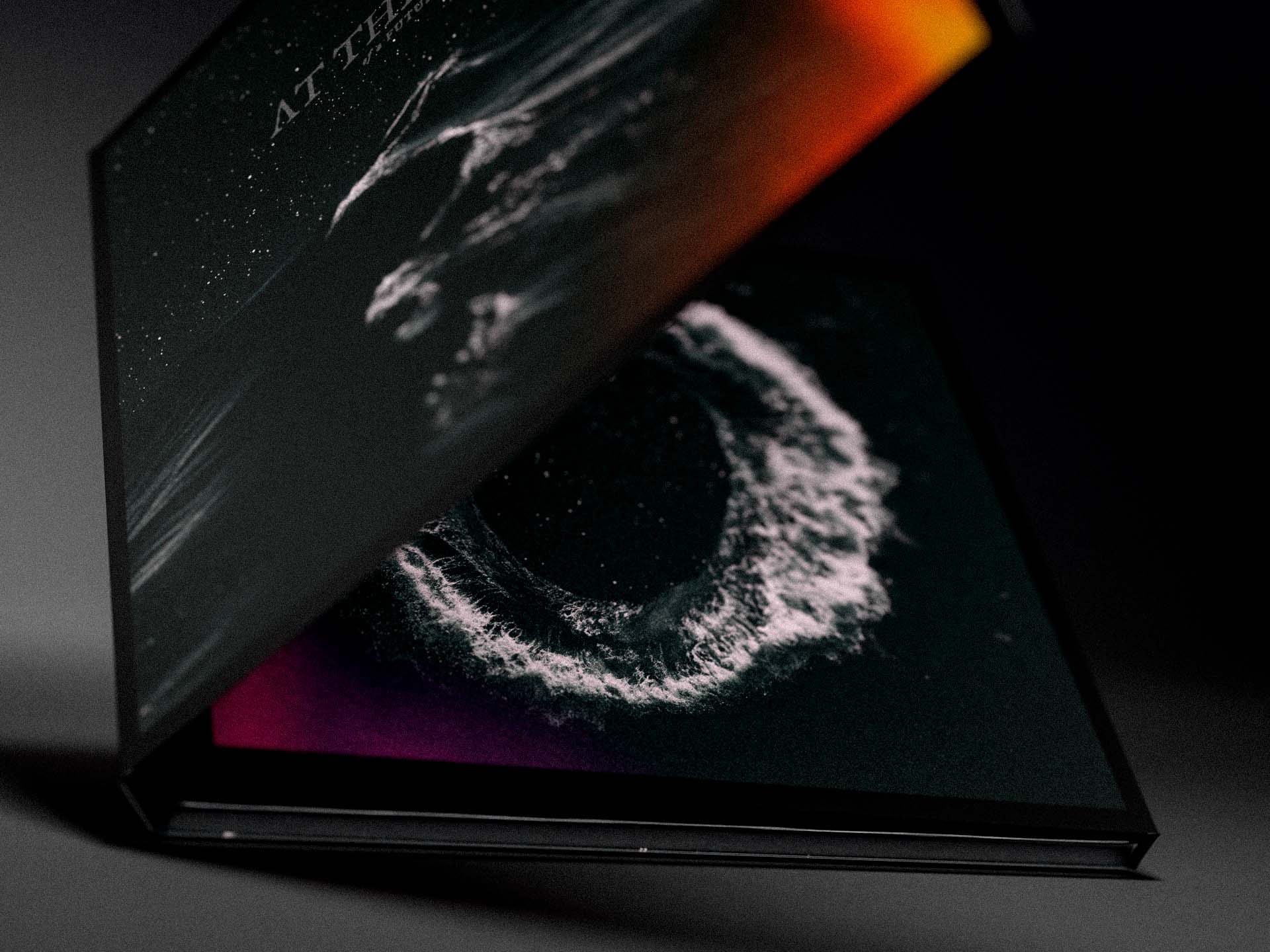
The assignment included full packaging design for four physical editions across LP and CD formats, as well as artwork for the first digital single, The Fever Mask.
Conversations, Fear and the Unfathomable
– Visualising The Ghost Of A Future Dead
My conversations with Tomas Lindberg about the album and its visual concept began in October 2023. He laid out early on that he wasn’t interested in having a “classic death metal album cover”, and having known him for some time I already knew that he was deeply interested in all kinds of music far outside the metal realm. We bonded deeply over our shared taste in music, and from the very beginning I expected the visual direction to move beyond the familiar aesthetics and clichés often associated with metal artwork.
Tomas mentioned a vague idea of ”space”. He kept returning to the image of an astronaut, though he couldn’t fully articulate exactly what it was. “Maybe seeing what the astronaut was seeing in space, looking through the visor. Or something like that.”
The idea of space stayed with me. During one of the meetings we had at my home, I told him about when I used to read bedtime stories to my son when he was younger, and how he always wanted me to read from a children’s fact book about space. My son would fall asleep peacefully, completely at ease, while I lay awake growing increasingly anxious. I kept thinking about infinite space and how we are all insignificant specks of dust in an ever-expanding void – a vast nothingness engulfing everything around it, an energy too vast for man to comprehend. My thoughts began spiraling, and I found myself drawn back to what it was like having fever dreams as a child.
The story made us both burst out laughing. Then his expression changed. He suddenly looked distant, lost in thought.
”— Oh, man.”
And I understood there was something in this story worth pursuing.
That conversation stayed with me long after the meeting had ended, and over the following weeks the ideas slowly began to take shape in my mind. I kept circling back to the idea of fear. Why does space make me so uneasy? Is it the terror of the unknown – that infinite, silent void? Or is it even silent? I can imagine space screaming. Or perhaps a low, constant hum – a roar capable of tearing worlds apart. But if space feels so terrifying to me, why doesn’t everyone else seem unsettled by the thought of it?
And what else carries that same sense of dread? The ocean. The vast, dark, endless ocean – deeply unsettling. Like space, it feels infinite and fiercely unrestrained. Wild and violently unbound. And like space, it’s an energy that both gives life and holds the power to erase it. I came to think of my friend Mieszko (in the band Nasum), who died in the great tsunami of 2004. I thought of death.
After a few weeks of listening to the demo songs the band had sent me, I spent a little over a week developing rough sketches in search of a visual concept that could hold all of these ideas together. I shared the first sketches with Tomas in November 2023.
He immediately connected with the visual approach of the ocean merging with infinite space – the unfathomable. The core aesthetic in the early drafts – the dark, grainy textures and abstract flares of colour – remained intact throughout the entire process.
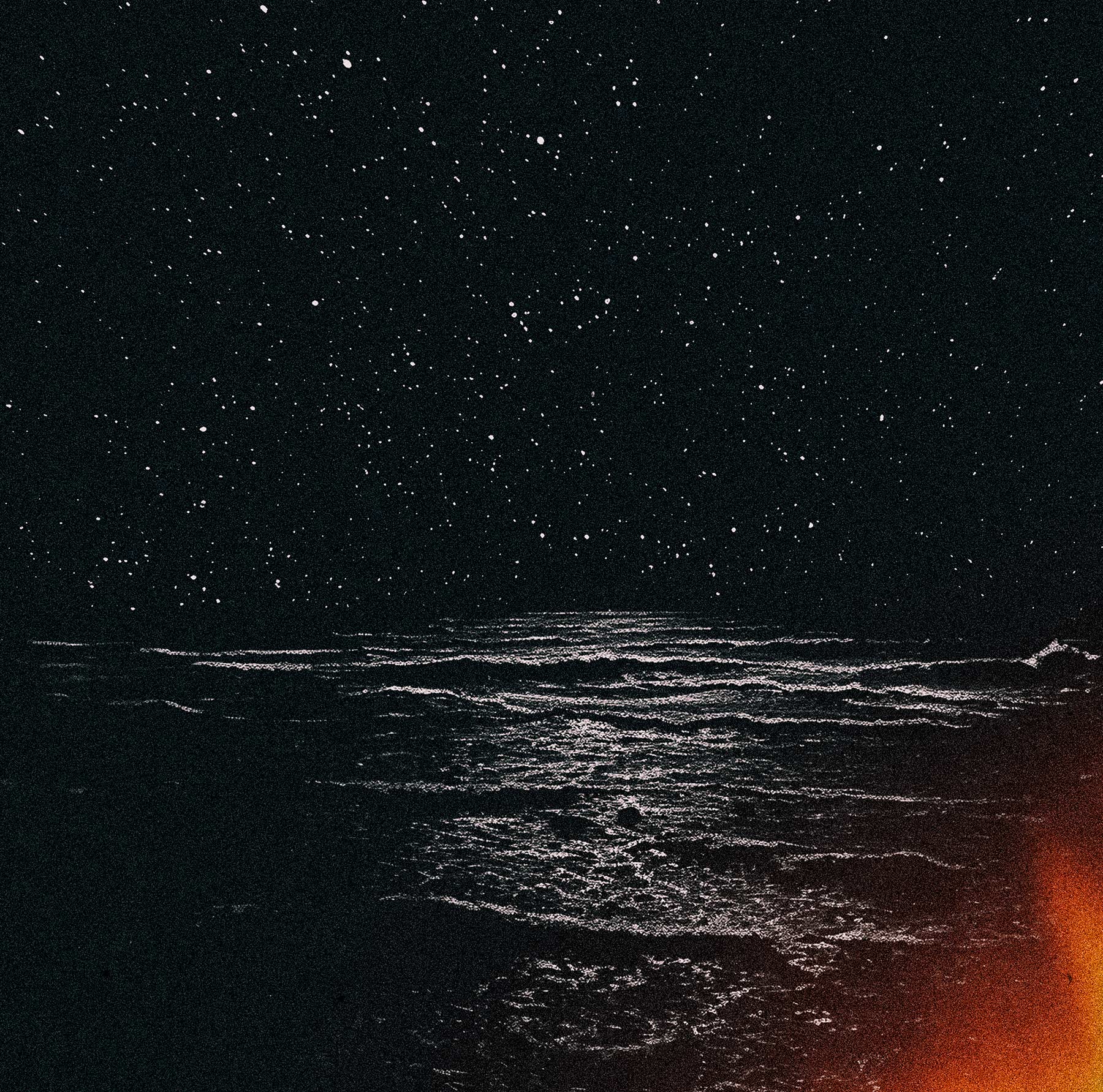
One of the early drafts of the album concept, October 2023.
Tomas and I never really analyzed every song or lyric in detail. Our conversations focused more on the overall themes and emotional landscape of the album. Tomas was very aware of – and quite open about – how dramatic and “over the top” his writing could be. He painted with a broad, exaggerated and often violent brush, yet there was always something deeply poetic beneath it all. In one way or another, the lyrics almost always circled around death, horror and – in a sense – what it means to be human.
Shortly after the initial sketches had been presented, Tomas shared the news of his cancer diagnosis. Naturally, the project slowed down considerably while he underwent treatment and recovery. It also became important for me to check in with him – to make sure the concepts of death and fear still felt right to continue exploring. He said his condition didn’t change anything about the visual direction. If anything, it made it even stronger.
During much of 2024, the work remained largely dormant apart from occasional conversations, new ideas, and moments of inspiration that would slowly shape the direction further.

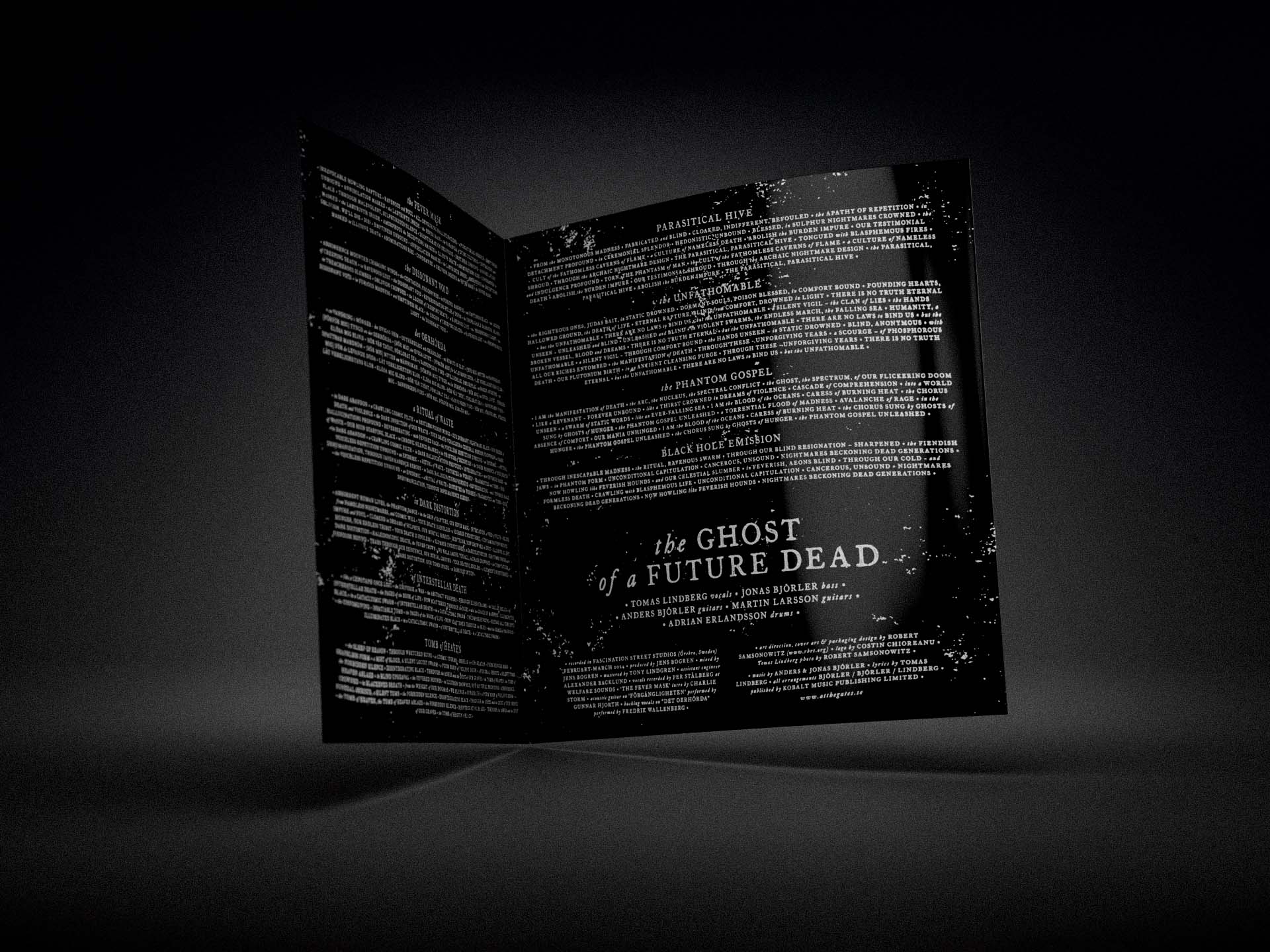
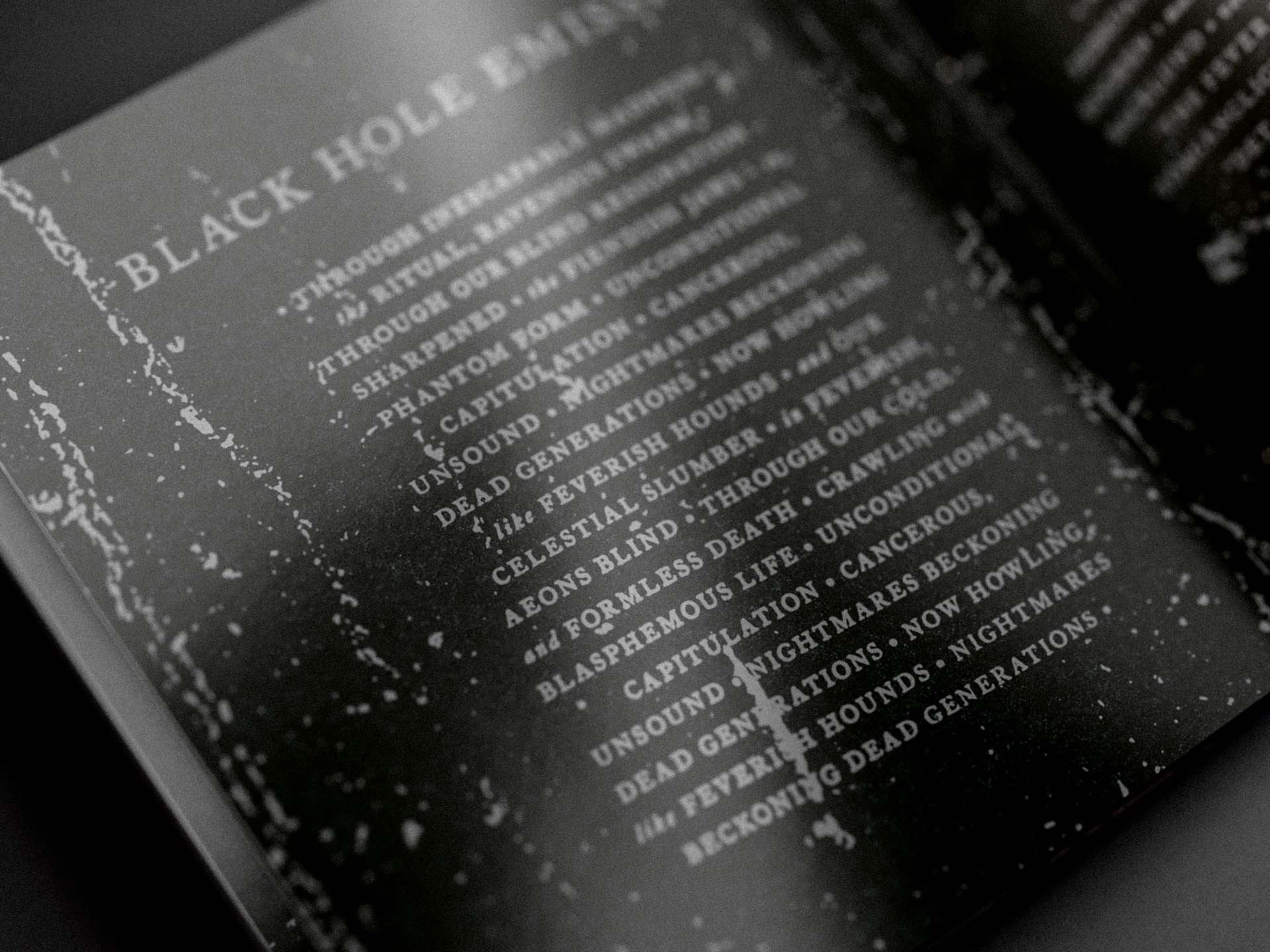
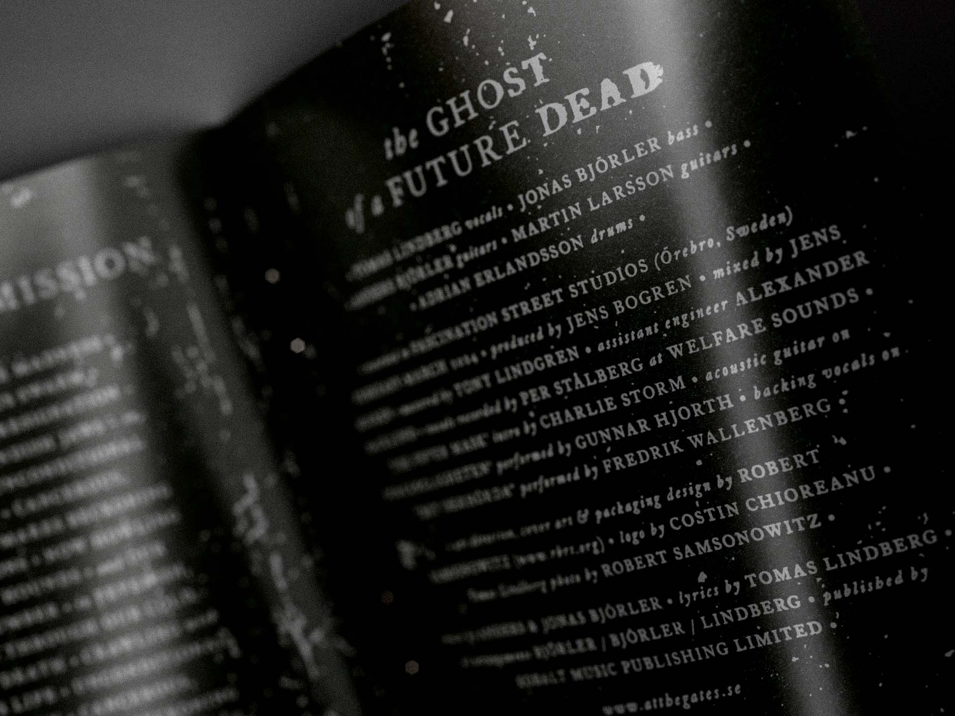
Text treatment example. All text elements throughout the packaging received custom manual treatment in order to integrate more naturally with the overall visual language of the artwork. A meticulous and time-consuming process, but an important part of the final result.
The design process was reignited early in 2025. After such a long hiatus in the project, I revisited the initial drafts and saw room for improvement. Although these initial sketches ultimately served as a proof of concept and established the visual direction moving forward, I still felt that something was missing from the front cover composition. The atmosphere and conceptual foundation were there, but I lacked a stronger sense of movement and emotional tension within the imagery.
I found myself returning to the visual language of albums such as Unknown Pleasures by Joy Division and Nowhere by Ride – artworks that, in very different ways, carried a sense of motion, abstraction and immersive atmosphere that resonated with what I was searching for. I allowed myself to be inspired by that emotional and compositional energy, and from there the artwork gradually evolved into something more dynamic while still preserving the original mood and visual language that Tomas and I had connected with early on.
Tomas followed the design process with great interest throughout the project. He cared intensely about how the music and his lyrics translated visually, and our conversations around the concept meant a great deal to me. I continued developing and refining the overall artwork direction, and by April 2025 the front and back cover concepts had been approved – something he was genuinely excited about.
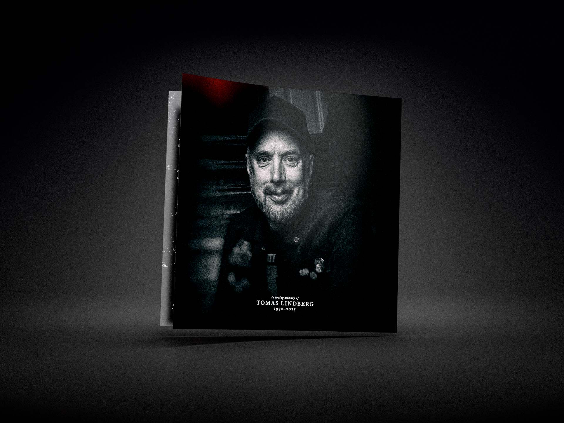
After Tomas sadly passed away in September 2025, we never had the chance to fully complete the final pieces of the artwork together. I deeply missed his input, his enthusiasm and the conversations we shared throughout the process. Carrying our shared vision forward after Tomas had left us was emotionally very difficult, and the responsibility of carrying that vision forward gave the remaining work on the project a very different emotional weight. In many ways, the final stages of the process became a tribute to Tomas and everything he brought to the project creatively and personally.
I remain deeply grateful for what we created together. I hope this work will continue to live on as a small part of Tomas’s creative legacy.
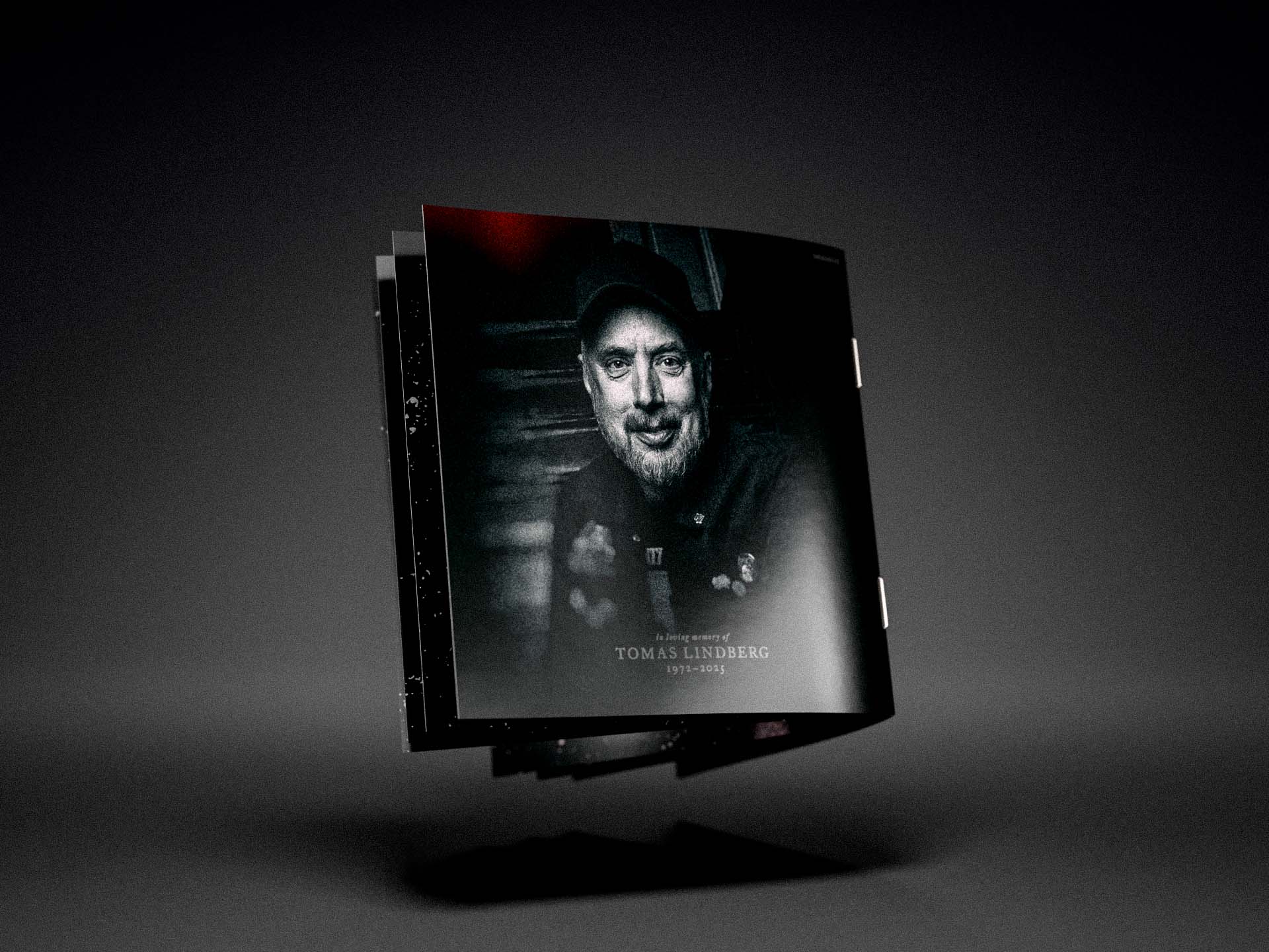
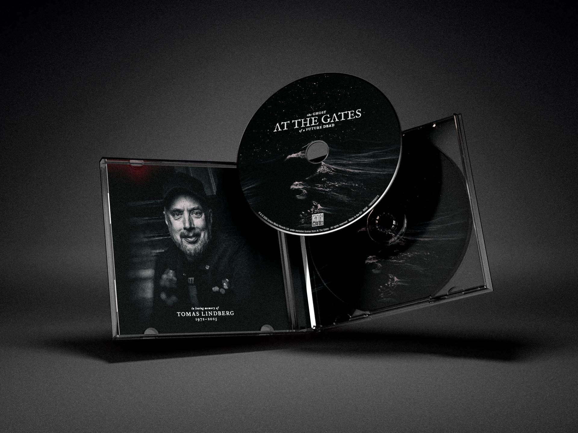
Tomas Lindberg 1972–2025.
I miss you, my friend.
The Vinyl LP Packaging
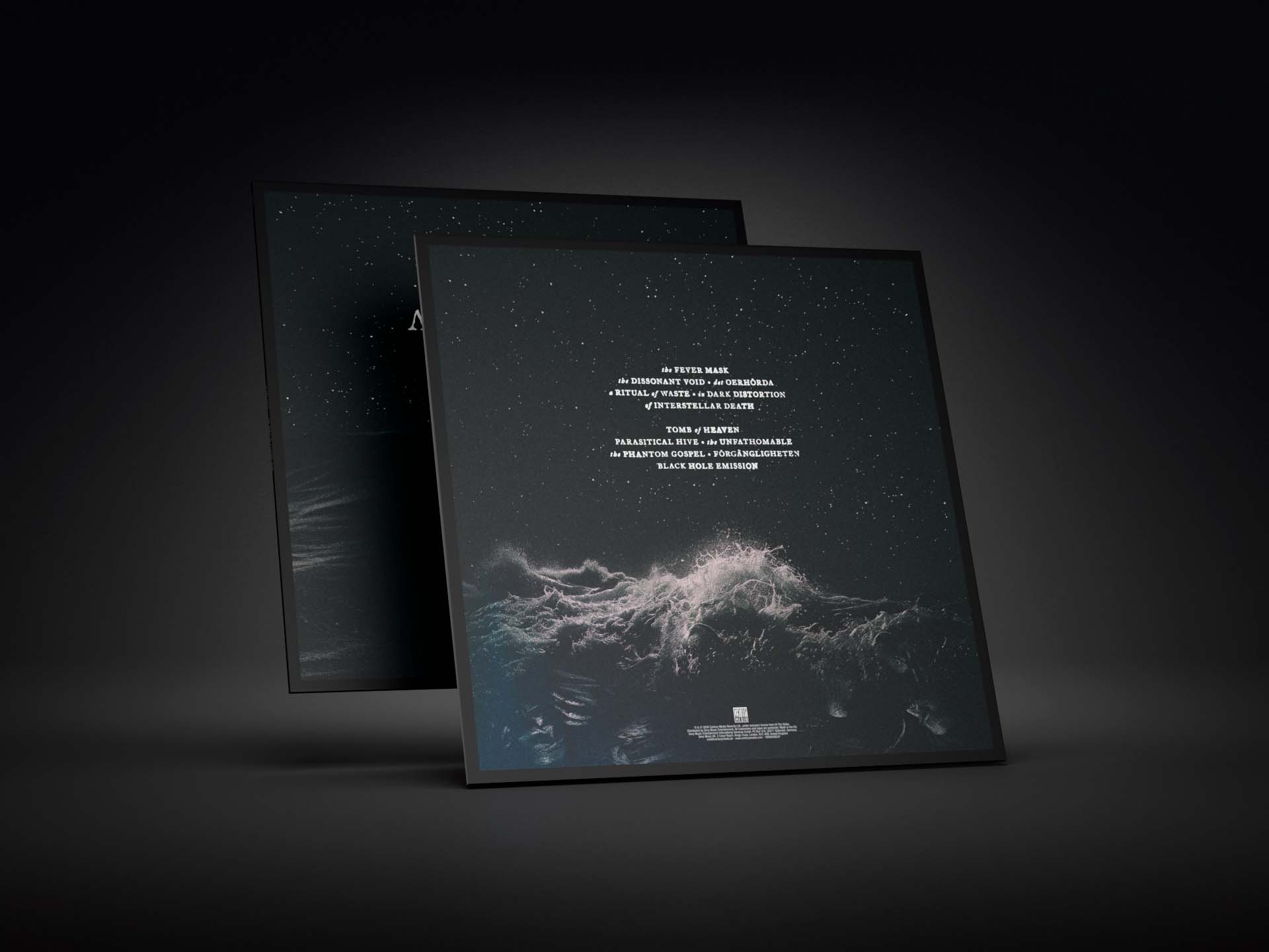
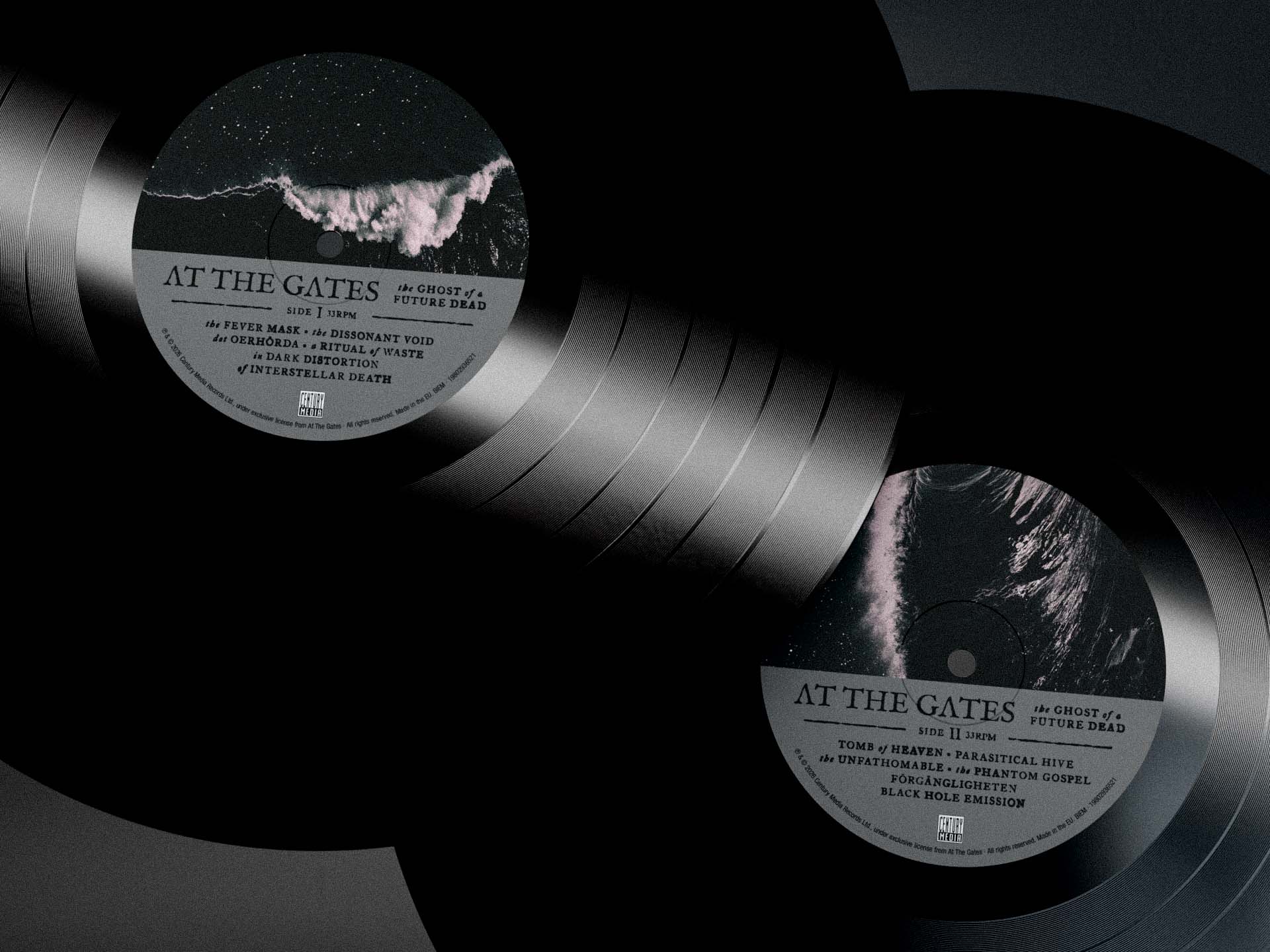
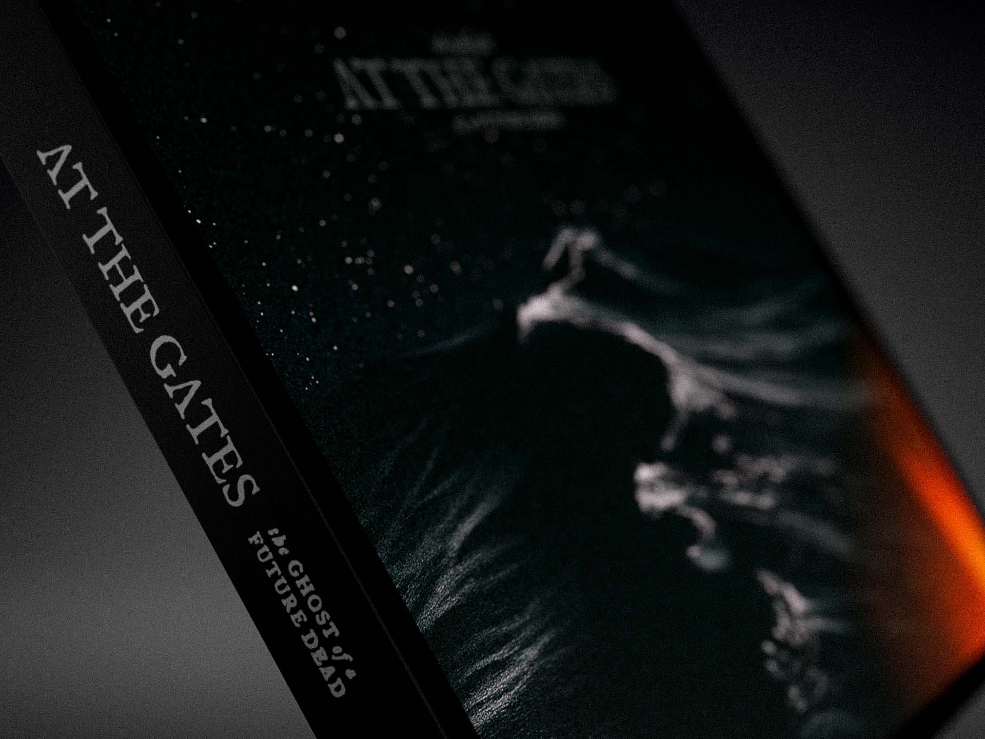
The vinyl LP edition is housed in a standard outer sleeve and includes a four-page LP-sized booklet insert. The vinyl labels are printed in standard CMYK.
Two vinyl LP versions of the album are available: a standard edition and a deluxe edition.
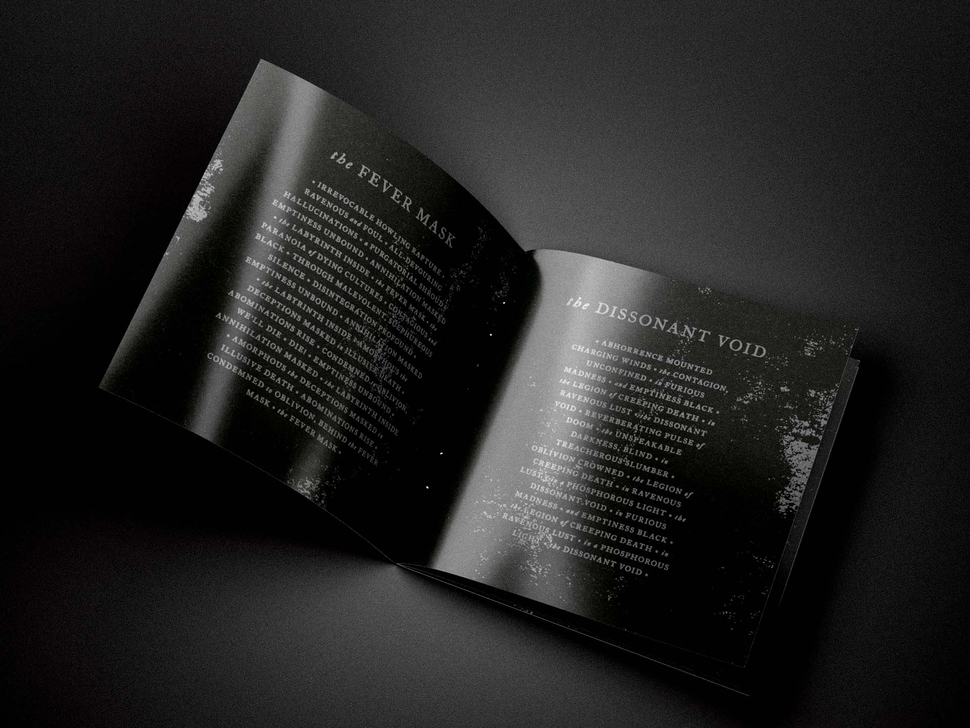
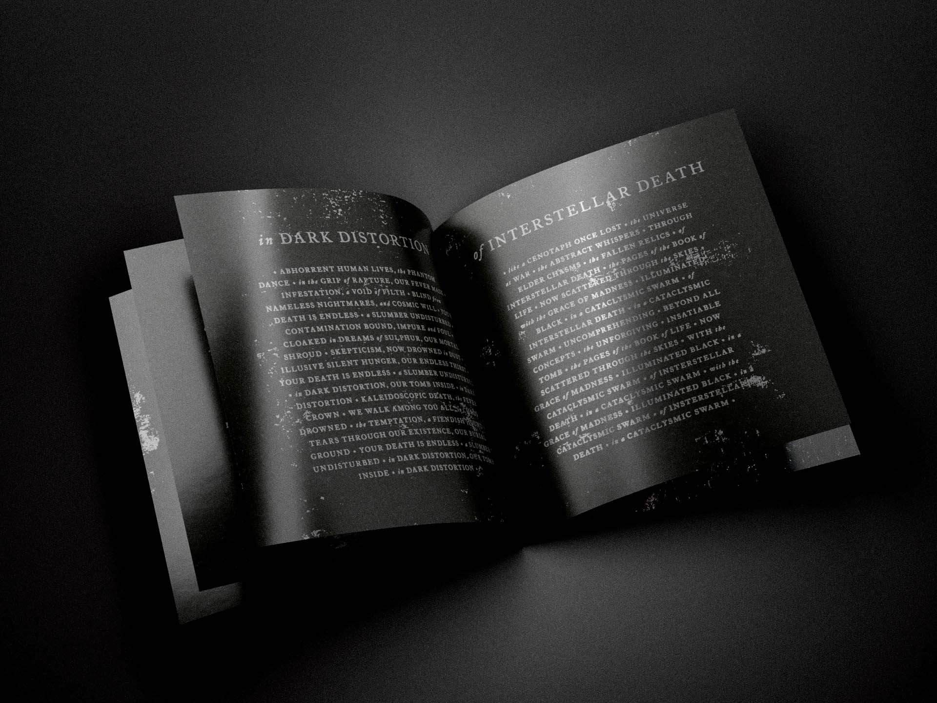
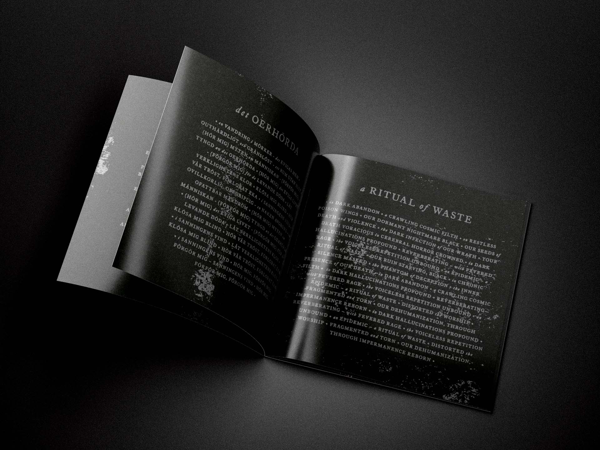
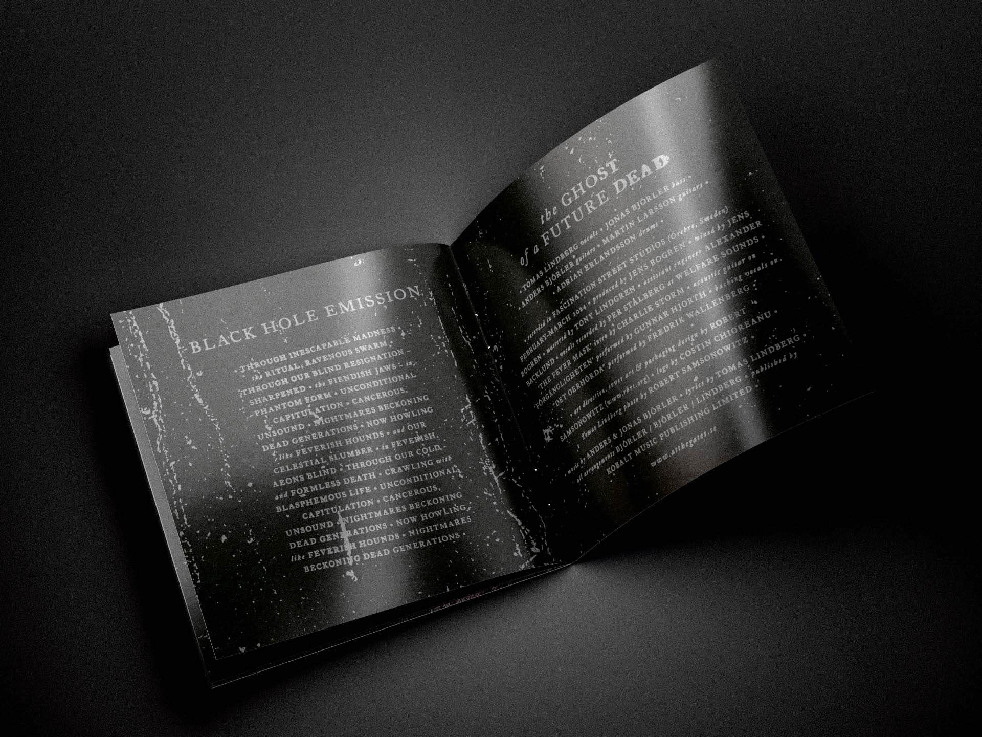
The standard edition features a full CMYK print throughout, with the band logo, song titles, lyrics, and text elements reproduced in the natural white of the paper stock.
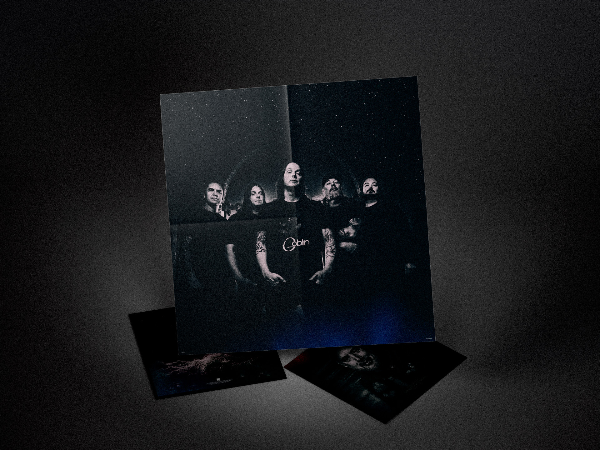
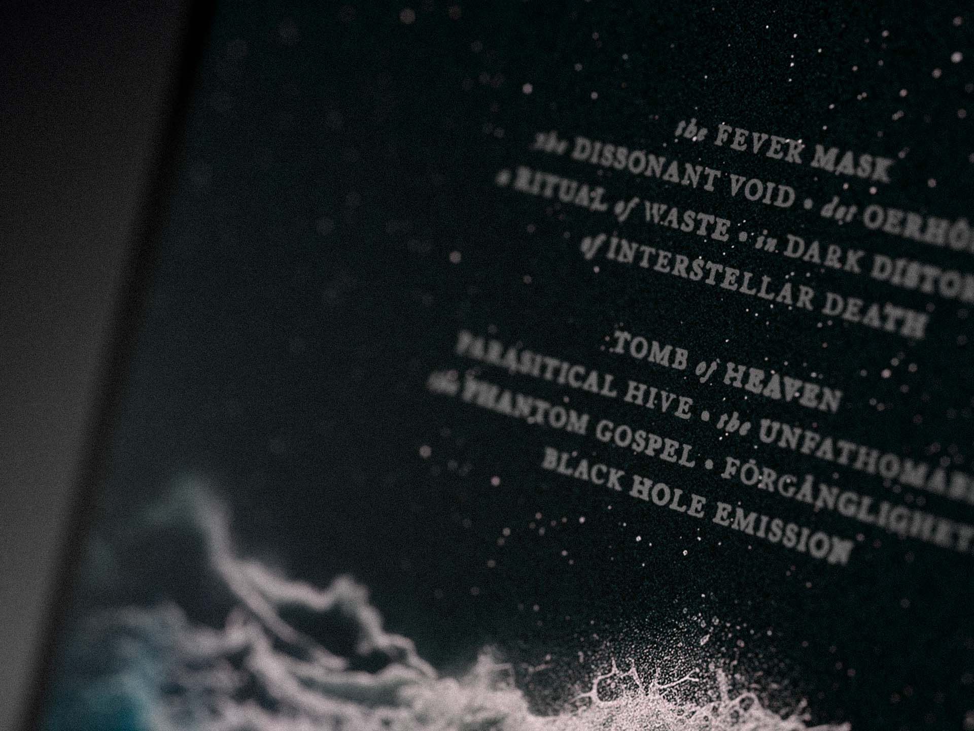
The deluxe edition upgrades all logo, title, lyric, and text elements to Pantone metallic silver print. It also features a black flood print on the inside of the outer sleeve and includes a double-sided 610 × 610 mm poster, featuring the album artwork on one side and a band photograph on the reverse.

The CD Packaging
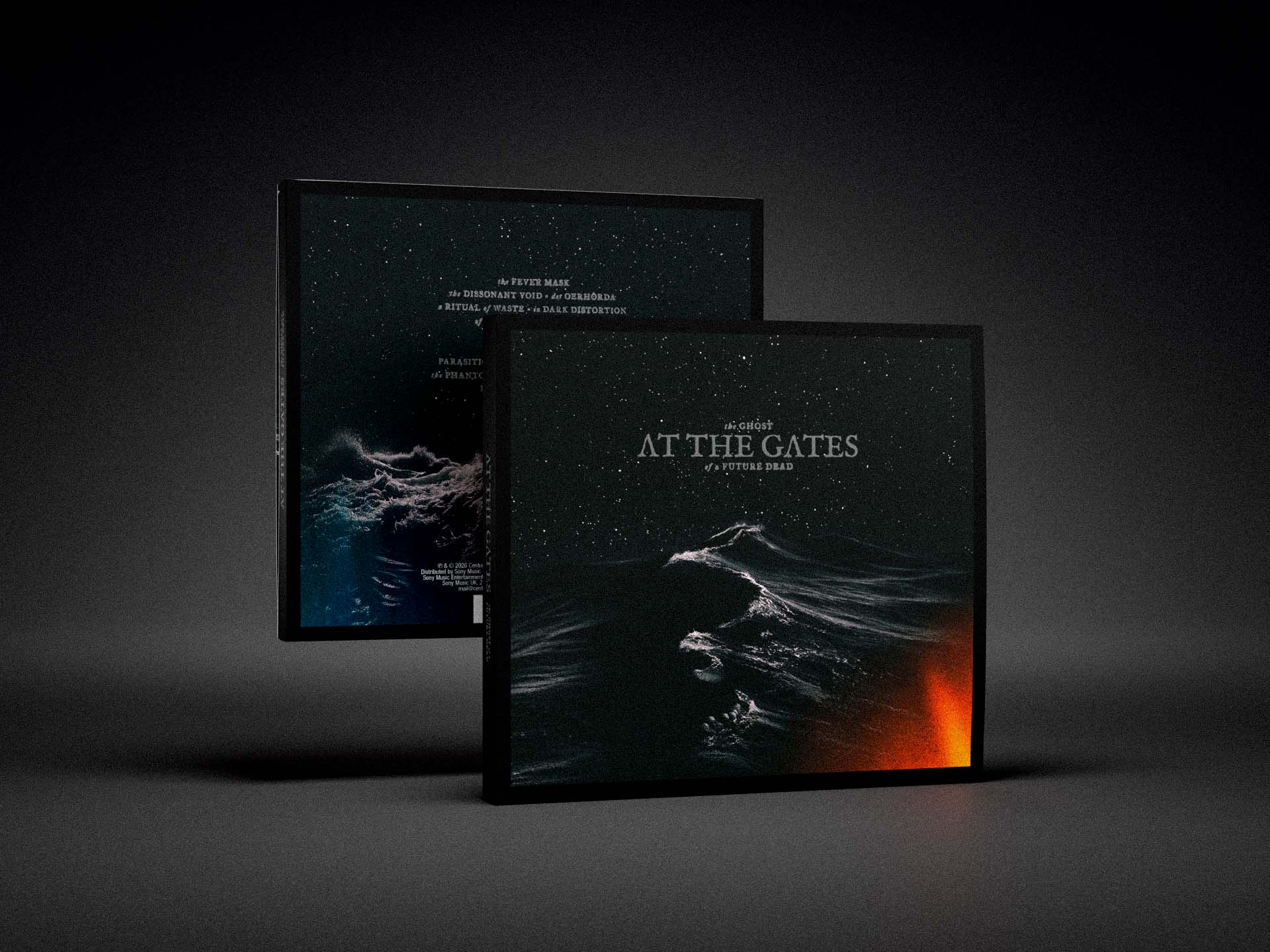
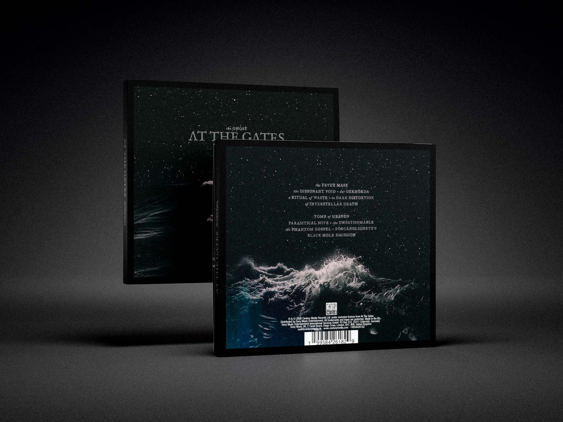
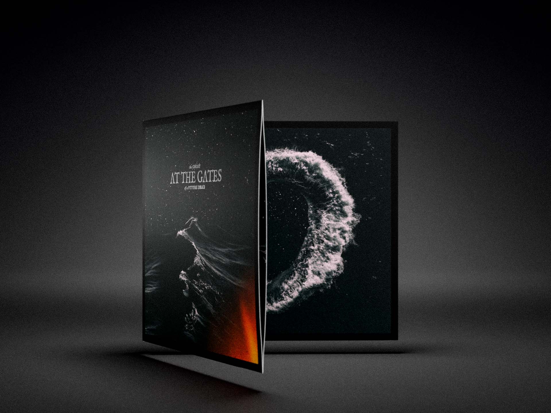
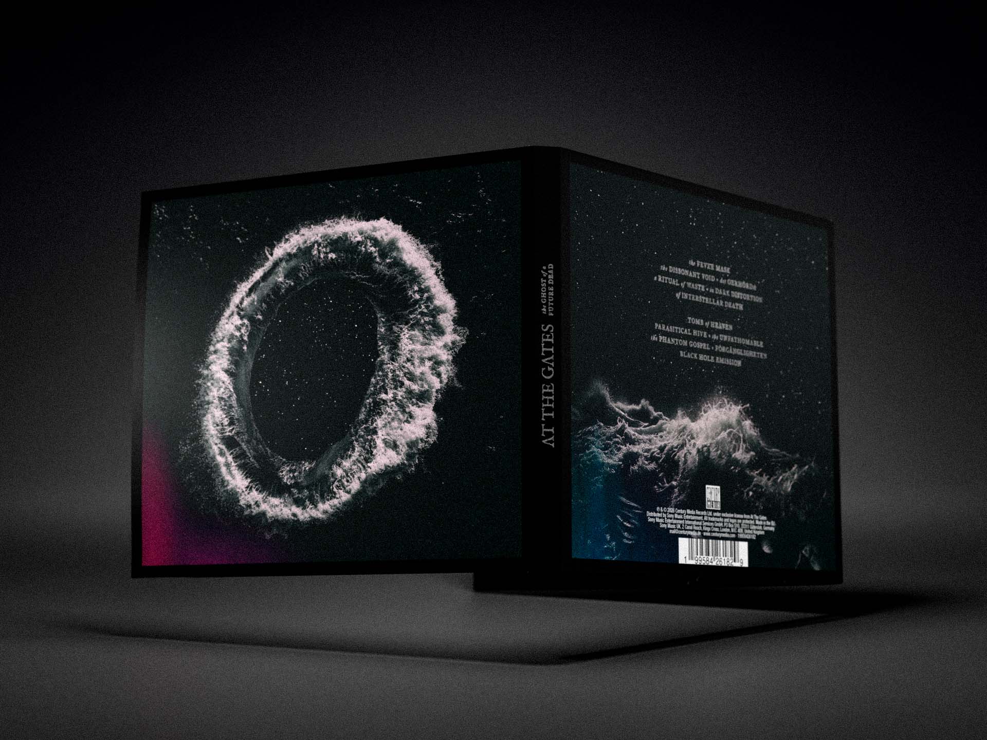
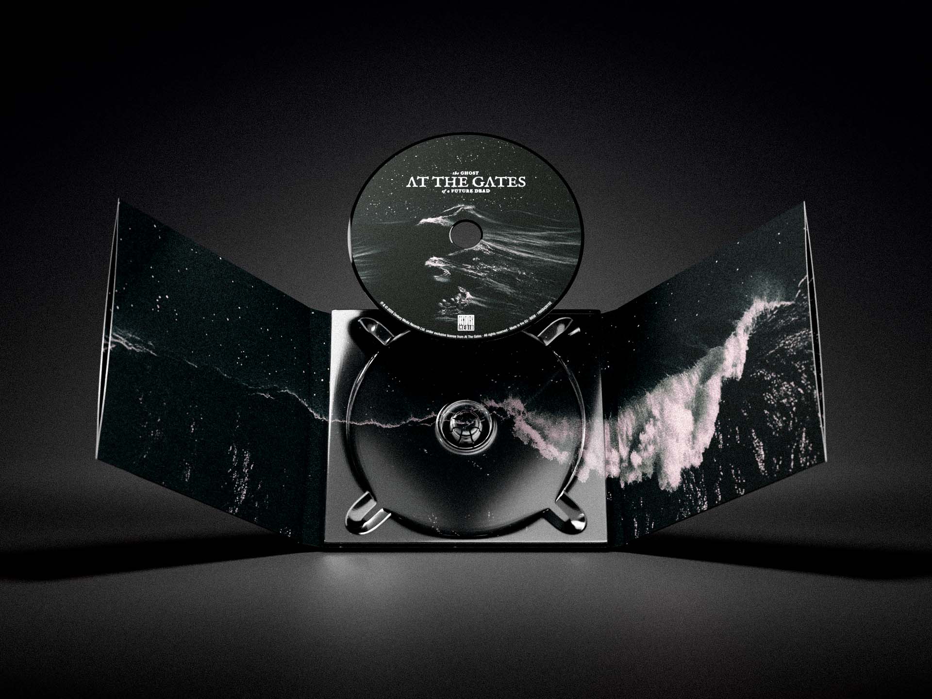
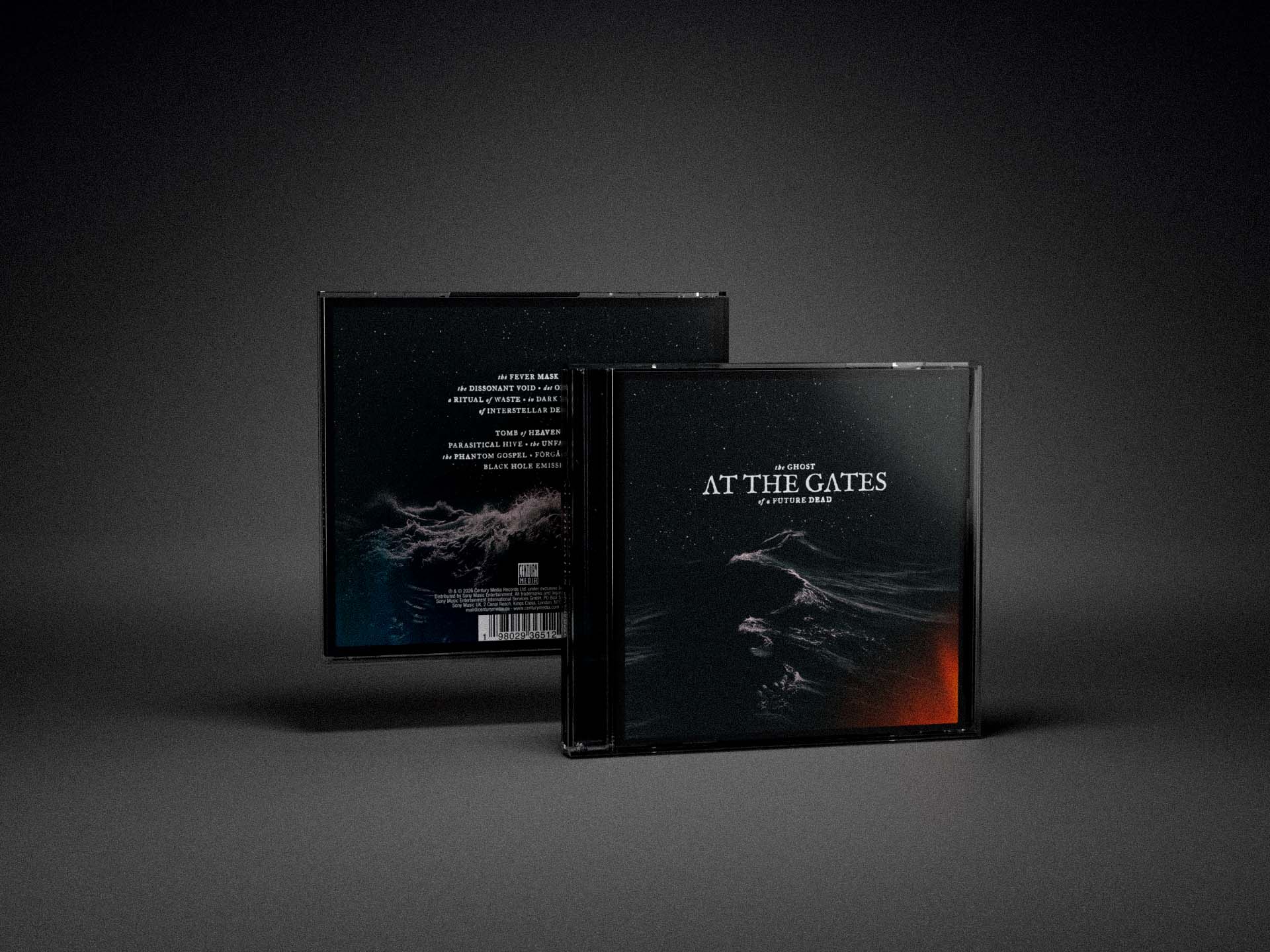
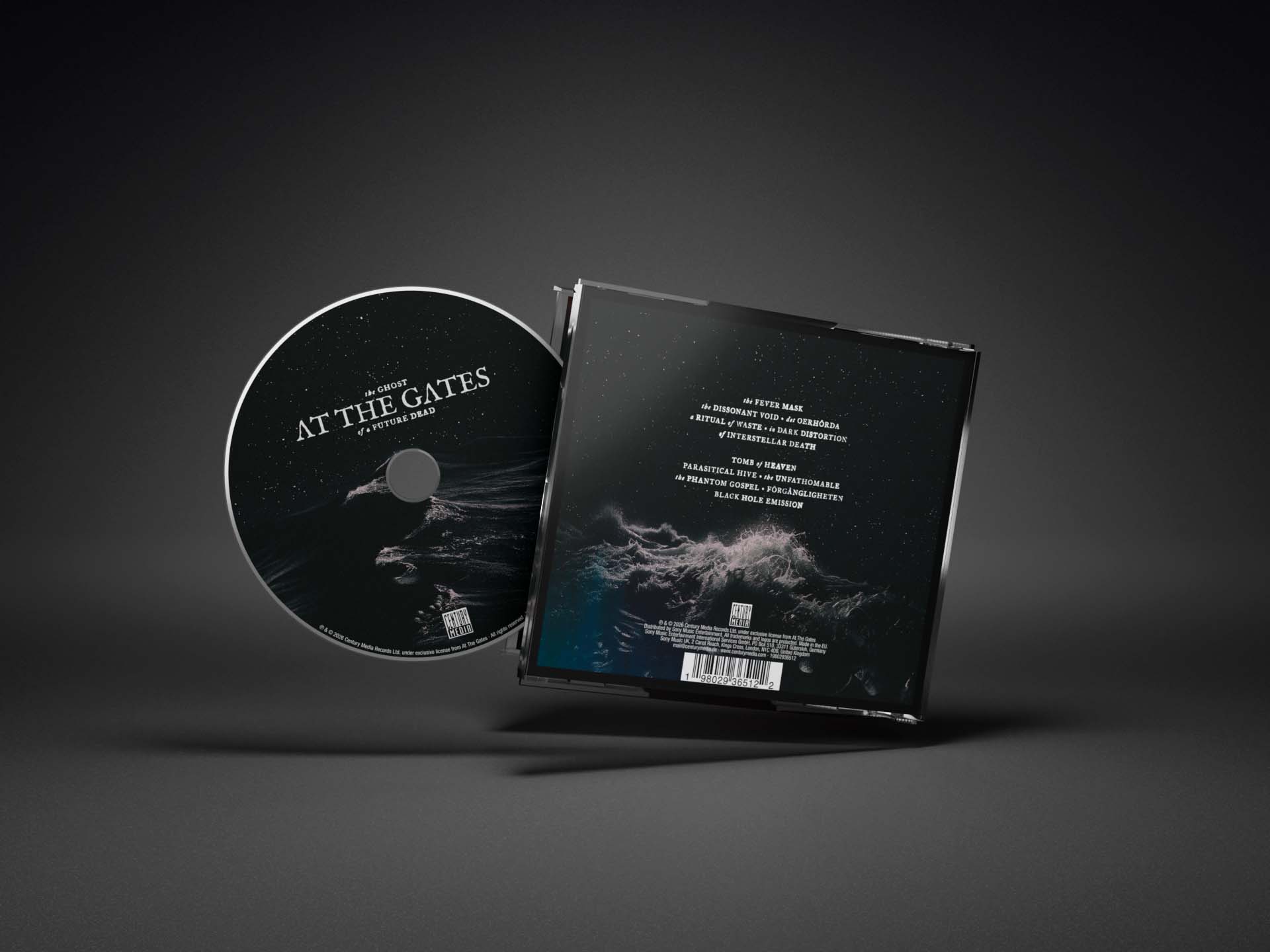
Two different CD editions are available: a standard edition and a deluxe edition.
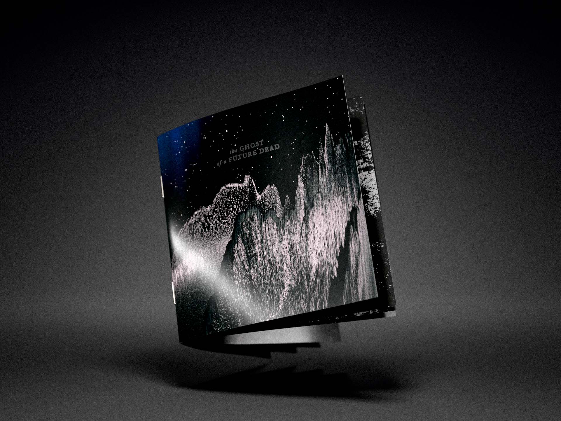
The standard edition is housed in a traditional jewel case and includes a 16-page booklet. All print elements are reproduced in standard CMYK.
The deluxe edition is housed in a six-panel Digipak and also includes a 16-page booklet. Like the deluxe LP edition, it comes with a double-sided 360 × 360 mm poster featuring the album artwork on one side and a band photograph on the reverse.
In the deluxe edition, all logo, title, lyric, and text elements are printed in Pantone metallic silver instead of standard white. The European pressing of the deluxe edition also features a black CD disc.
Digital Artwork and Merch
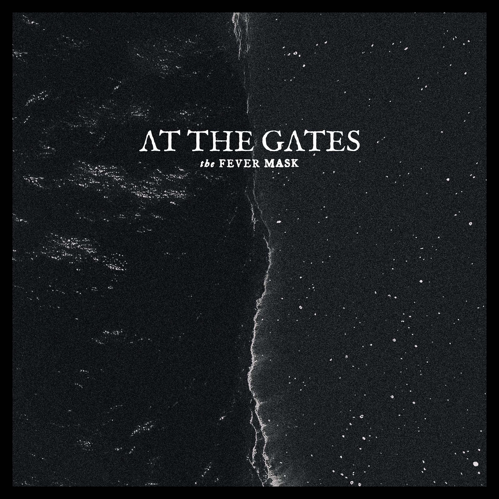
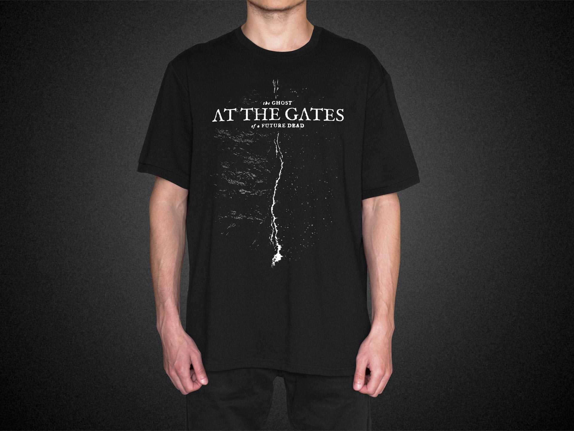
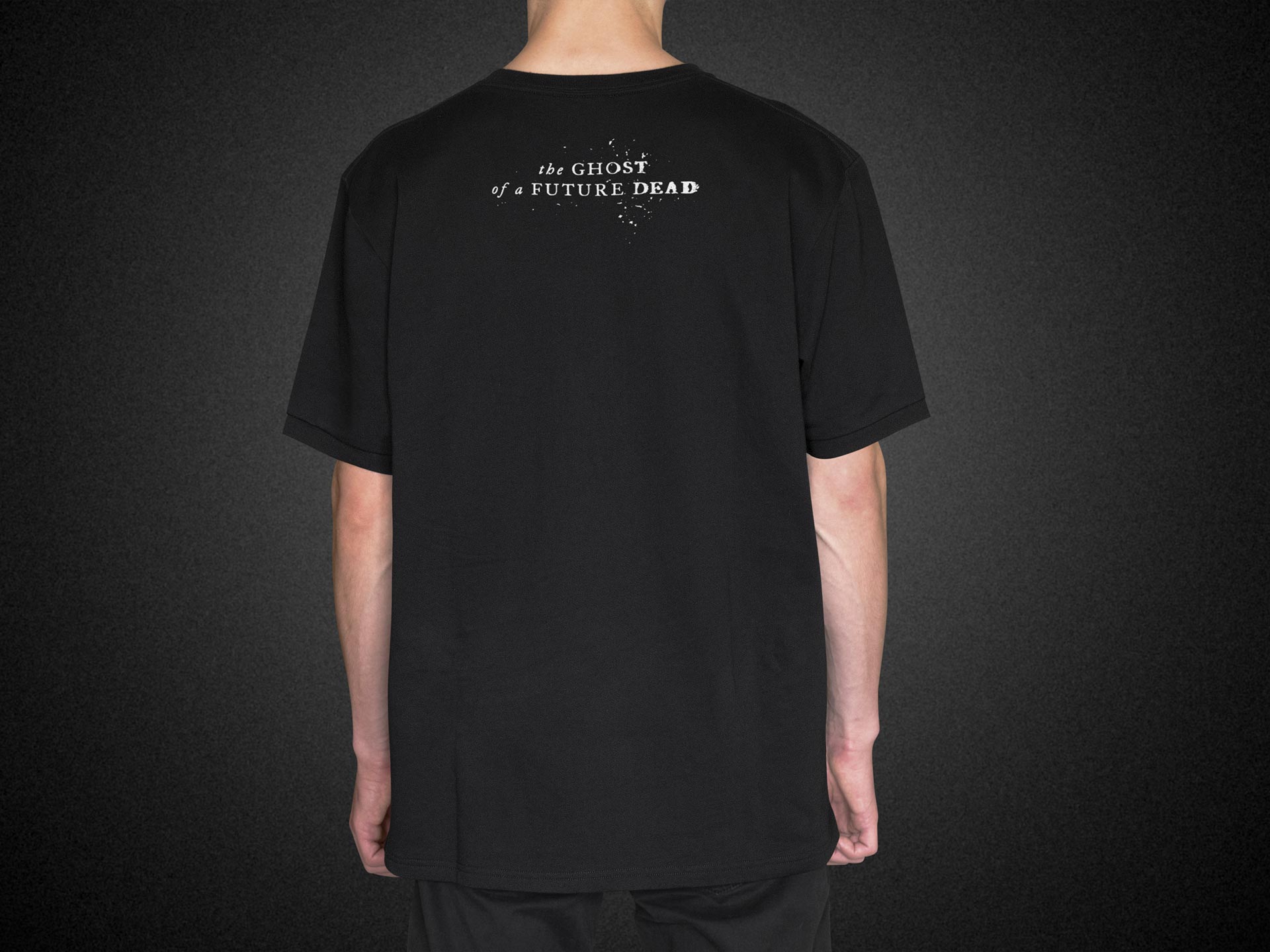
In addition to the LP packaging, I also designed the cover artwork for The Fever Mask, released as a digital single ahead of the album. The intention was to present the artwork as an early glimpse of the album’s overall visual concept, while maintaining a cohesive identity throughout the release campaign. The artwork was also adapted for T-shirts sold through the band’s web shop.
If you liked this album packaging project,
here are a few more projects you might like.

José González – Against The Dying Of The Light Album Packaging Design
José González – Against The Dying Of The Light Album Packaging Design
Art Direction & Graphic Design

Lödöse Musteri – Äppelfära Label Design
Lödöse Musteri – Äppelfära Label Design
Art direction, illustration & graphic design

José González 2025 Visual Identity
José González 2025 Visual Identity
Art Direction & Graphic Design

Signal & Wave Logo And Visual Identity
Signal & Wave Logo And Visual Identity
Art Direction & Graphic Design

Kim – Äntligen LP Packaging Design
Kim – Äntligen LP Packaging Design
LP Packaging Design

Mono Total Typeface Identity
Mono Total Typeface Identity
Type Design, Identity & Usage Examples

Laurelina Langhe Nebbiolo Wine Label Design
Laurelina Langhe Nebbiolo Wine Label Design
Art Direction & Graphic Design
Laurelina Identity and Wine Label Concept
Laurelina Identity and Wine Label Concept
Visual identity

Burst – A Labyrinth Of Layers Box Set Packaging Design
Burst – A Labyrinth Of Layers Box Set Packaging Design
Art Direction, Graphic Design & Illustration
Division Of Laura Lee – At The Royal Club LP packaging design
Division Of Laura Lee – At The Royal Club LP packaging design
LP Packaging Design

Colosso Typeface Identity and Marketing
Colosso Typeface Identity and Marketing
Type Design, Identity & Usage Examples
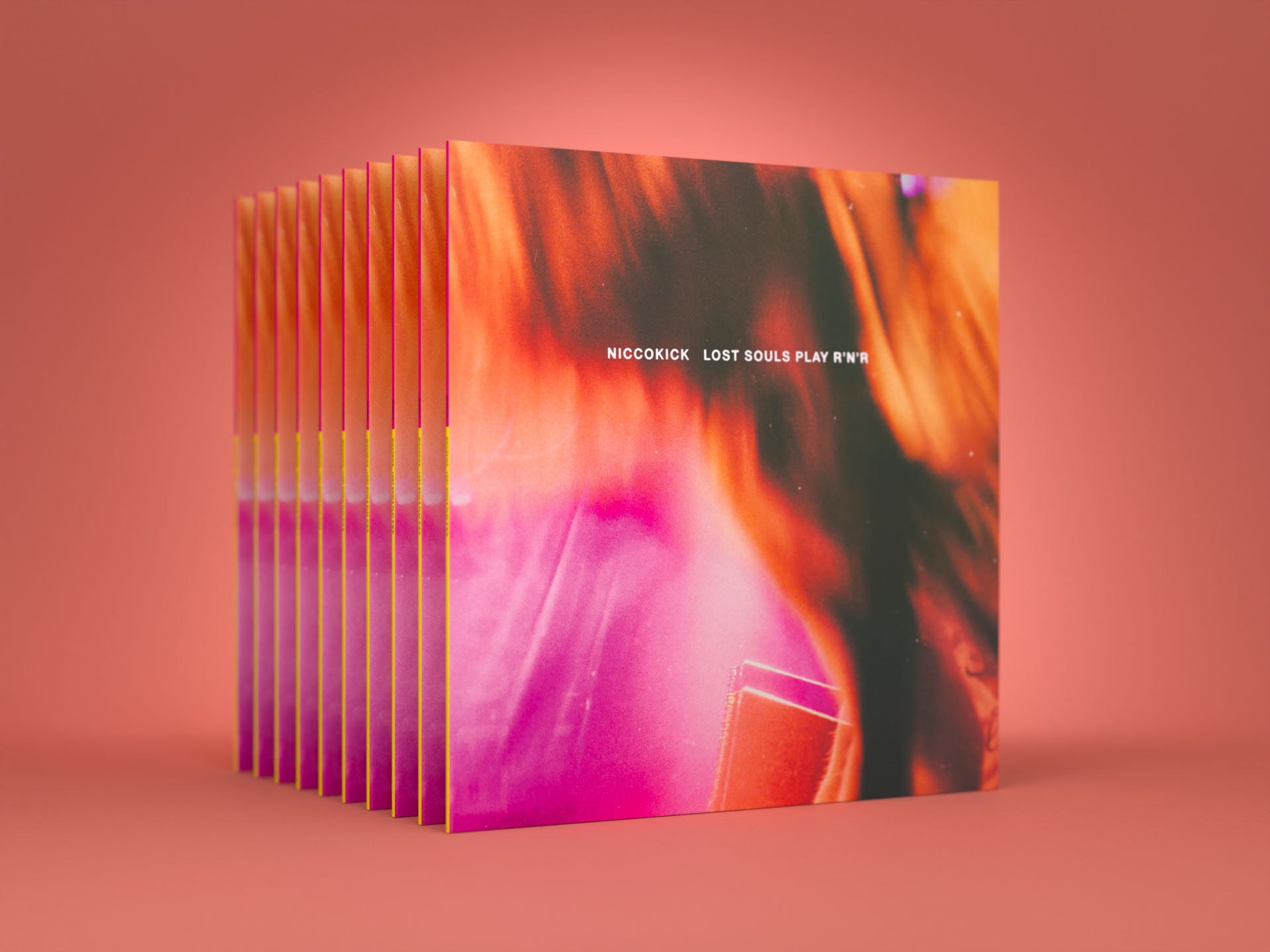
Niccokick – Lost Souls Play R’n’R Album Packaging Design
Niccokick – Lost Souls Play R’n’R Album Packaging Design
LP Packaging Design
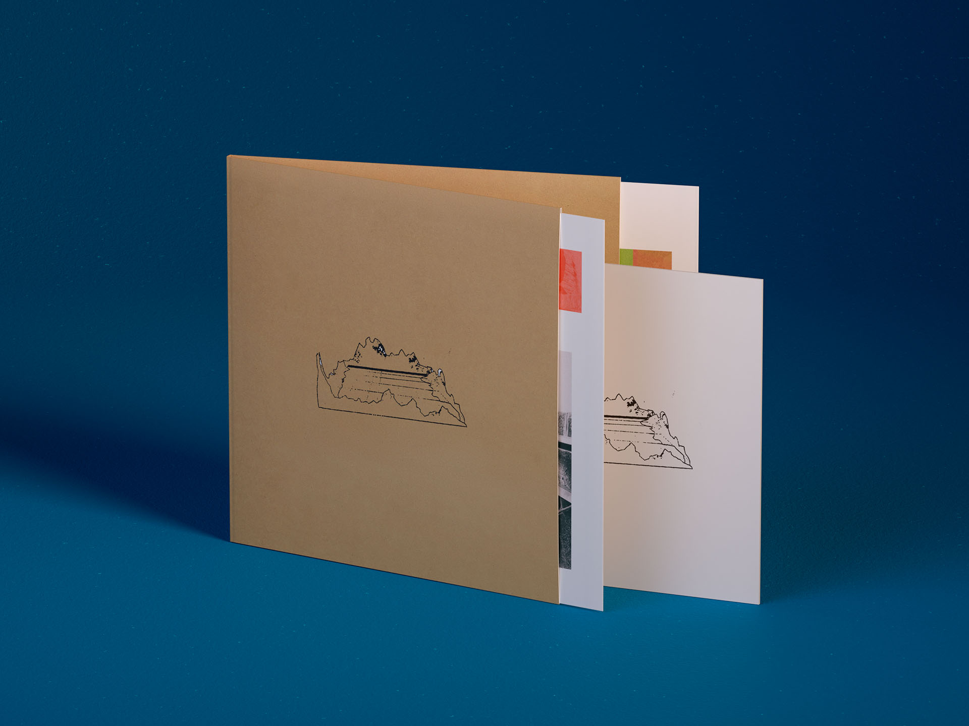
José González – Veneer 20th Anniversary Deluxe Edition Album Packaging Design
José González – Veneer 20th Anniversary Deluxe Edition Album Packaging Design
Album packaging design
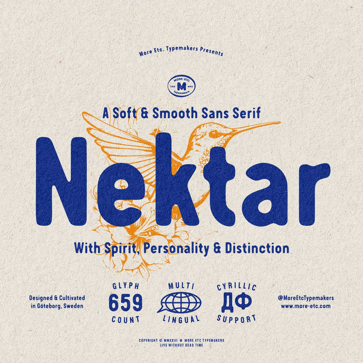
Nektar Typeface Identity
Nektar Typeface Identity
Type Design
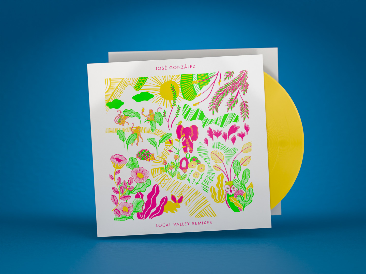
José González – Local Valley Remixes Album Packaging Design
José González – Local Valley Remixes Album Packaging Design
Album packaging design

Lödöse Musteri – Apple Syrup Packaging Design
Lödöse Musteri – Apple Syrup Packaging Design
Packaging Design
Hoax Typeface
Hoax Typeface
Type Design
Division Of Laura Lee – Last Light EP
Division Of Laura Lee – Last Light EP
Vinyl EP packaging design
Bedroom Eyes – Sisyphus Rock
Bedroom Eyes – Sisyphus Rock
Album packaging design
Inceptive Logo Design & Rebranding
Inceptive Logo Design & Rebranding
Identity
José González – Local Valley
José González – Local Valley
Album packaging design
Sounds Like Branding Book Cover
Sounds Like Branding Book Cover
Art Direction & Graphic Design
More Etc. Typemakers – Visual Identity
More Etc. Typemakers – Visual Identity
Visual identity
Division Of Laura Lee – Black City
Division Of Laura Lee – Black City
Album packaging design
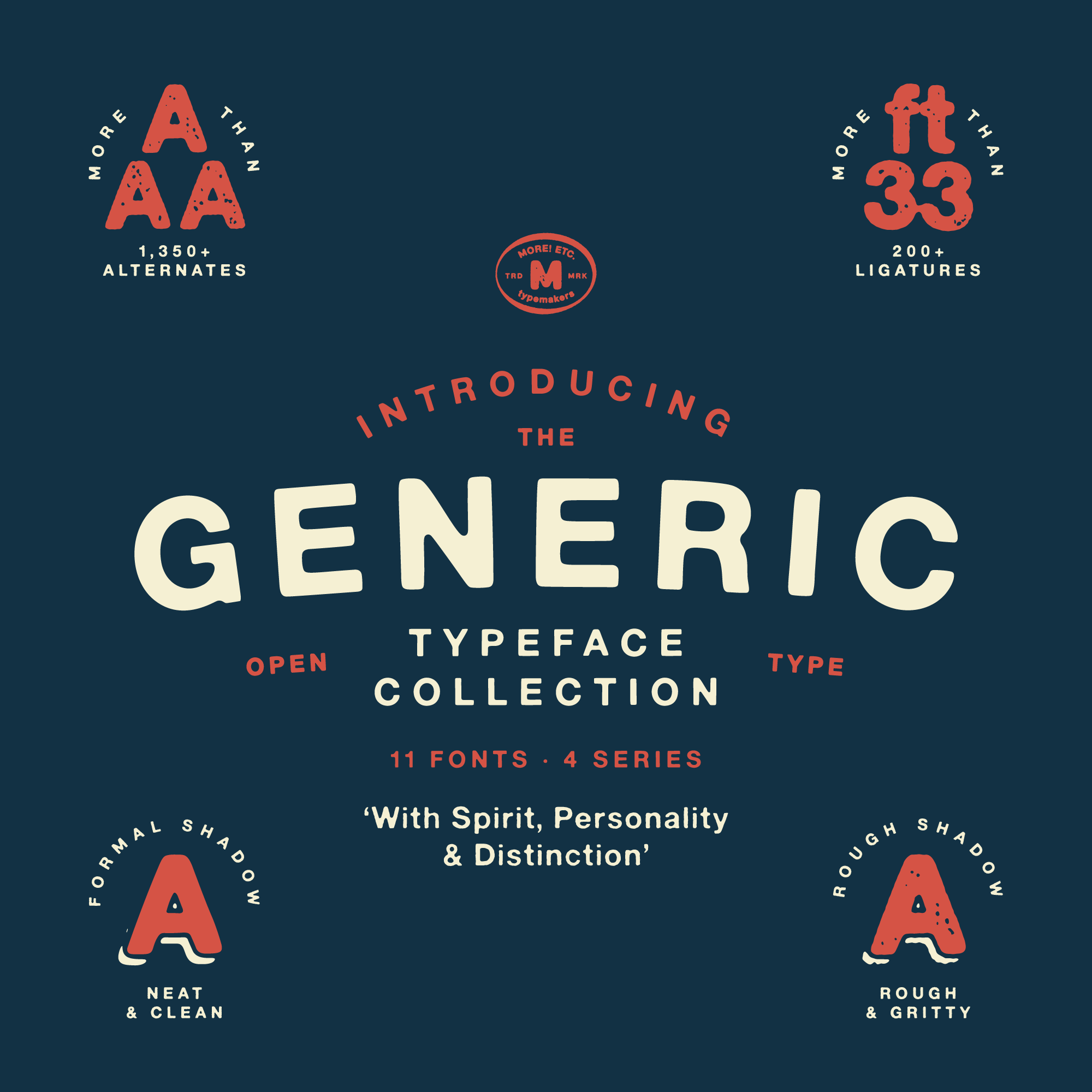
Generic Typeface Collection – Type Design & Font Making
Generic Typeface Collection – Type Design & Font Making
Type Design

The Los Angeles Suite
The Los Angeles Suite
Album packaging design
Lödöse Musteri
Lödöse Musteri
Identity

Kristofer Åström – The Story of a Heart’s Decay
Kristofer Åström – The Story of a Heart’s Decay
Album packaging design
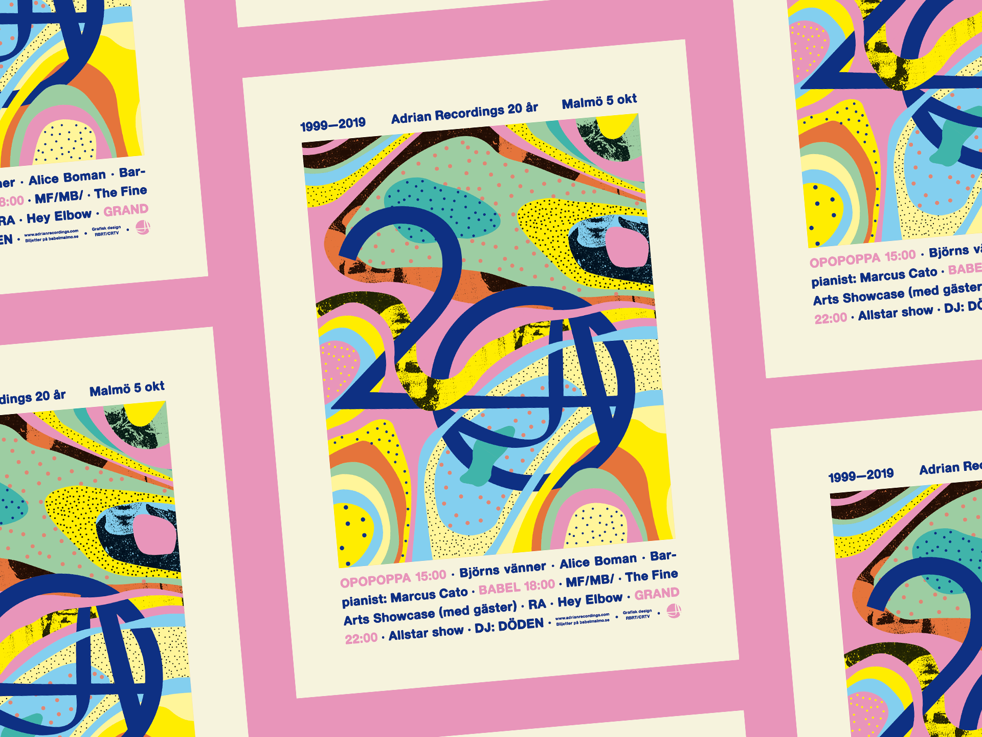
Adrian Recordings 20th Anniversary Poster Design and Event Visuals
Adrian Recordings 20th Anniversary Poster Design and Event Visuals
Poster design & event visuals
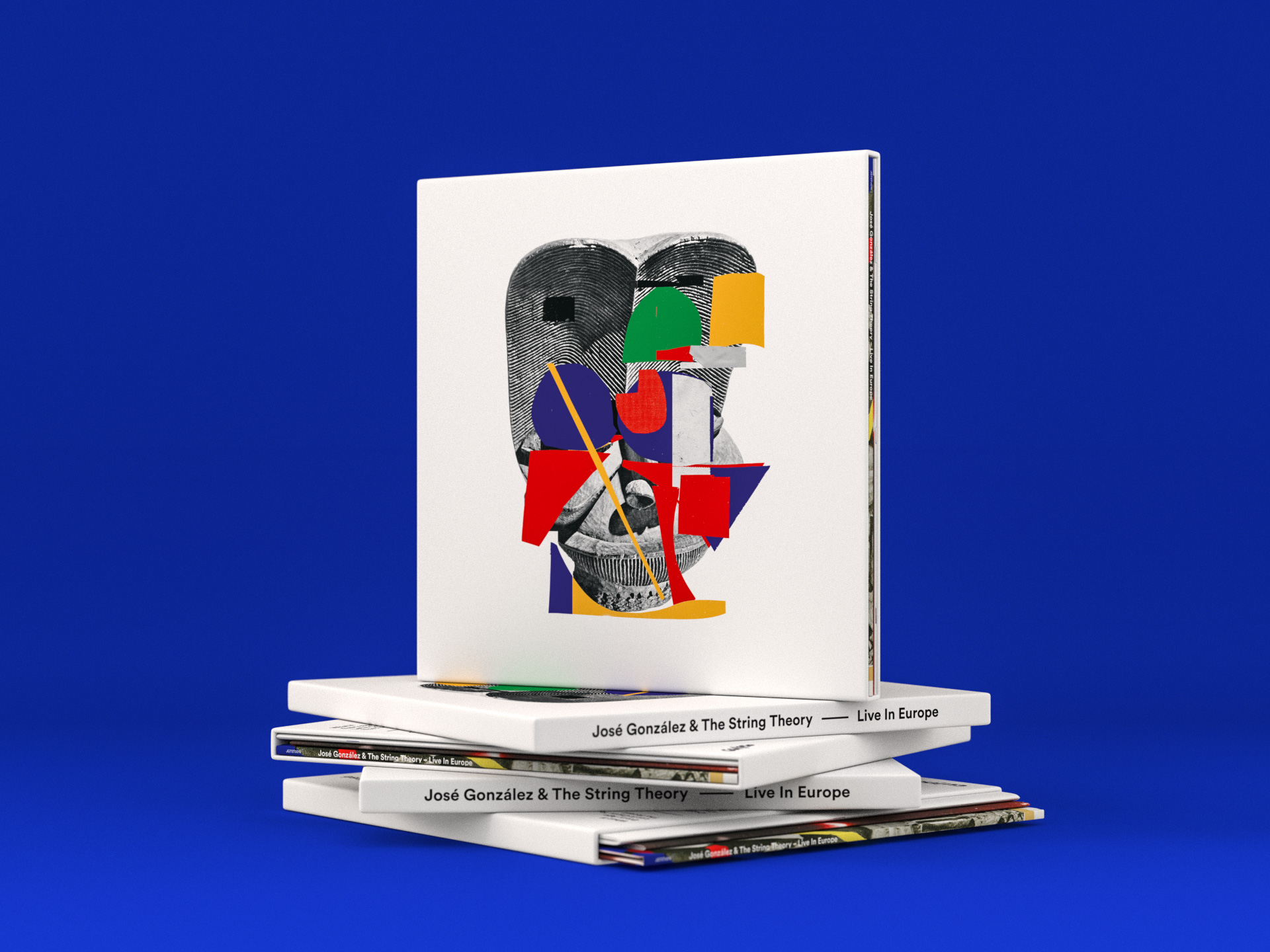
José González & The String Theory – Live In Europe
José González & The String Theory – Live In Europe
Album & Box packaging design
Startracks 25th anniversary
Startracks 25th anniversary
Identity
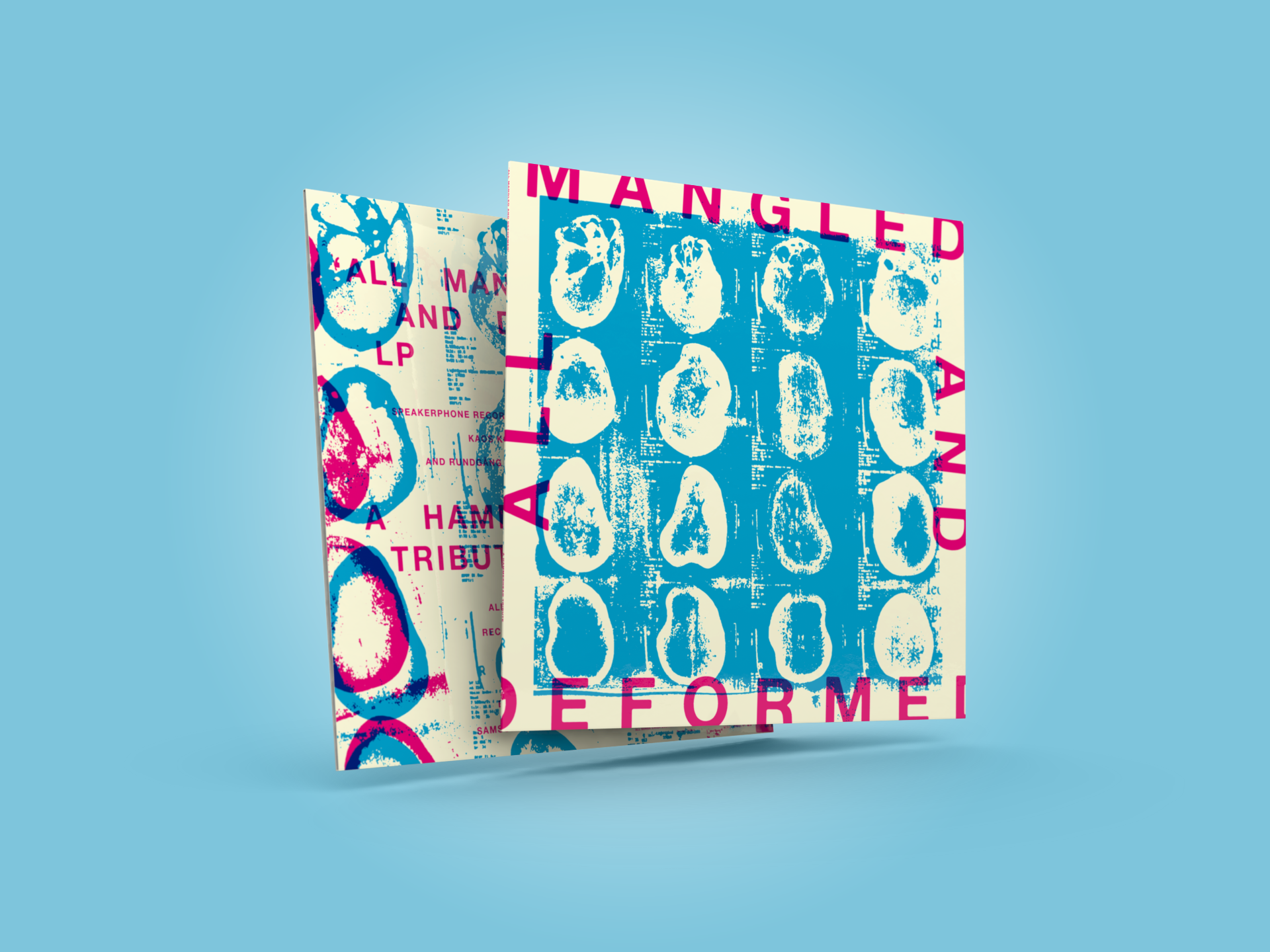
All Mangled And Deformed
All Mangled And Deformed
Album packaging design
Metaltown
Metaltown
Festival identity design
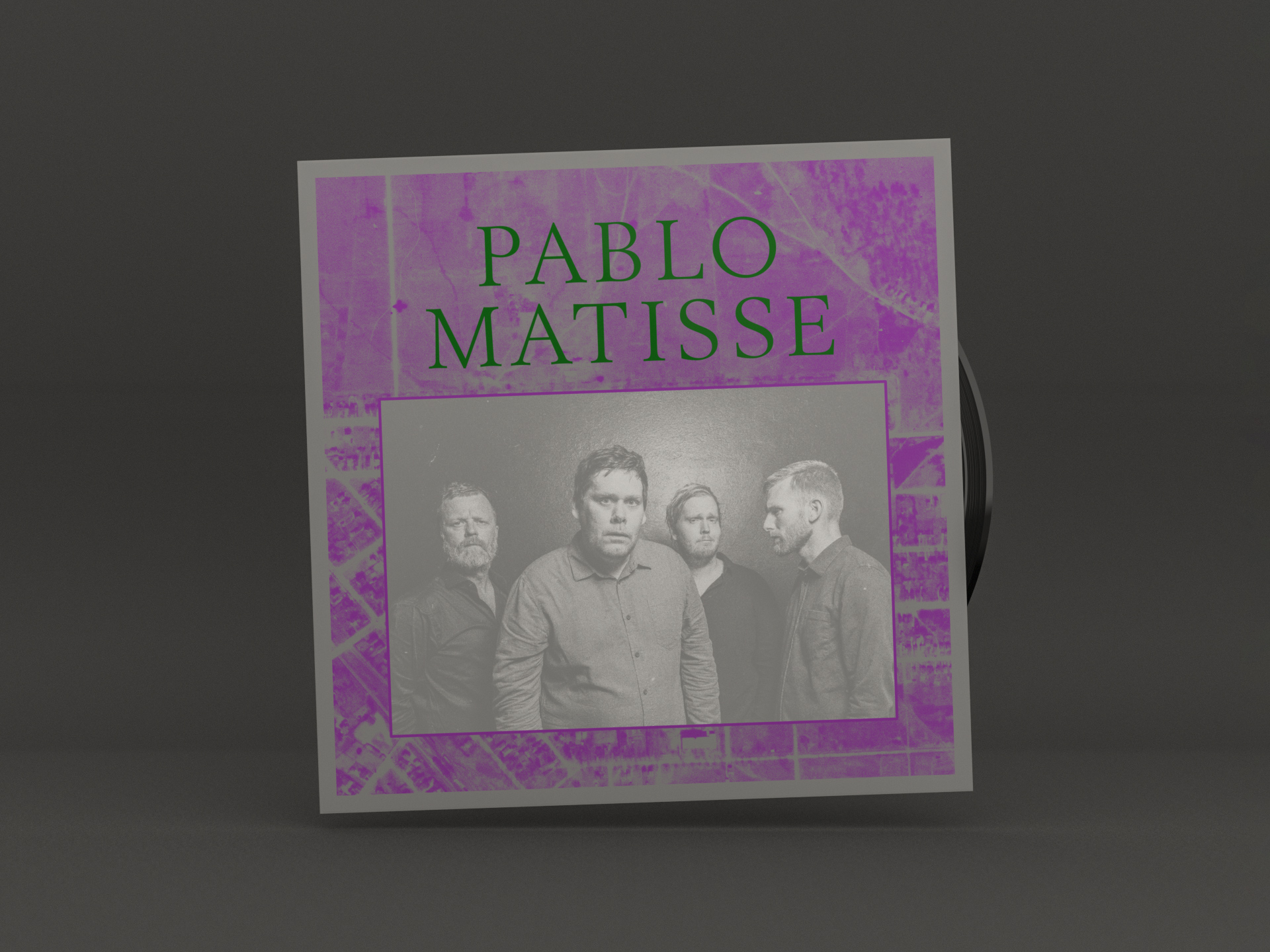
Pablo Matisse – Rise
Pablo Matisse – Rise
Album packaging design

The Come Together Singles
The Come Together Singles
Singles Artwork

Nasum – Shift – Album Packaging Design
Nasum – Shift – Album Packaging Design
Album packaging design
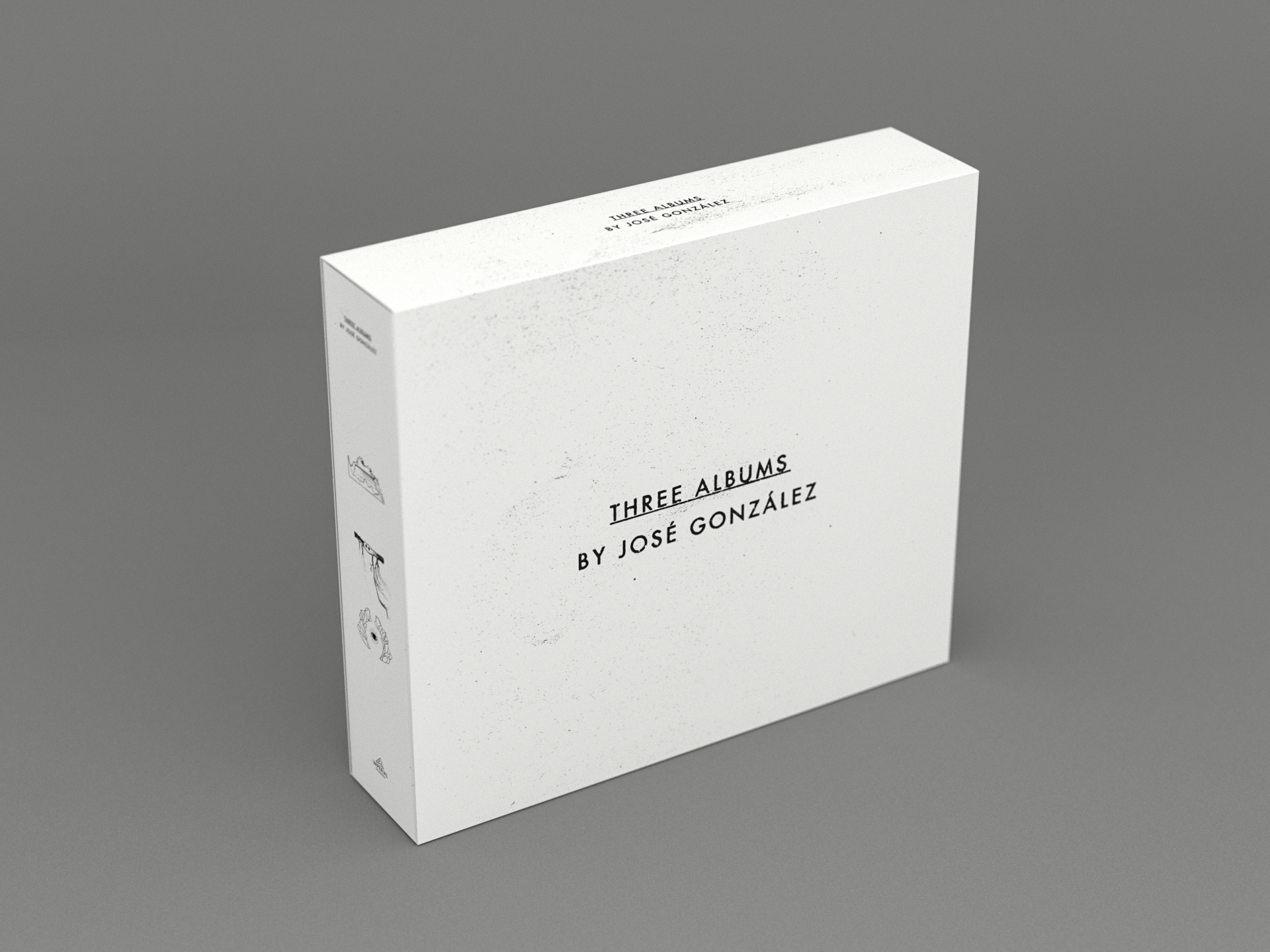
Three albums by José González
Three albums by José González
CD-box design
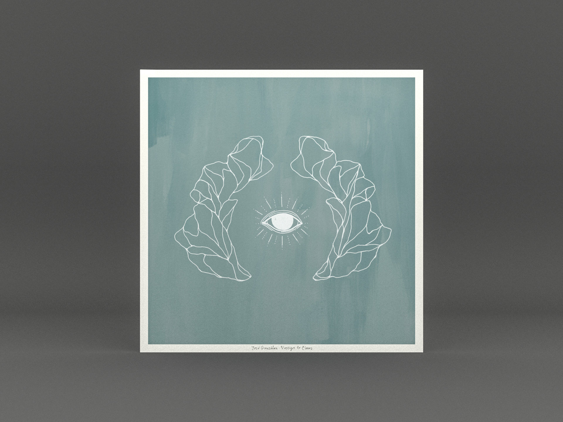
José González – Vestiges & Claws
José González – Vestiges & Claws
Album packaging design
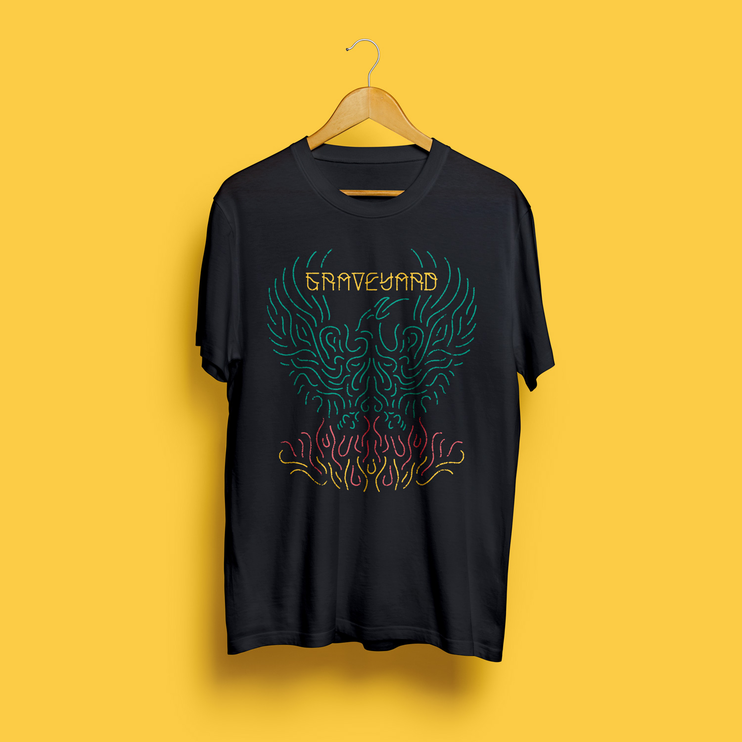
T-shirts
T-shirts
Various artworks

Nefertiti Jazz Club
Nefertiti Jazz Club
Brochure designs

Blueprints
Blueprints
Album packaging design
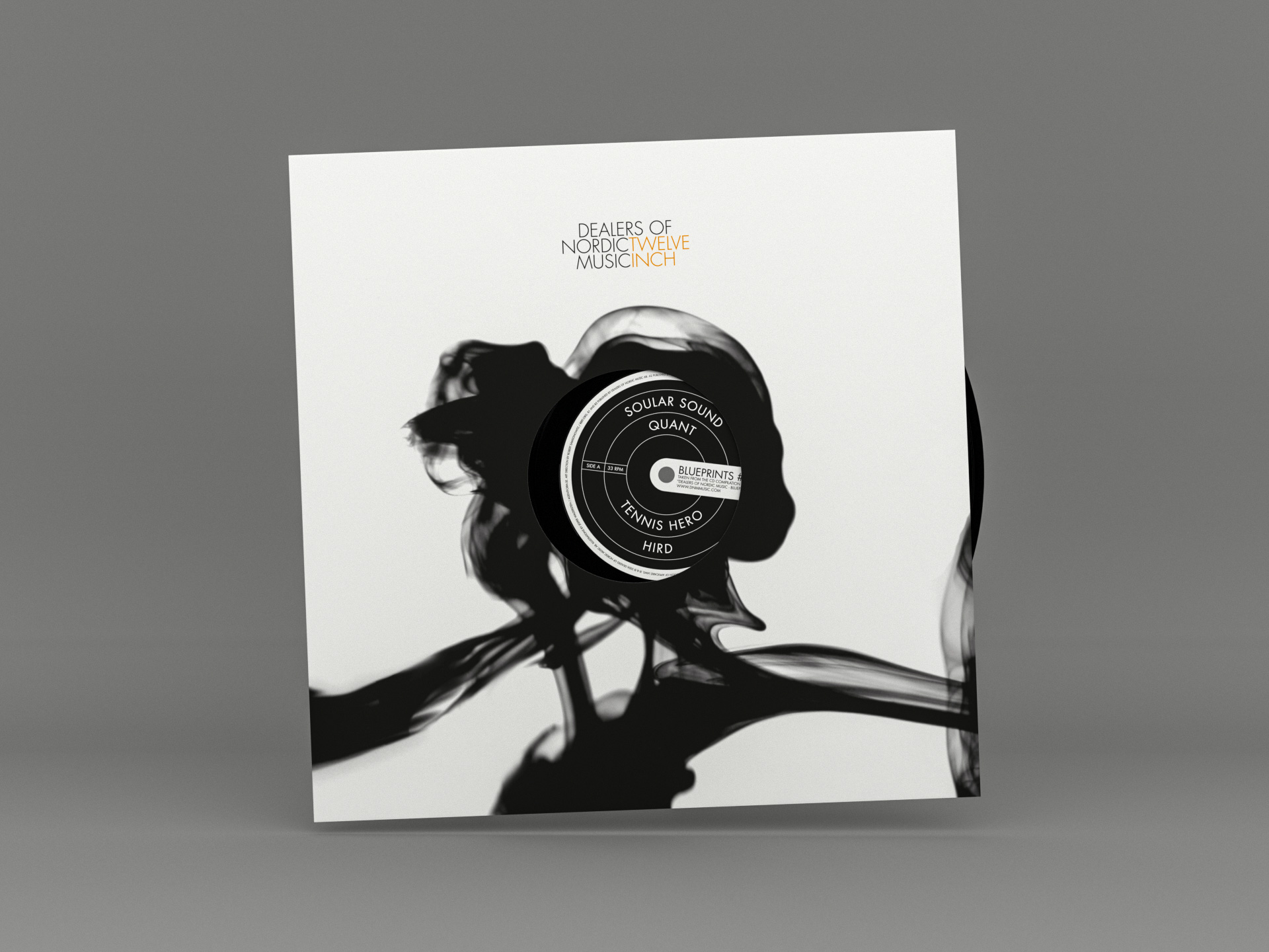
DNM Twelve Inch Series
DNM Twelve Inch Series
Branding & record series packaging design

Ingen ska lämnas utanför
Ingen ska lämnas utanför
Publication design
Inkludera Mera
Inkludera Mera
Identity
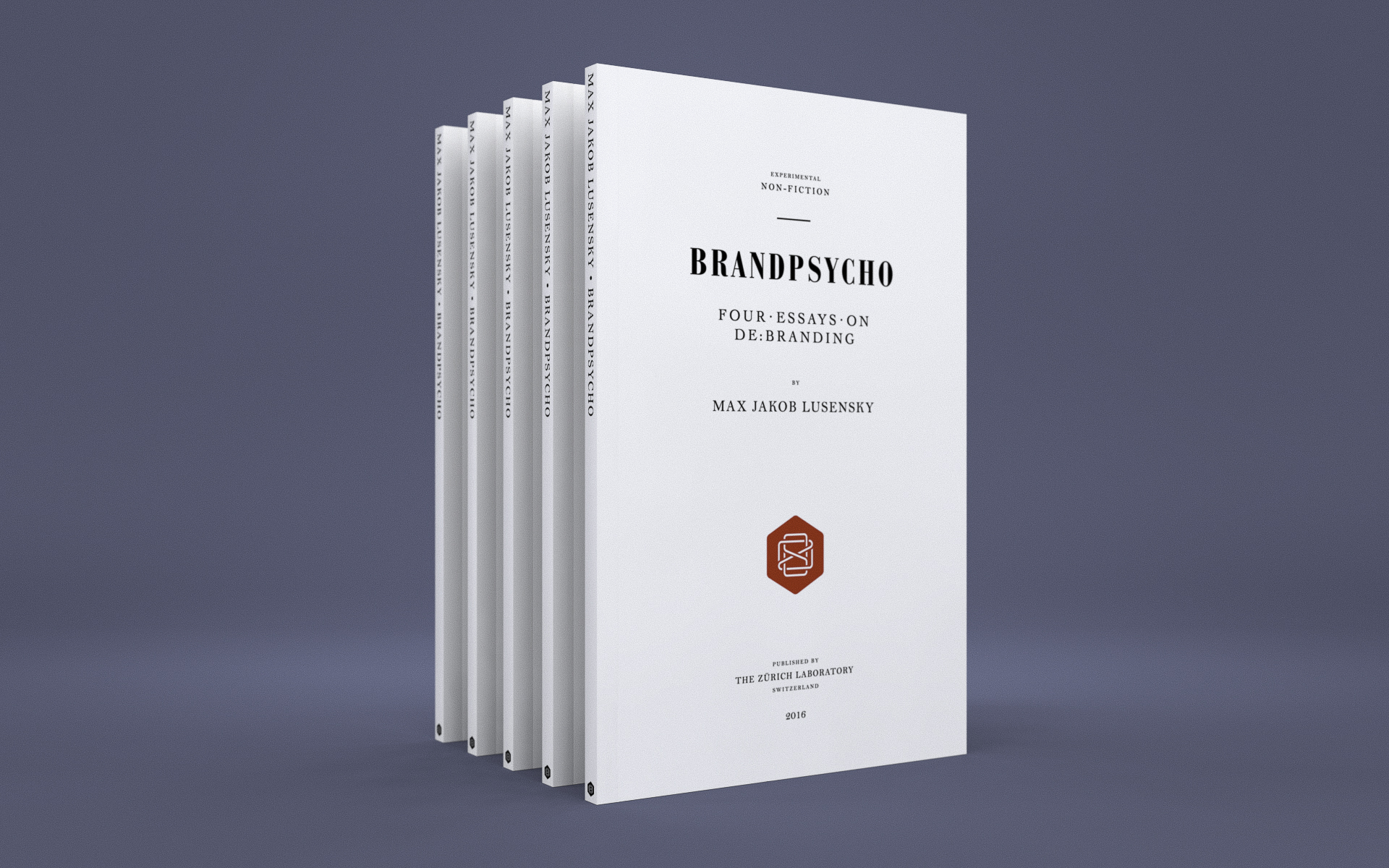
Brandpsycho
Brandpsycho
Book cover
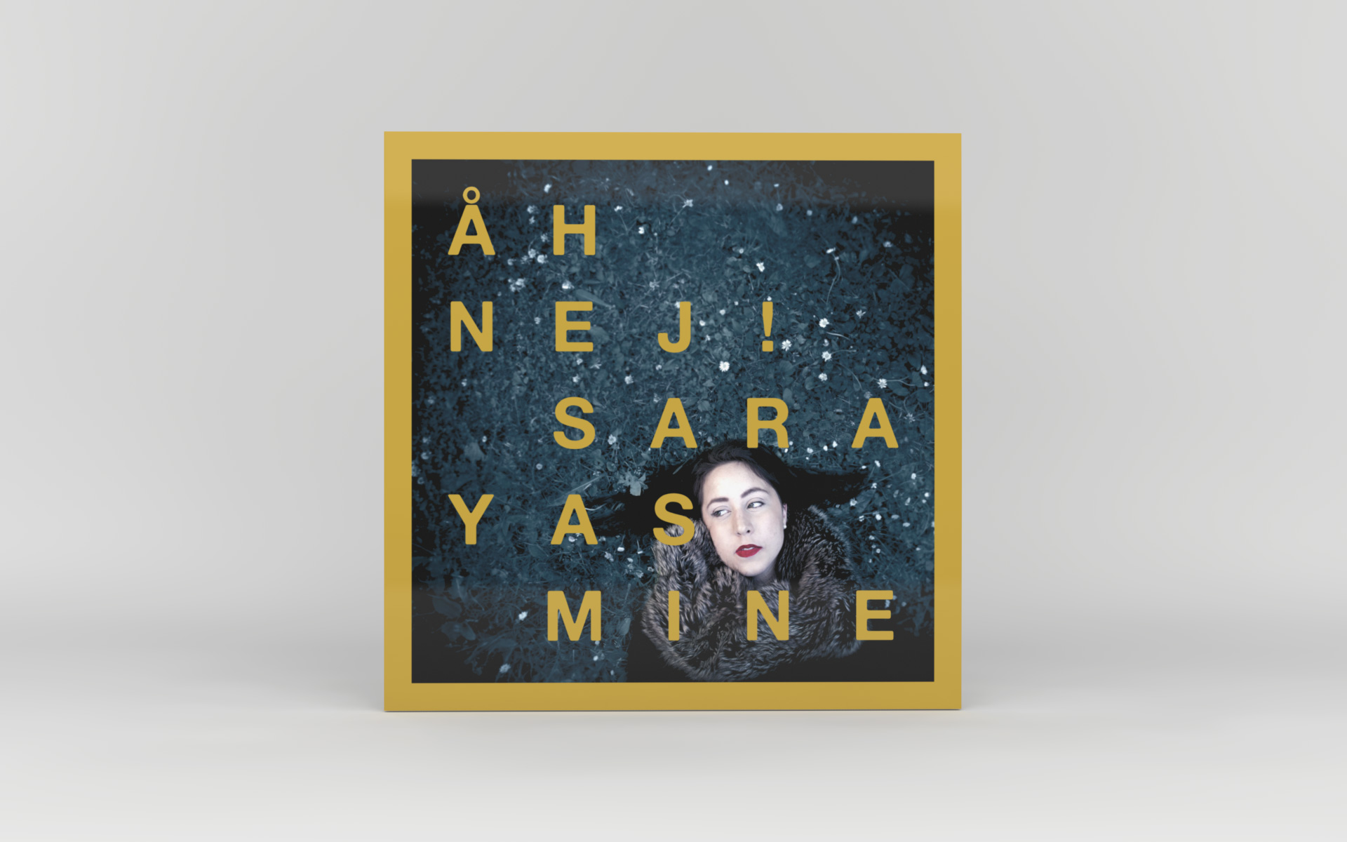
Sara Yasmine – Åh Nej!
Sara Yasmine – Åh Nej!
Album packaging design

Kyllikki
Kyllikki
Book design

Modern
Modern
Identity & album packaging design
Dither
Dither
Identity & Website
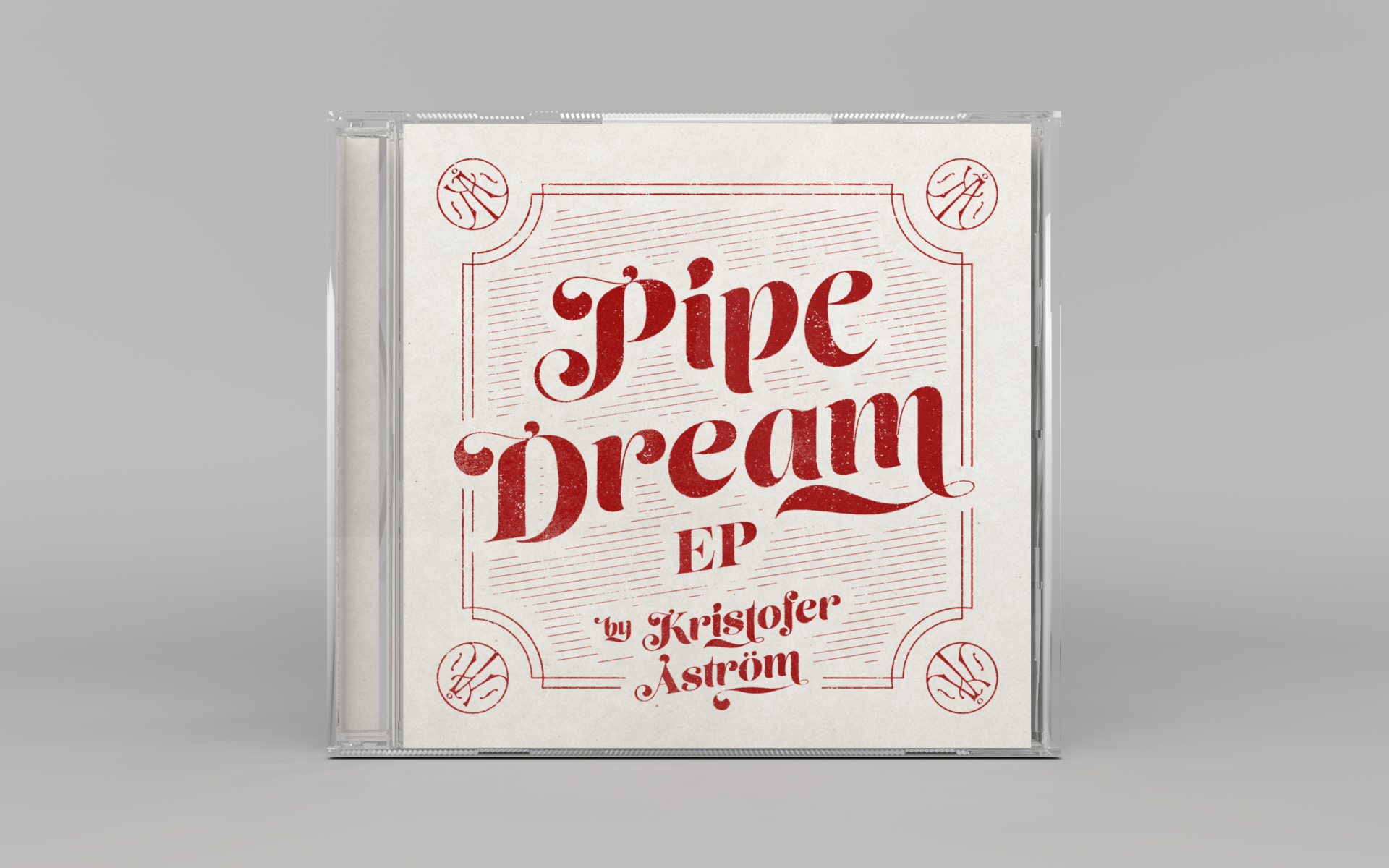
Kristofer Åström – Pipe Dream EP
Kristofer Åström – Pipe Dream EP
CD packaging design

The Zürich Laboratory
The Zürich Laboratory
Identity
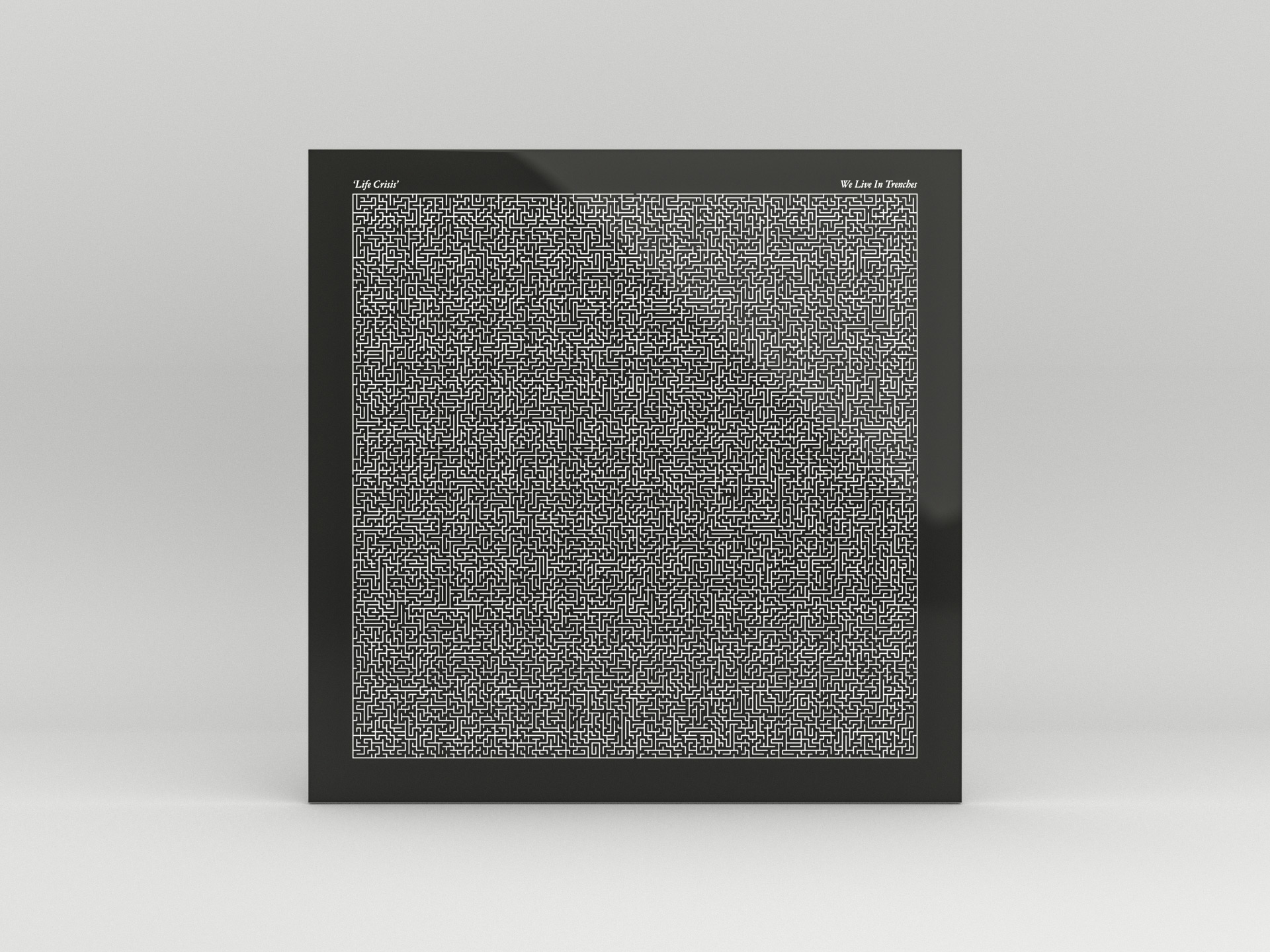
Life Crisis
Life Crisis
Album packaging design
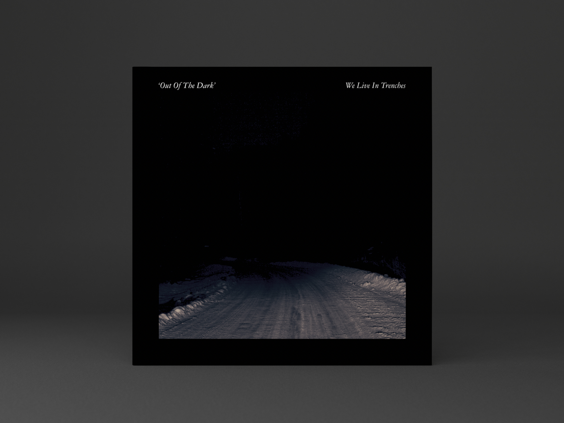
Out Of The Dark
Out Of The Dark
Vinyl 7-inch packaging design

Kristofer Åström – Göteborg String Session
Kristofer Åström – Göteborg String Session
Album packaging design
Arena 29
Arena 29
Identity
West Coast Riot
West Coast Riot
Festival identity

Dia Psalma – Re Voltere
Dia Psalma – Re Voltere
Album packaging design

Fairfest
Fairfest
Festival identity

Dia Psalma – Djupa Skogen
Dia Psalma – Djupa Skogen
Album packaging design
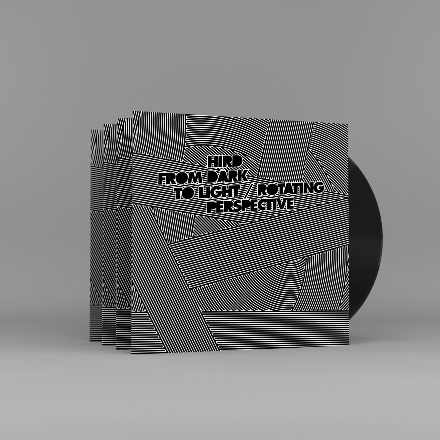
Hird – From Dark To Light
Hird – From Dark To Light
Record packaging design
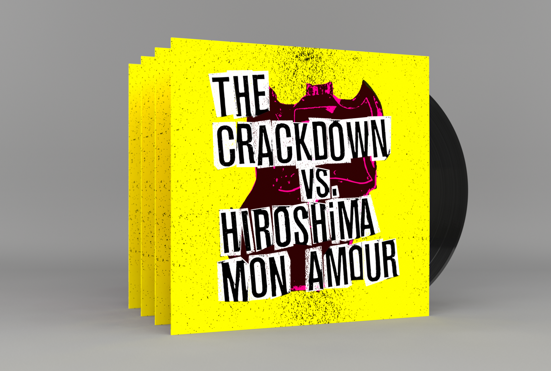
Broken Guitars & Trashy Bars
Broken Guitars & Trashy Bars
Album packaging design