- Pelagic Records
Year
- 2022
What
- LP Reissue Packaging Designs
- Box Set Packaging Design
Role
- Art Direction
- Graphic Design
- Illustration
Burst: A Labyrinth of Layers Box Set
Burst defies musical boundaries. Their sound weaves through progressive metal, post-metal, hardcore, math rock, post-hardcore and post-rock, making them a challenge to label. With one foot firmly planted in the gritty depths of hardcore and metal, and the other rooted in 70s progressive rock, they’ve carved out a musical universe entirely their own.
When Burst approached me to design the box set and LP reissues for Pelagic Records, I set out to visually interpret their rich and layered sound. Drawing inspiration from the title A Labyrinth of Layers, I created an illustration for the box set combining their origins and the boundless landscapes their music explores. The artwork ties together the band’s local heritage with the unknown.
The box packaging features black-and-white offset printing on semi-matte coated paper, with the illustration and typography on the top of the lid in silver hot foil stamping. Inside, the set includes three of Burst’s seminal albums – Prey On Life (2003), Origo (2005), and Lazarus Bird (2008) – originally released on Relapse Records.
Each album artwork feature a signature metallic Pantone colour. Prey On Life is Pantone 871c (gold), Origo is Pantone 877c (silver) and Lazarus Bird is Pantone 876c (copper). These signature metallics are used on various graphics and typography for each release (on gatefold sleeves, inner sleeves and labels). The album packaging designs were made in tribute to their original album packaging designs, with many updates and redesigns to ensure a more timeless aesthetic for these reissues.
My role included art direction, illustration, album packaging design and graphic design.
Lazarus Bird
Lazarus Bird is the only album in the box set that had previously been released on vinyl in its own right. While I paid tribute to the original LP artwork by Marcus Ivarsson, I refined the typography and refreshed the packaging as a whole. Rather than relying on standard CMYK, I limited the palette to the signature metallic Pantone 876c (copper), complemented by Pantone 877c (silver) and black. The result is a cleaner, more sophisticated aesthetic than the original 2008 LP version.
The album comes in a gatefold sleeve finished with a high-gloss UV varnish. To maintain a cohesive look throughout the packaging, the inner sleeves and labels were printed in the same Pantone 876c (copper) and black.
Origo
Origo had not previously been released in its own LP format, so my task was to adapt the earlier 2005 CD packaging to an LP format as a tribute to the original CD packaging design by Orion Landau.
The band wanted me to tone down the elements of the CD packaging that felt very characteristic of the early 2000s. To achieve a cleaner and more sophisticated feel, I decided to retain only the typography and the Wieslaw Walkuski oil painting that the cover is based on. The signature metallic colour for Origo’s packaging is Pantone 877c (silver).
The album comes in a gatefold sleeve finished with a high-gloss UV varnish. To maintain a cohesive look throughout the packaging, the inner sleeves and labels were printed in the same Pantone 877c (silver) and black.
Prey On Life
Just like Origo, Prey On Life had also never been released in its own LP format before. My task here was once again to adapt the previous CD packaging to the new LP format, this time as a tribute to Aaron Turner’s 2003 CD packaging design.
I reworked some of the old cover photographs to better suit the larger format, used the same typeface, and reused Aaron’s cover illustration. The signature metallic color for Prey On Life’s packaging is Pantone 871c (gold).
The album comes in a gatefold sleeve finished with a high-gloss UV varnish. To maintain a cohesive look throughout the packaging, the inner sleeves and labels were printed in the same Pantone 871c (gold).
If you liked this packaging project,
you might want to check out any of these projects too.

Lödöse Musteri – Äppelfära Label Design
Art direction, illustration & graphic design

José González 2025 Visual Identity
Art Direction & Graphic Design

Signal & Wave Logo And Visual Identity
Art Direction & Graphic Design

Kim – Äntligen LP Packaging Design
LP Packaging Design

Mono Total Typeface Identity
Type Design, Identity & Usage Examples
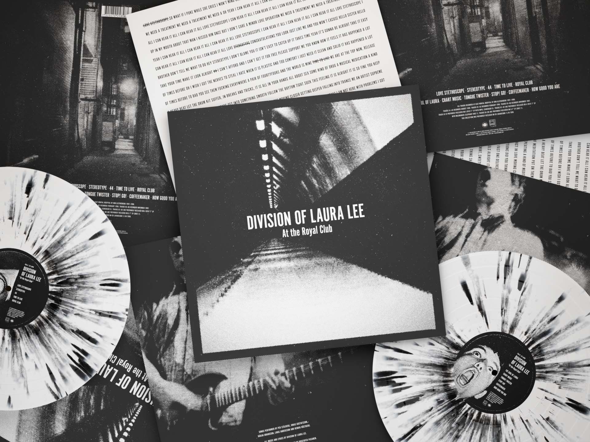
Division Of Laura Lee – At The Royal Club LP packaging design
LP Packaging Design

Colosso Typeface Identity and Marketing
Type Design, Identity & Usage Examples
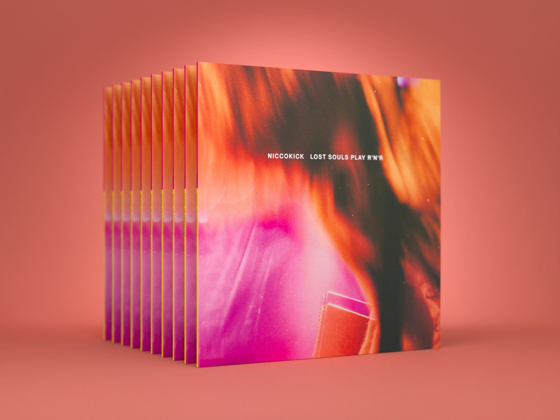
Niccokick – Lost Souls Play R’n’R Album Packaging Design
LP Packaging Design
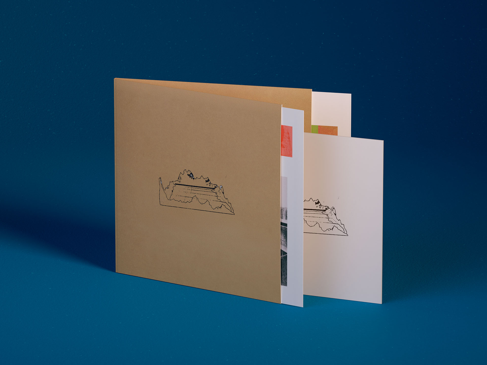
José González – Veneer 20th Anniversary Deluxe Edition Album Packaging Design
Album packaging design
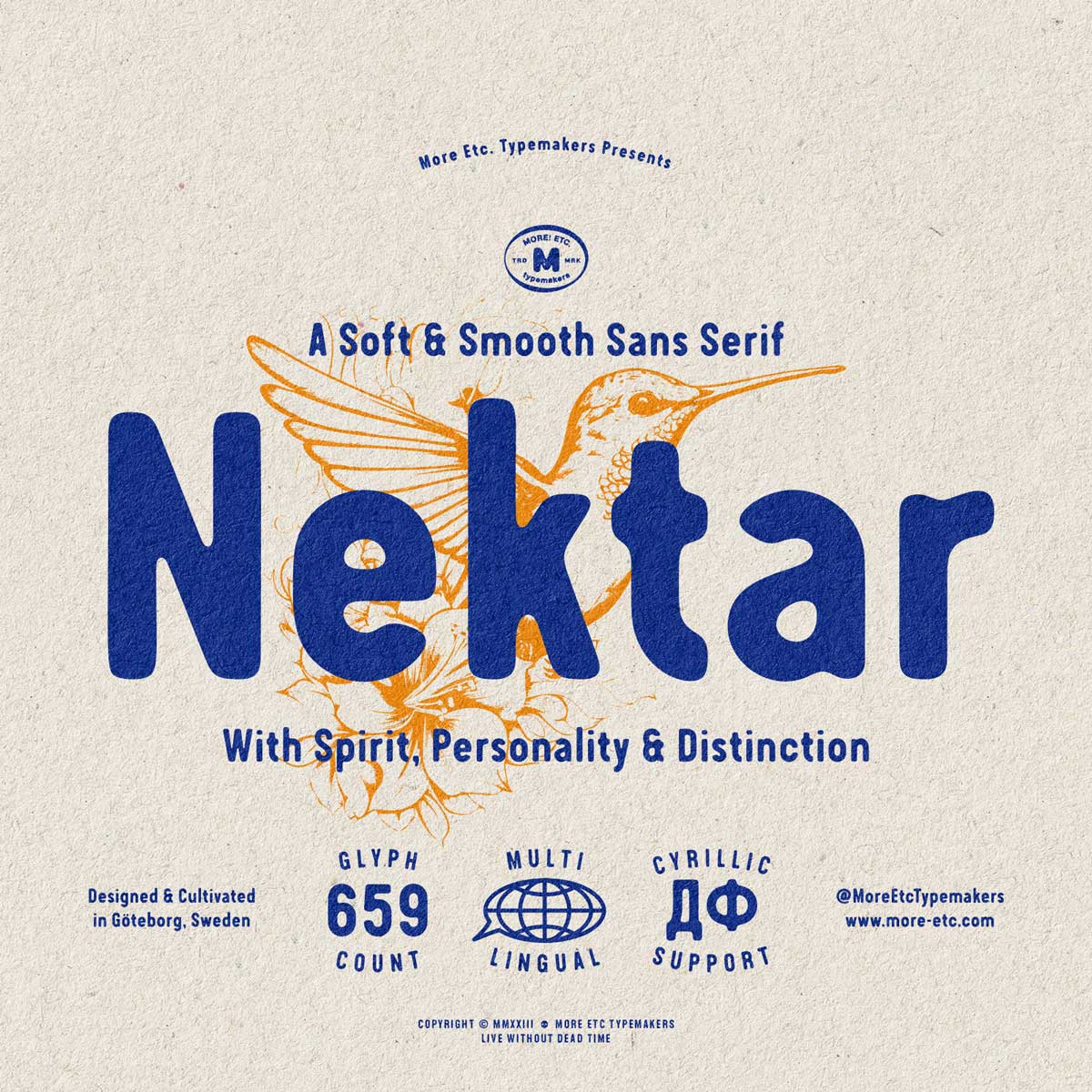
Nektar Typeface Identity
Type Design
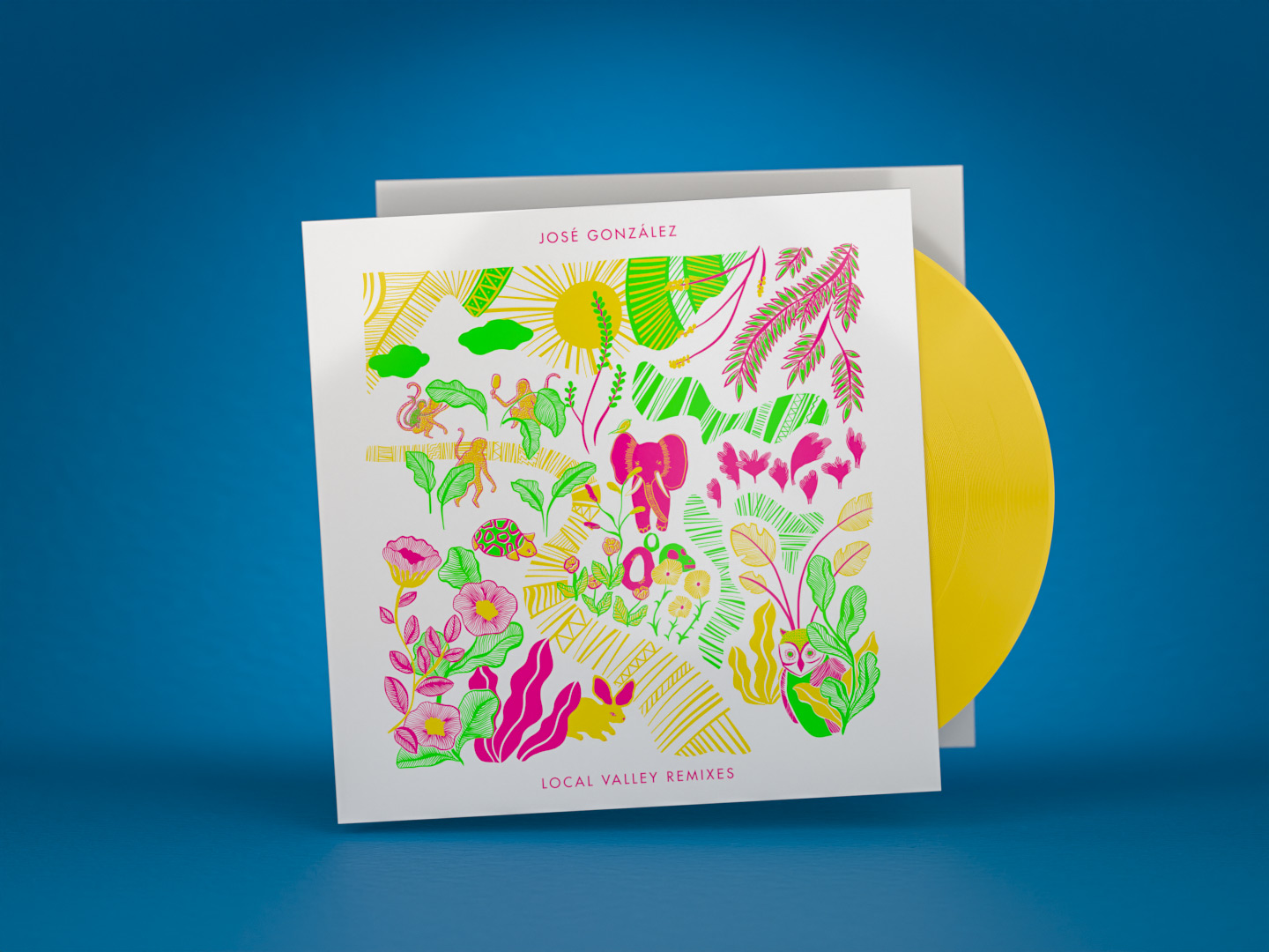
José González – Local Valley Remixes Album Packaging Design
Album packaging design
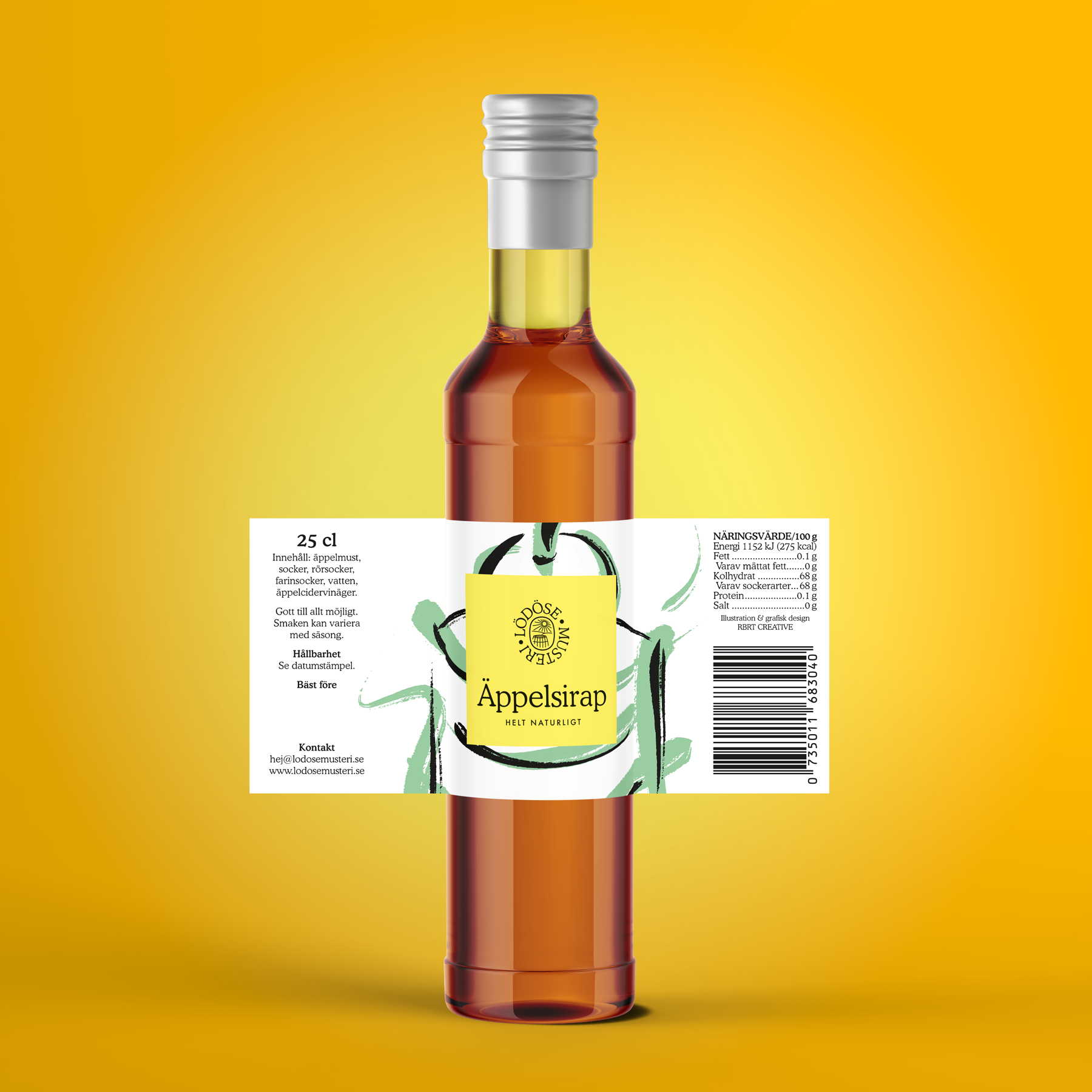
Lödöse Musteri – Apple Syrup Packaging Design
Packaging Design
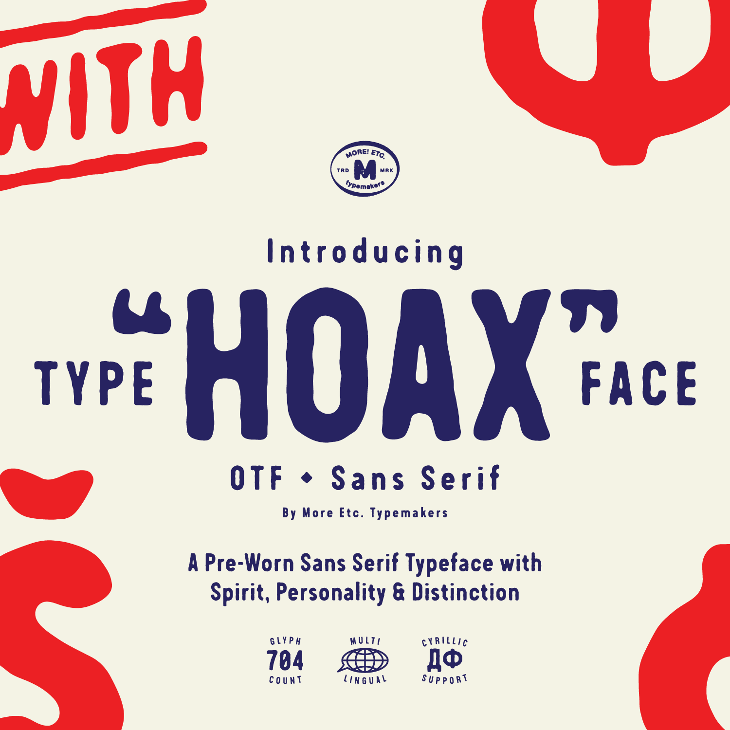
Hoax Typeface
Type Design
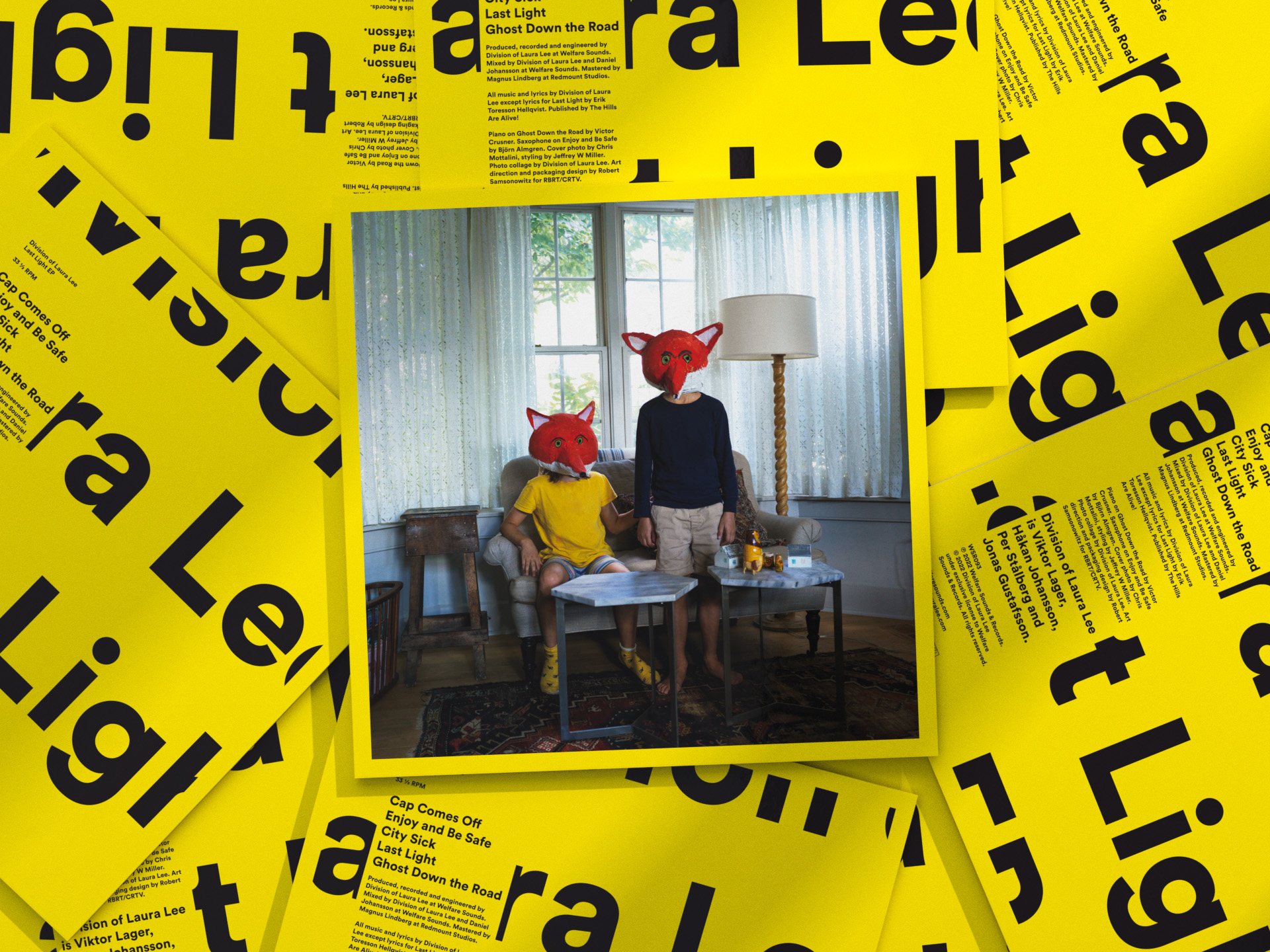
Division Of Laura Lee – Last Light EP
Vinyl EP packaging design
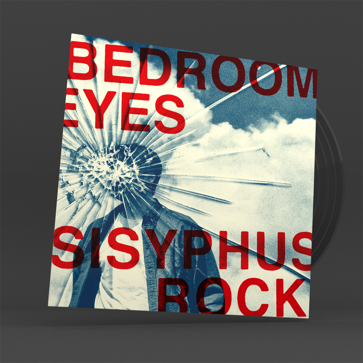
Bedroom Eyes – Sisyphus Rock
Album packaging design

Inceptive Logo Design & Rebranding
Identity
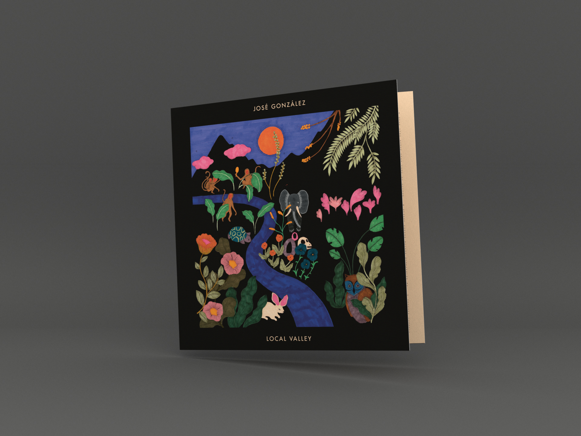
José González – Local Valley
Album packaging design
More Etc. Typemakers – Visual Identity
Visual identity
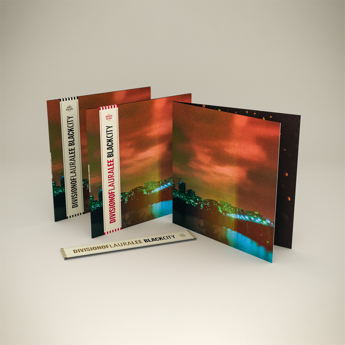
Division Of Laura Lee – Black City
Album packaging design
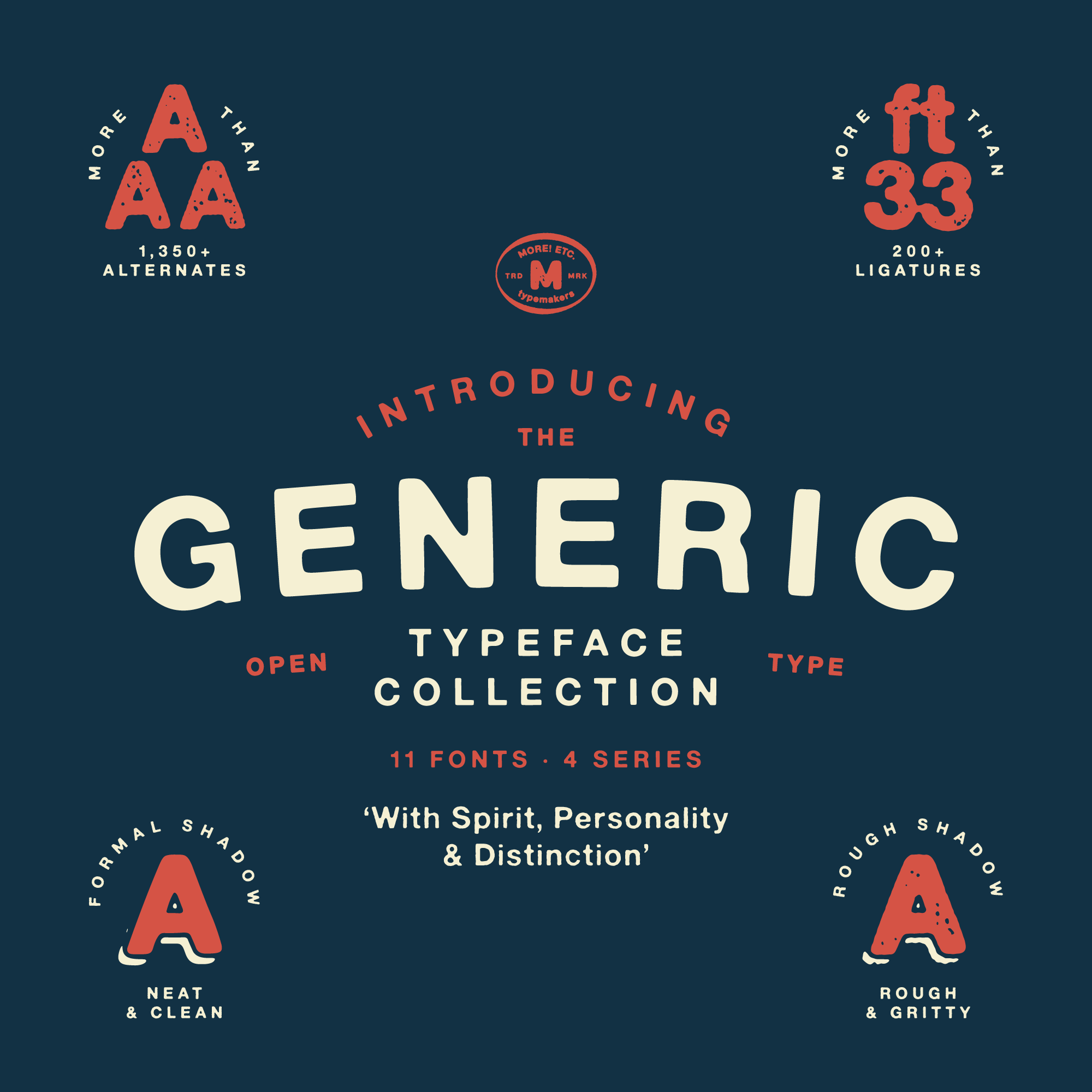
Generic Typeface Collection – Type Design & Font Making
Type Design

The Los Angeles Suite
Album packaging design
Lödöse Musteri
Identity

Kristofer Åström – The Story of a Heart’s Decay
Album packaging design
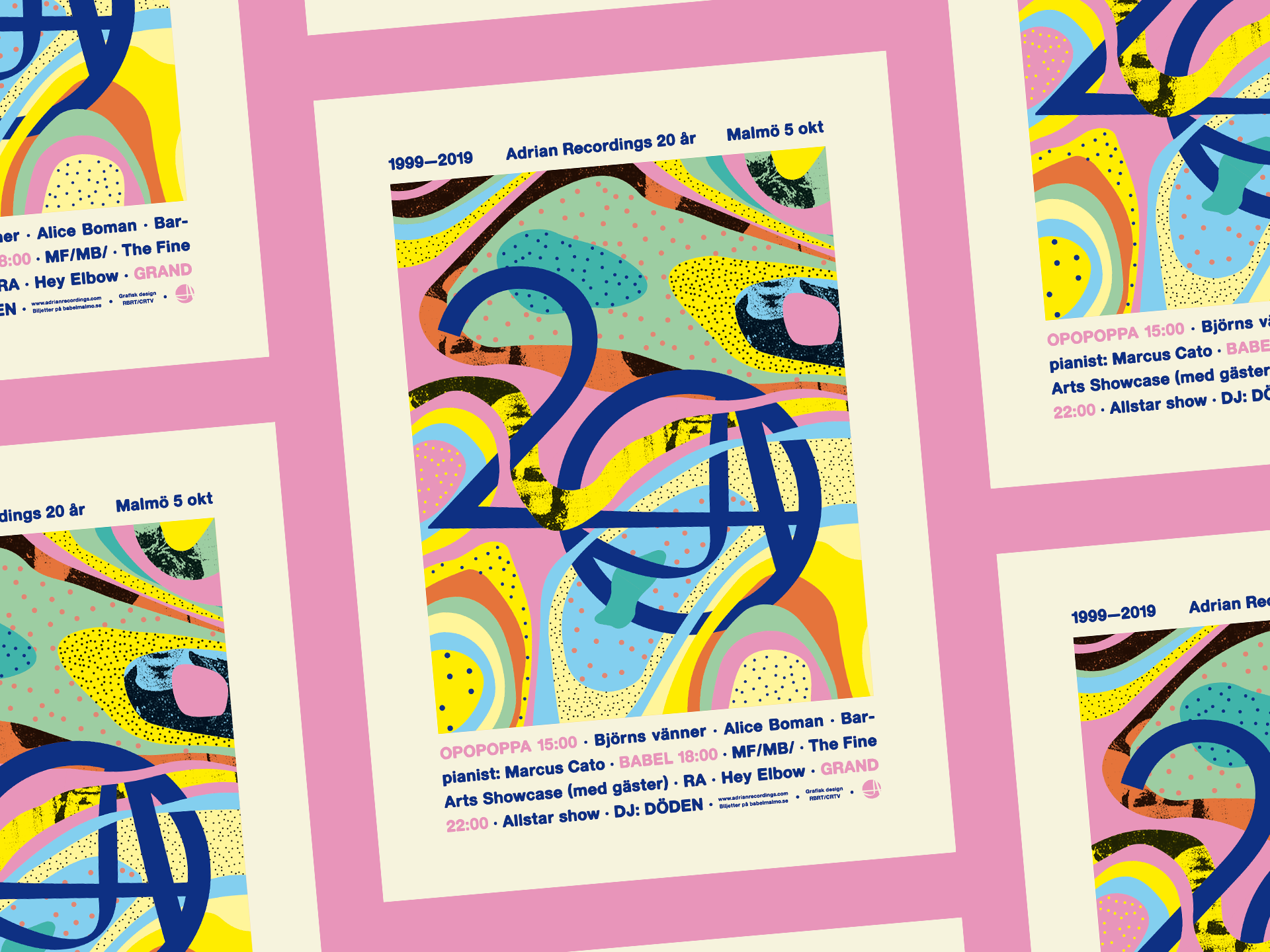
Adrian Recordings 20th Anniversary Poster Design and Event Visuals
Poster design & event visuals
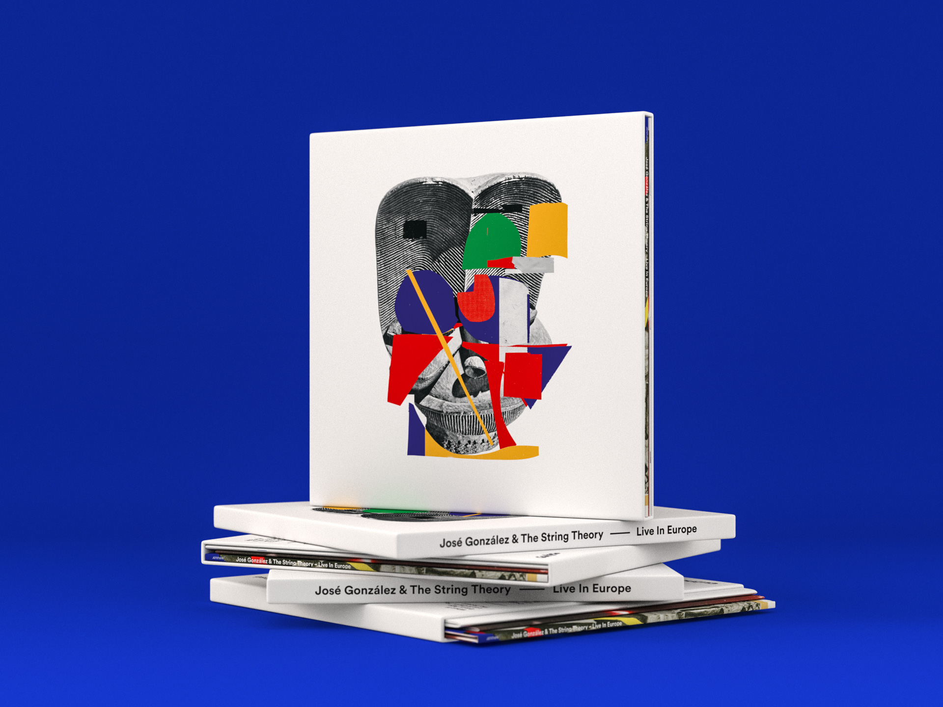
José González & The String Theory – Live In Europe
Album & Box packaging design
Startracks 25th anniversary
Identity
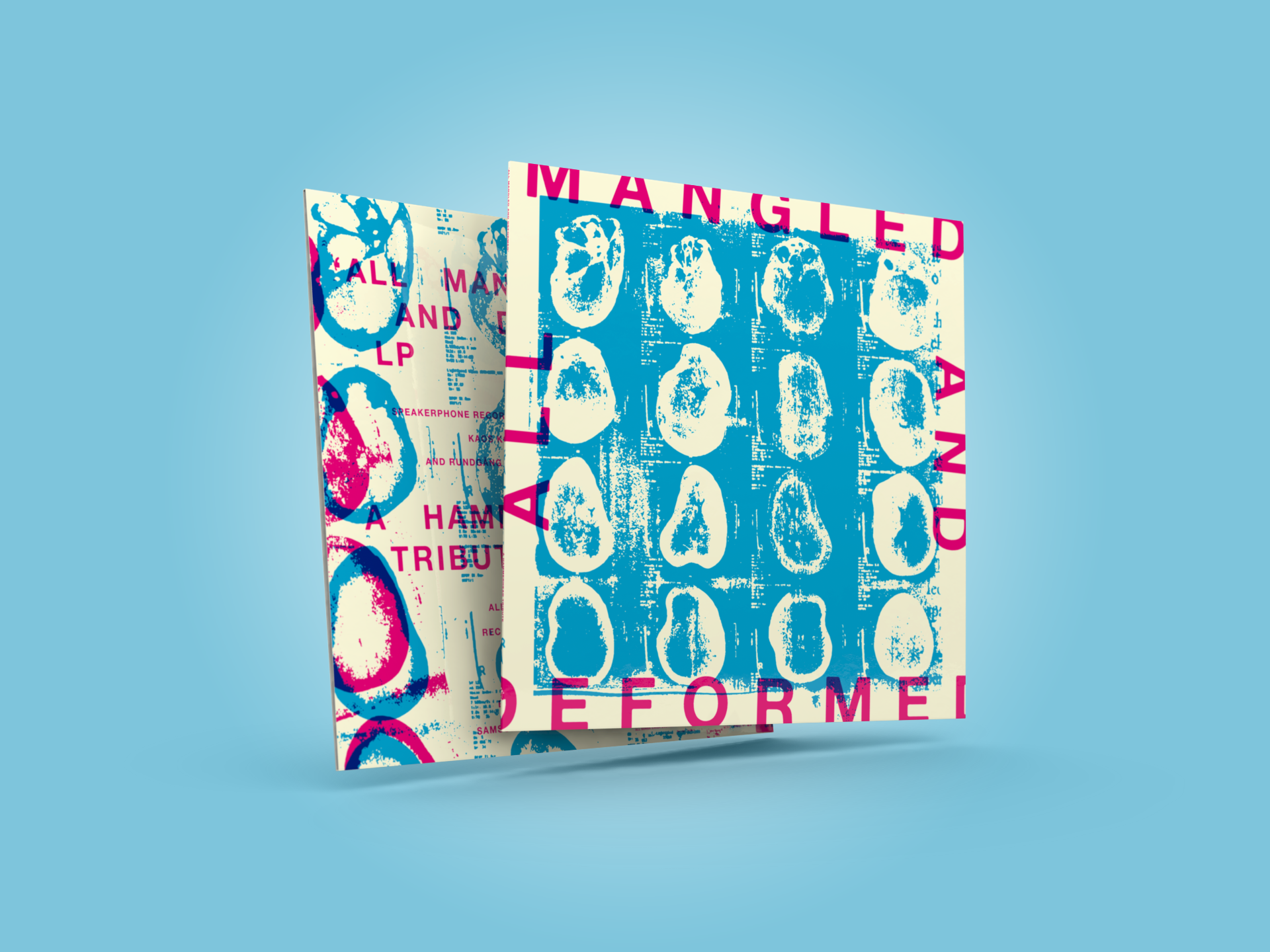
All Mangled And Deformed
Album packaging design
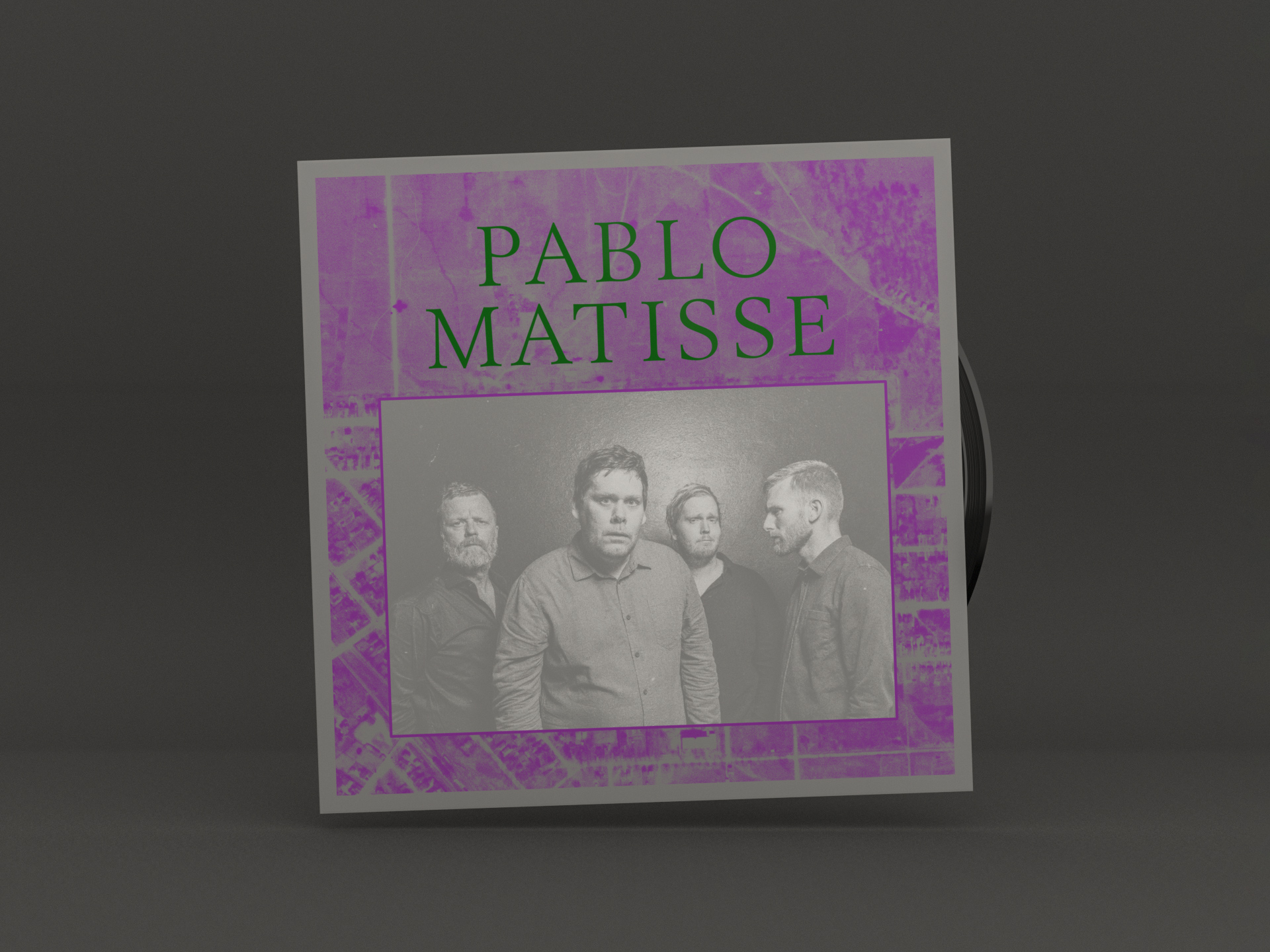
Pablo Matisse – Rise
Album packaging design
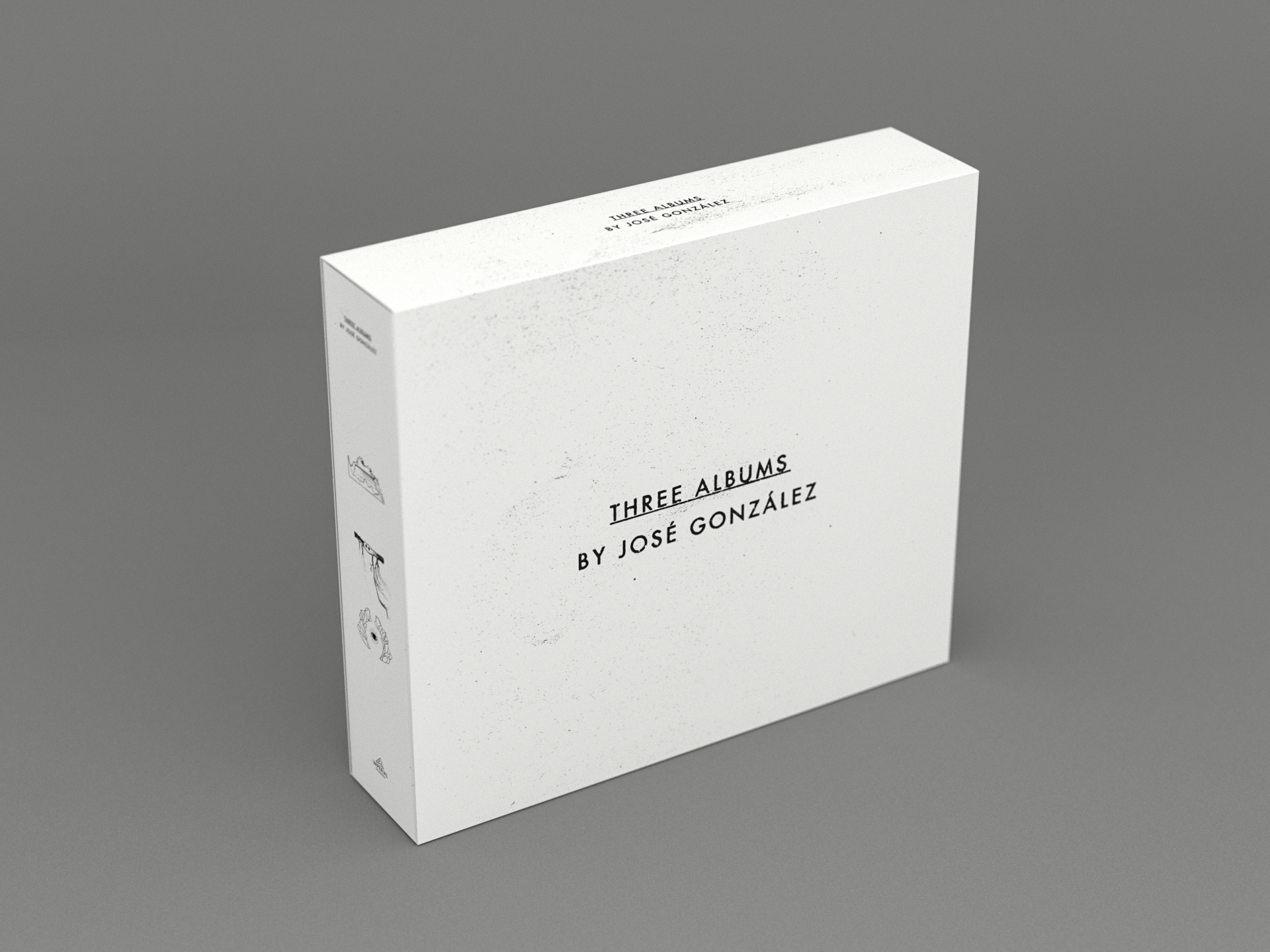
Three albums by José González
CD-box design
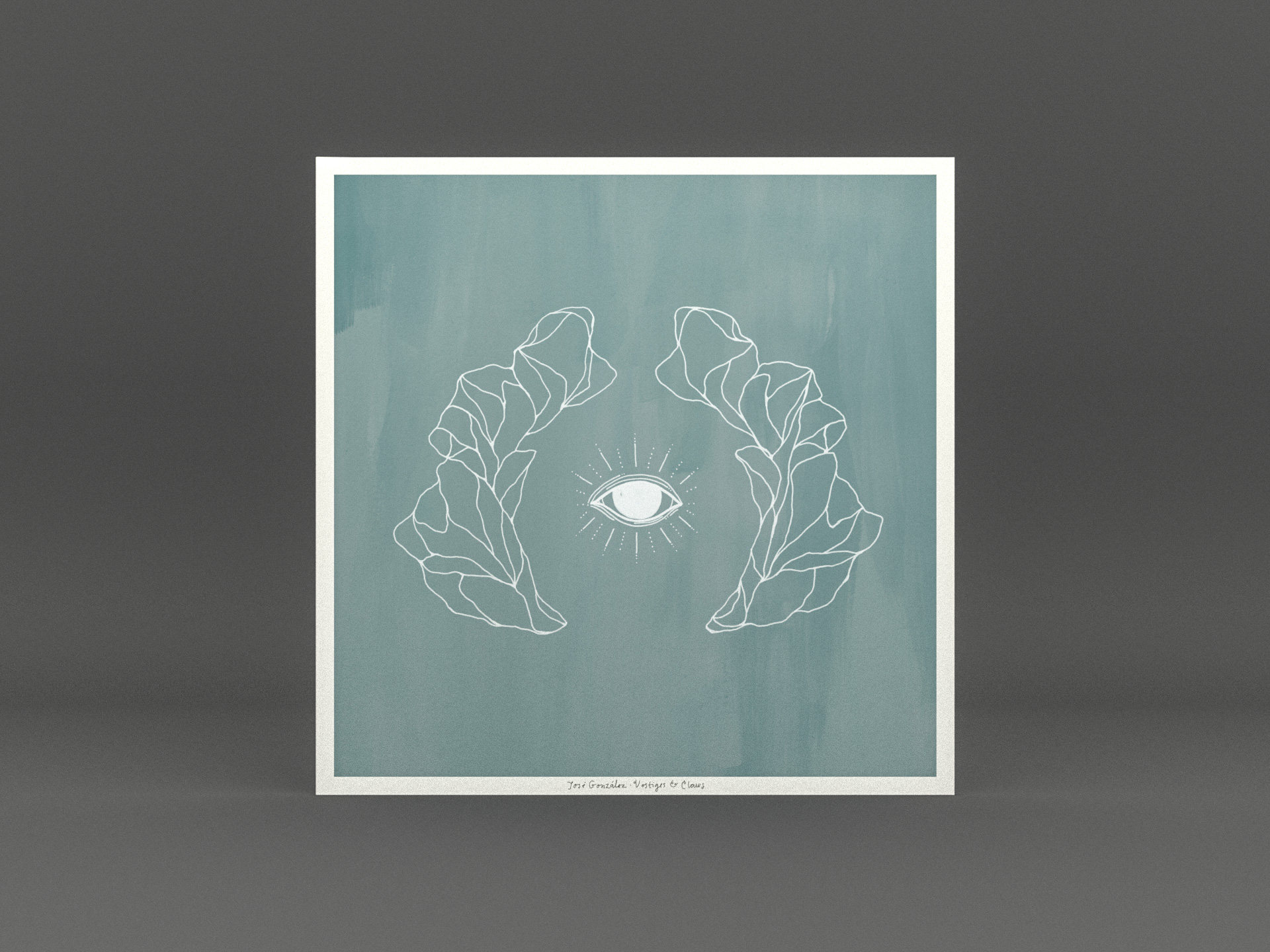
José González – Vestiges & Claws
Album packaging design
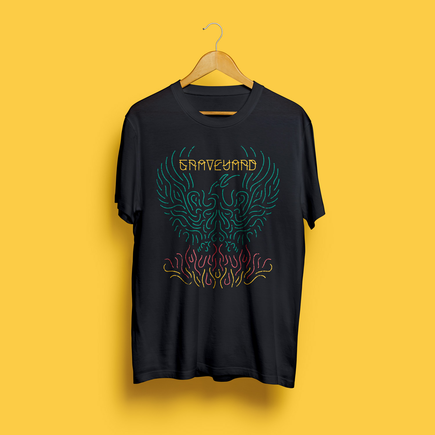
T-shirts
Various artworks

Nefertiti Jazz Club
Brochure designs

Blueprints
Album packaging design
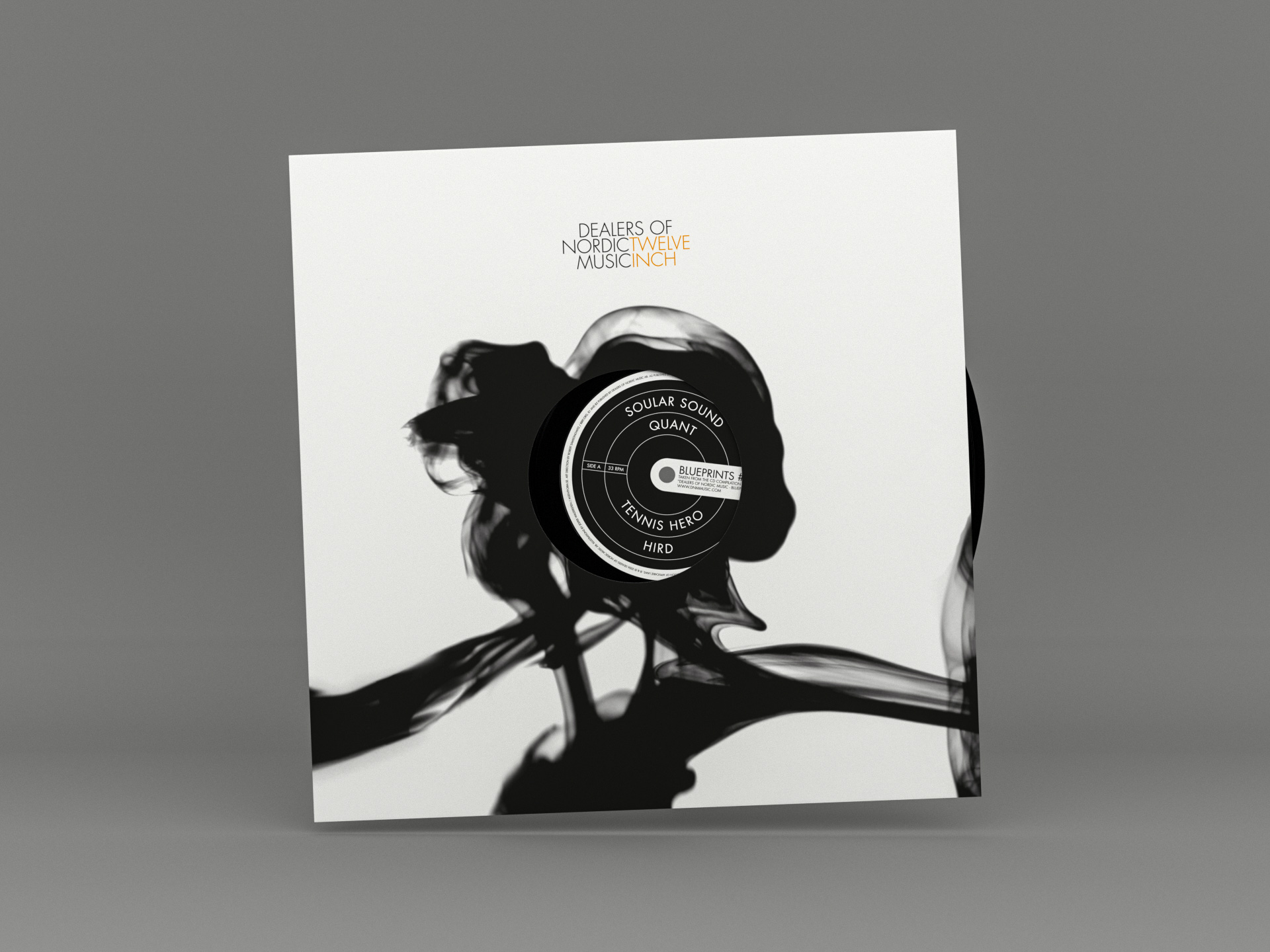
DNM Twelve Inch Series
Branding & record series packaging design
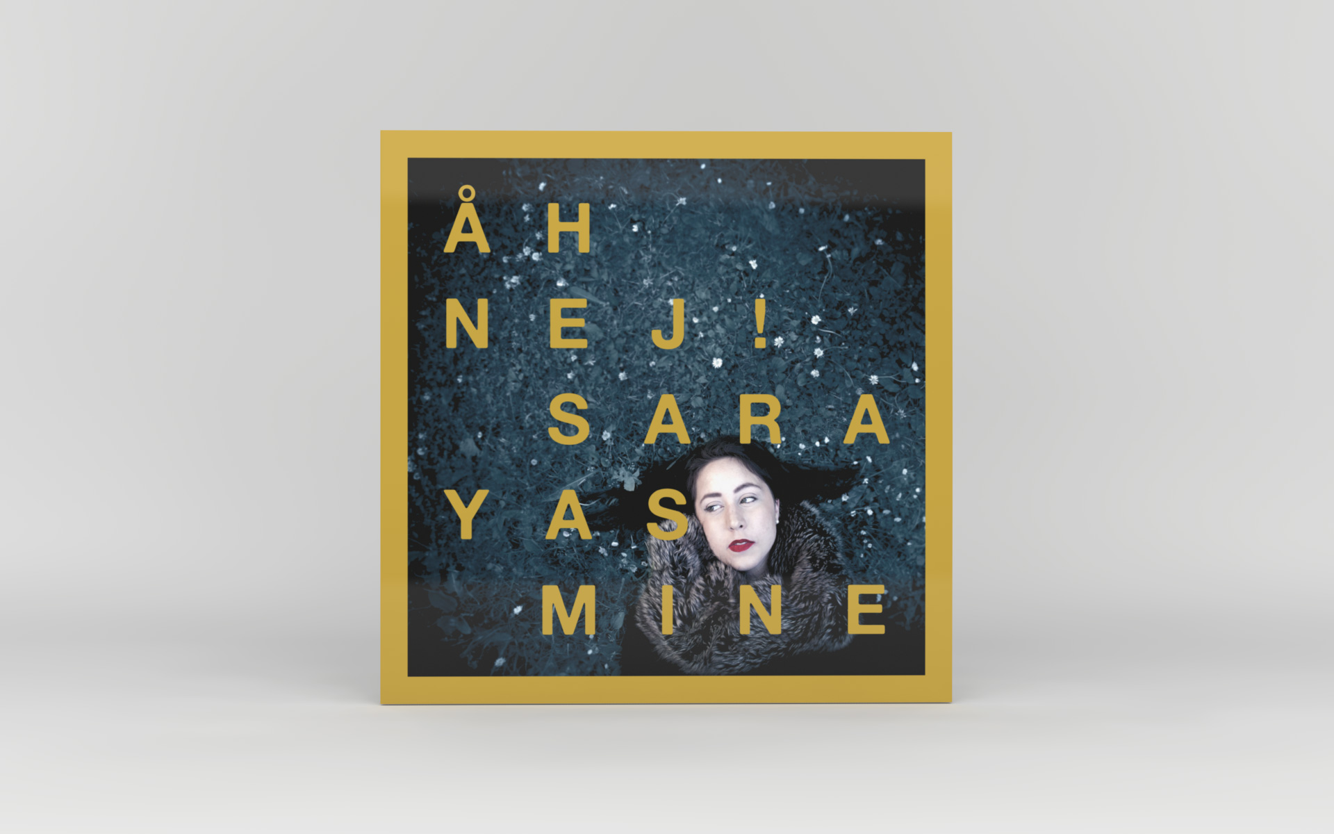
Sara Yasmine – Åh Nej!
Album packaging design

Kyllikki
Book design

Modern
Identity & album packaging design
Dither
Identity & Website

Kristofer Åström – Pipe Dream EP
CD packaging design
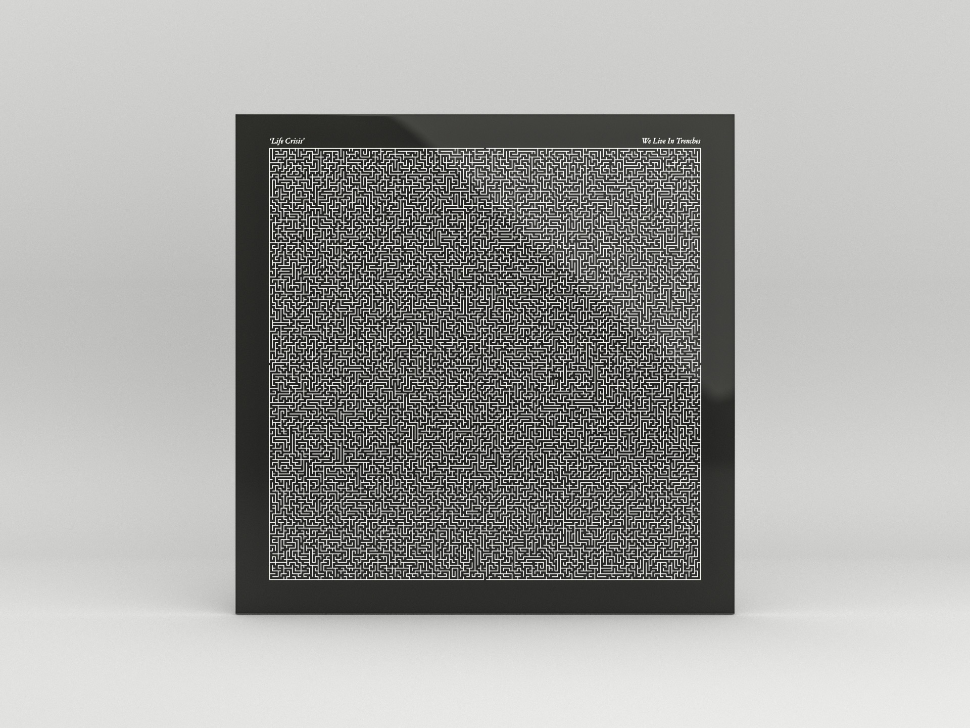
Life Crisis
Album packaging design
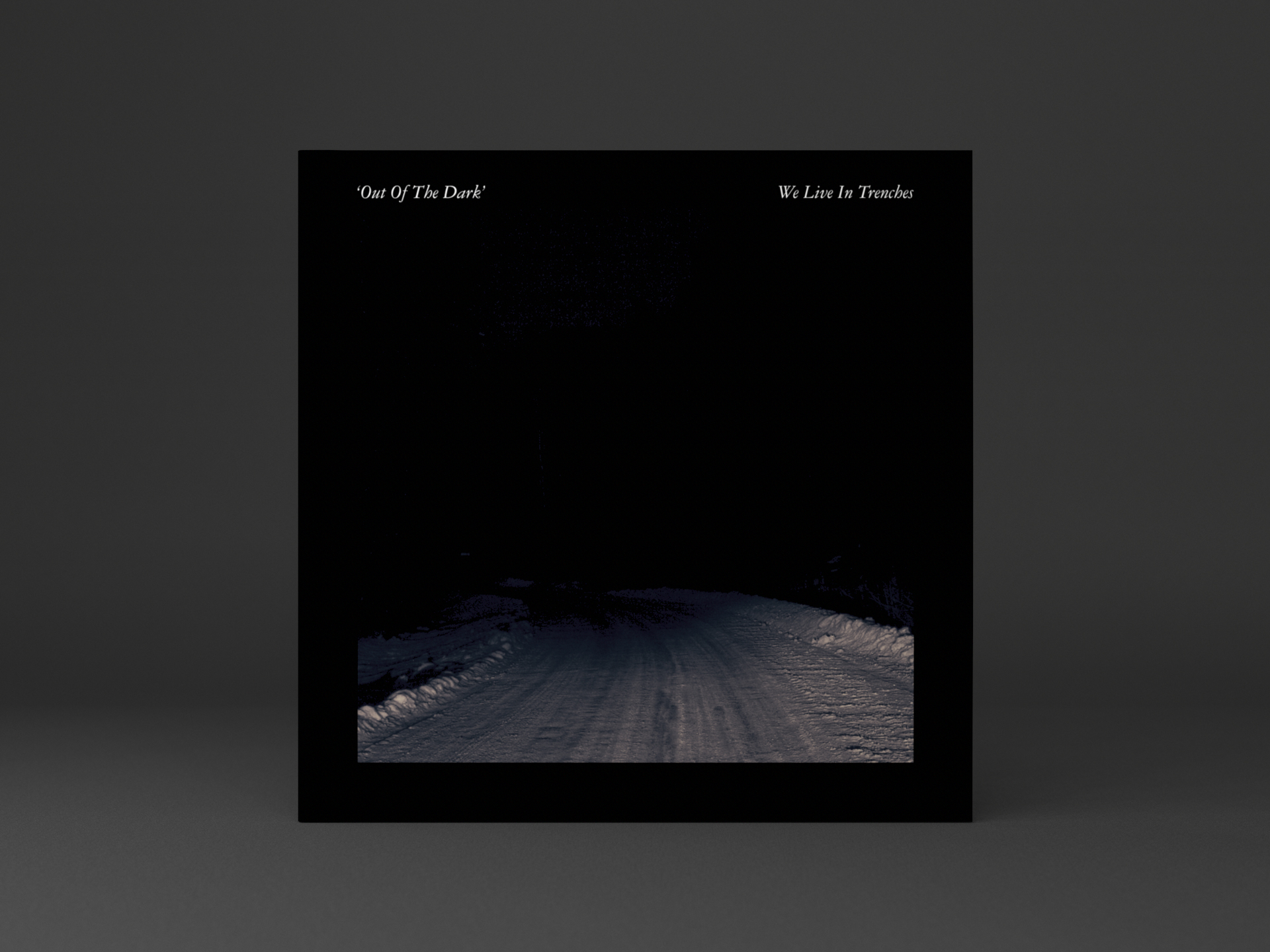
Out Of The Dark
Vinyl 7-inch packaging design

Kristofer Åström – Göteborg String Session
Album packaging design
Arena 29
Identity

Fairfest
Festival identity
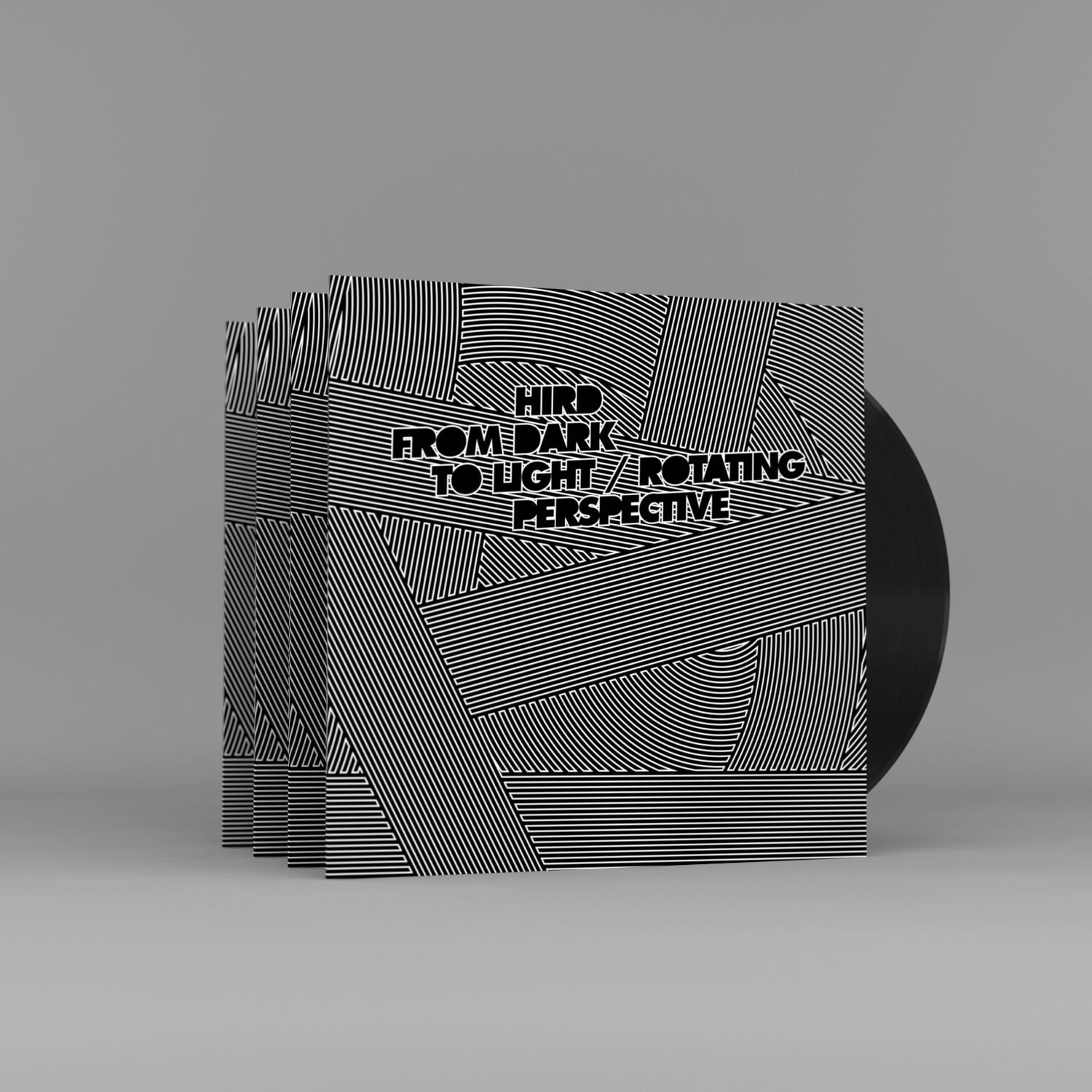
Hird – From Dark To Light
Record packaging design
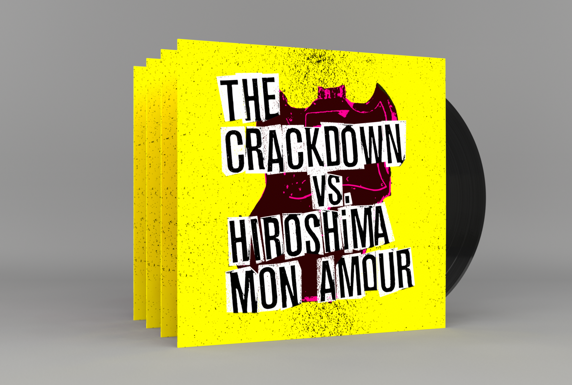
Broken Guitars & Trashy Bars
Album packaging design


