- Splendid Wines AB
Year
- 2024
What
- Logo design & identity
- Label concept
- Packaging design
Role
- Art Direction
- Illustration
- Graphic Design
Laurelina: Crafting a Classic Contemporary Wine Brand Identity
I had the pleasure of working with Laurelina, an emerging wine brand, to craft their visual identity. This included creating the logo and conceptualizing the wine labels. My responsibilities encompassed art direction, graphic design, and illustration.
Initially, the client positioned themselves firmly on the modern side of the “modern vs. traditional” scale. However, as the project evolved, they sought a more traditional visual approach. We ultimately found a balance that we refer to as “Classic Contemporary,” blending traditional roots with modern aesthetics.
The overall concept for Laurelina’s brand labels is inspired by the name itself. Given the laurel reference in “Laurelina,” bay leaves became a recurring motif throughout the visual identity. These elements were used to create a cohesive and meaningful brand image.
The visual identity aims to capture the essence of traditional winemaking, balanced with a contemporary approach, creating a sophisticated and memorable impression that resonates with both traditional and modern wine enthusiasts.
The assignment included logotype design & identity, wine label concept, and packaging design for four different wines.


The Logo Concept
At the heart of the symbol is the bowl of a wine glass, representing the cultural and traditional roots of winemaking. Encased within the bowl is the golden ratio, symbolizing harmony and balance. Crowning this is a wave, indicative of motion and fluidity, reflecting the creative spirit.

The Logo Variations
The Symbol: The heart of Laurelina is the symbol, set in gold foil on the wine labels. Featuring the bowl of a wine glass, symbolizing culture and tradition. Inside the bowl is the golden ratio, representing harmony, with a wave on top to signify motion and the creative spirit.
The Wordmark: This bespoke treatment of a classic typeface is both feminine and impactful, balancing elegance with energy.
The Emblem Logo: Inspired by traditional heraldic seals, this emblem merges classic elements with a contemporary design, perfectly embodying the “Classic Contemporary” style.


Wine Label Concept
The wine labels for Laurelina are a visual narrative inspired by the brand’s name. Given the laurel reference in “Laurelina,” bay leaves feature prominently throughout the design, creating a cohesive and meaningful identity. Each Laurelina wine features a unique bay leaf illustration, allowing for variation in design and print techniques.
Key elements of the label design include:
Bay Leaf Illustrations: These are artfully integrated into the label, providing a visual link to the brand’s name.
Gold Hot Foiling: The symbol and the ornamented lines around the vintage year are accentuated with gold hot foiling, adding a touch of luxury and tradition.
High-Build Tactile Gloss Varnish: This technique is used for the wine name and the Laurelina wordmark, giving them an embossed, tactile feel that enhances visual impact and adds a modern touch.
Fine Print Details: Echoing classic Italian wine labels, the fine print at the bottom of the label includes detailed information such as alcohol content, volume, and country of origin. This not only pays homage to traditional wine labeling but also provides a solid visual foundation for the prominent Laurelina wordmark to rest above it.


If you liked this identity project,
you might want to check out these related projects too.

Lödöse Musteri – Äppelfära Label Design
Lödöse Musteri – Äppelfära Label Design
Art direction, illustration & graphic design

José González 2025 Visual Identity
José González 2025 Visual Identity
Art Direction & Graphic Design

Signal & Wave Logo And Visual Identity
Signal & Wave Logo And Visual Identity
Art Direction & Graphic Design

Laurelina Langhe Nebbiolo Wine Label Design
Laurelina Langhe Nebbiolo Wine Label Design
Art Direction & Graphic Design
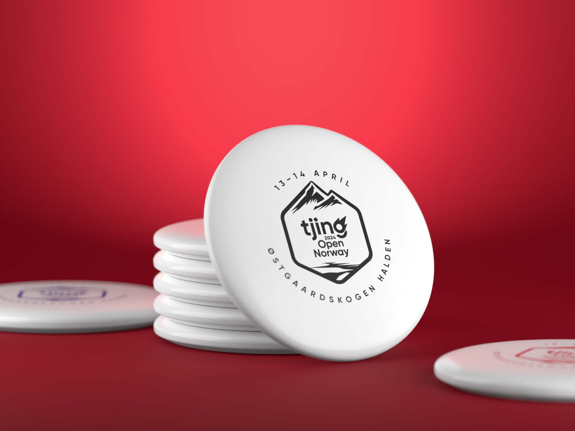
Tjing Open Norway – Disc Golf Event Visual Identity
Tjing Open Norway – Disc Golf Event Visual Identity
Visual identity
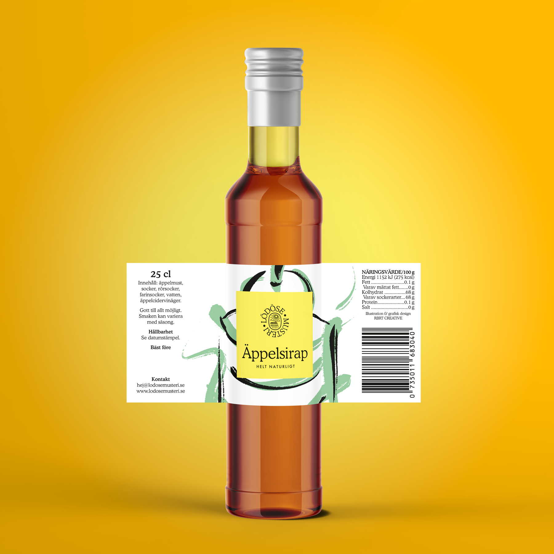
Lödöse Musteri – Apple Syrup Packaging Design
Lödöse Musteri – Apple Syrup Packaging Design
Packaging Design

Inceptive Logo Design & Rebranding
Inceptive Logo Design & Rebranding
Identity
More Etc. Typemakers – Visual Identity
More Etc. Typemakers – Visual Identity
Visual identity
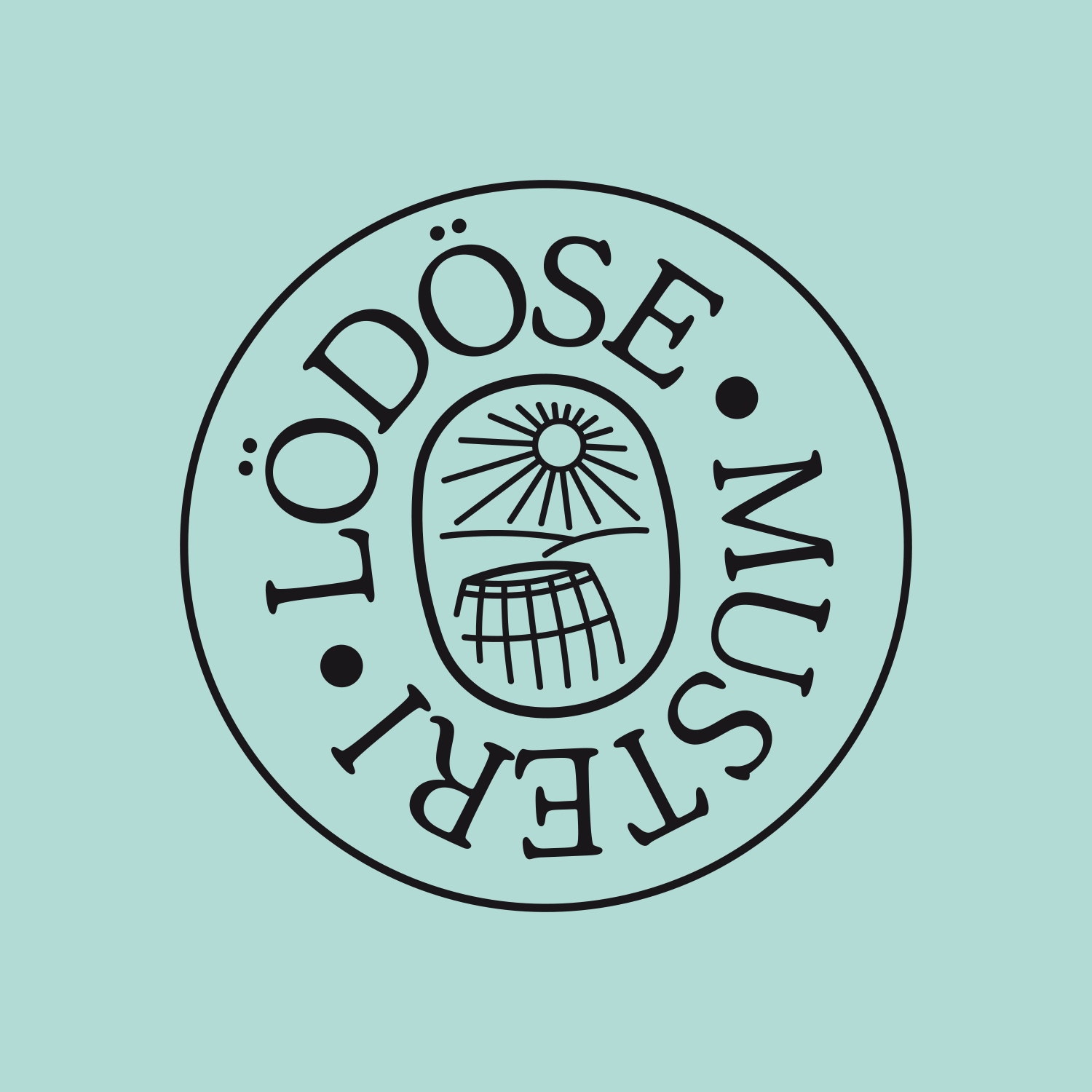
Lödöse Musteri
Lödöse Musteri
Identity
Startracks 25th anniversary
Startracks 25th anniversary
Identity
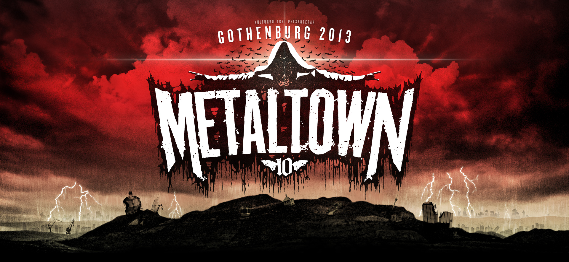
Metaltown
Metaltown
Festival identity design
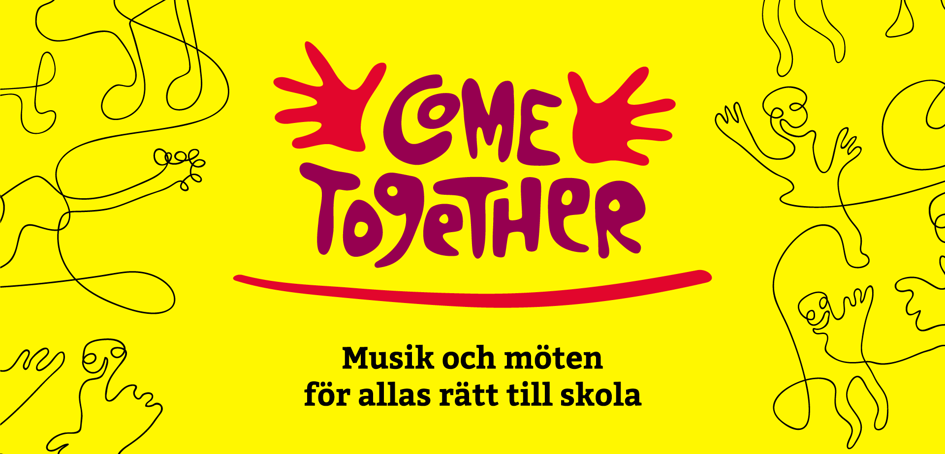
Come Together
Come Together
Identity

The White Shirt
The White Shirt
Identity & packaging design
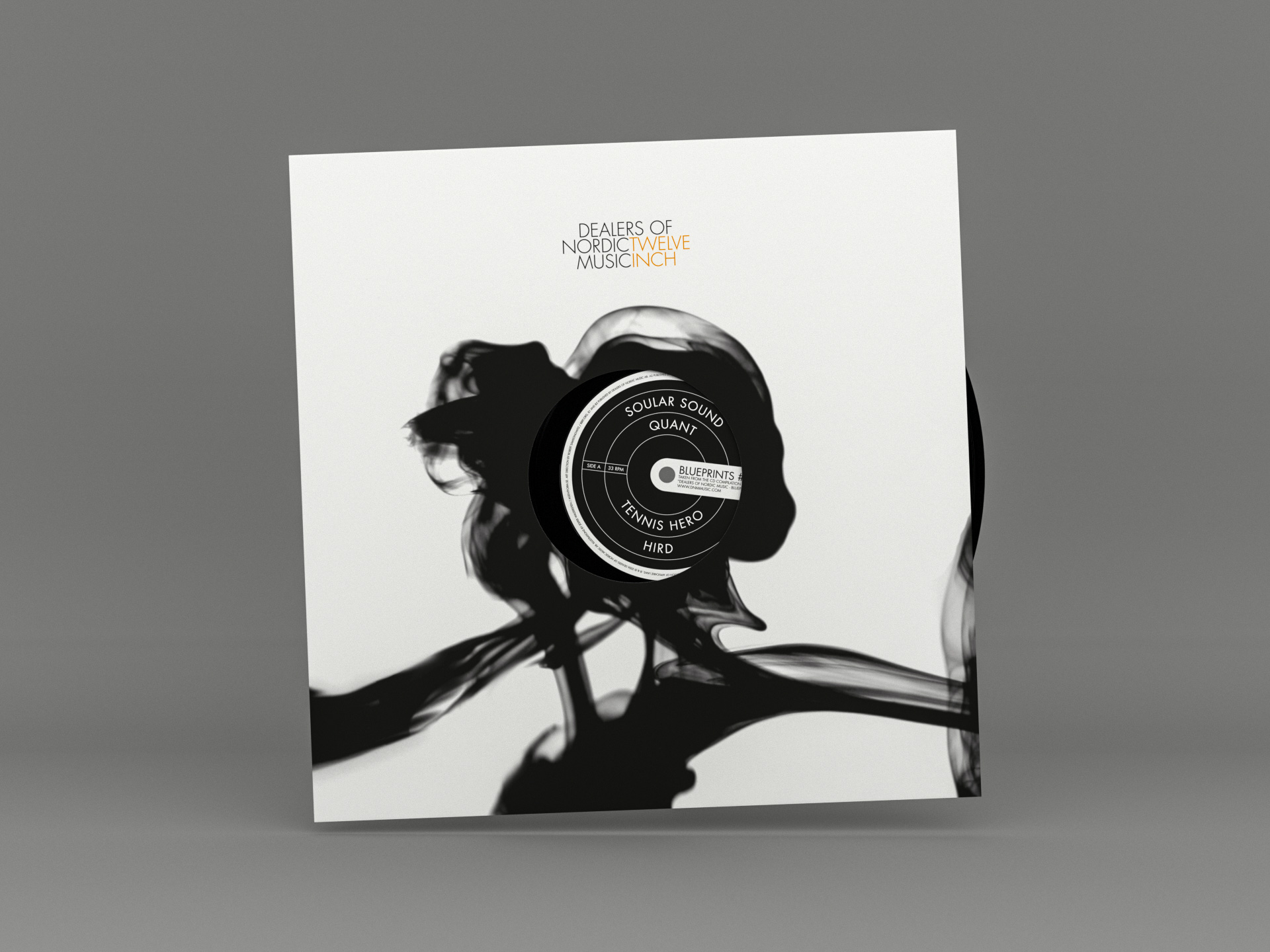
DNM Twelve Inch Series
DNM Twelve Inch Series
Branding & record series packaging design
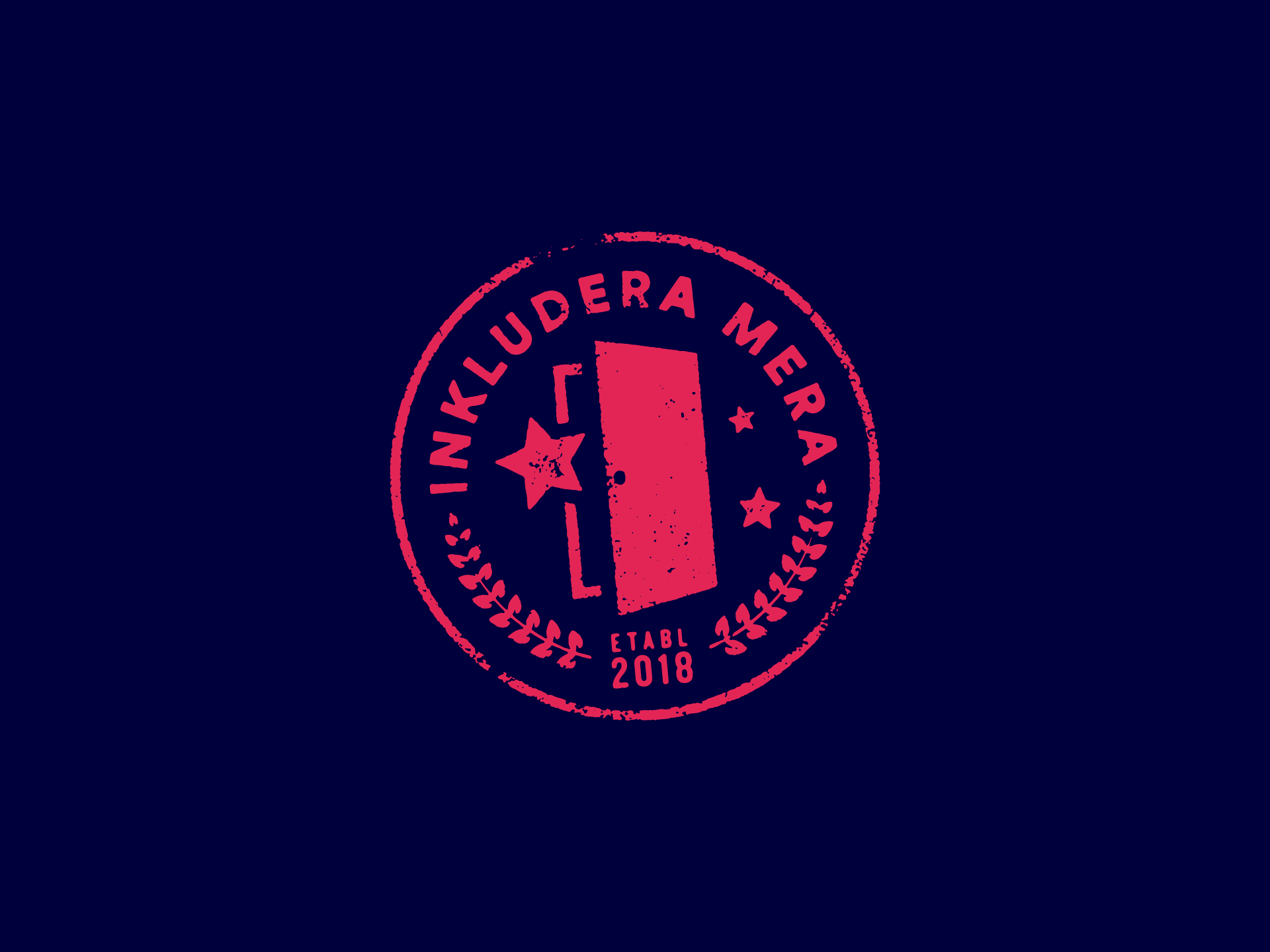
Inkludera Mera
Inkludera Mera
Identity

Modern
Modern
Identity & album packaging design
Dither
Dither
Identity & Website
The Zürich Laboratory
The Zürich Laboratory
Identity
Arena 29
Arena 29
Identity
West Coast Riot
West Coast Riot
Festival identity
Heartbeats International
Heartbeats International
Identity
Appearance by Anna
Appearance by Anna
Identity
Fairfest
Fairfest
Festival identity